A new blog is made up of far more than just words
Early this summer we redesigned and relaunched our company blog with a brand new name, visual identity and a new reader experience.
Today it is already half a year since the Jolocom Logbook – our internal playground to share “lessons learned from the edge of decentralization” – has been up and running, generating more leads than ever before and guiding us toward a more “editorial-led” approach to blogging logging.
■
To make this case study a light read I divided it into three parts:
01. From Medium to Logbook in five steps - an article for non-designers that explains our blog redesign process and equips you with a ton of links to resources. Find the link at the end of the project page.
02. [coming soon] ‘Your blog deserves a name. How do you pick the right one?’ - a how-to guide to creating product and brand names (it also contains a short story about how we named the Logbook)
03. [this case study] ↓ a visual story with the focus on branding and art direction of the Logbook.
00
01
02
Naming
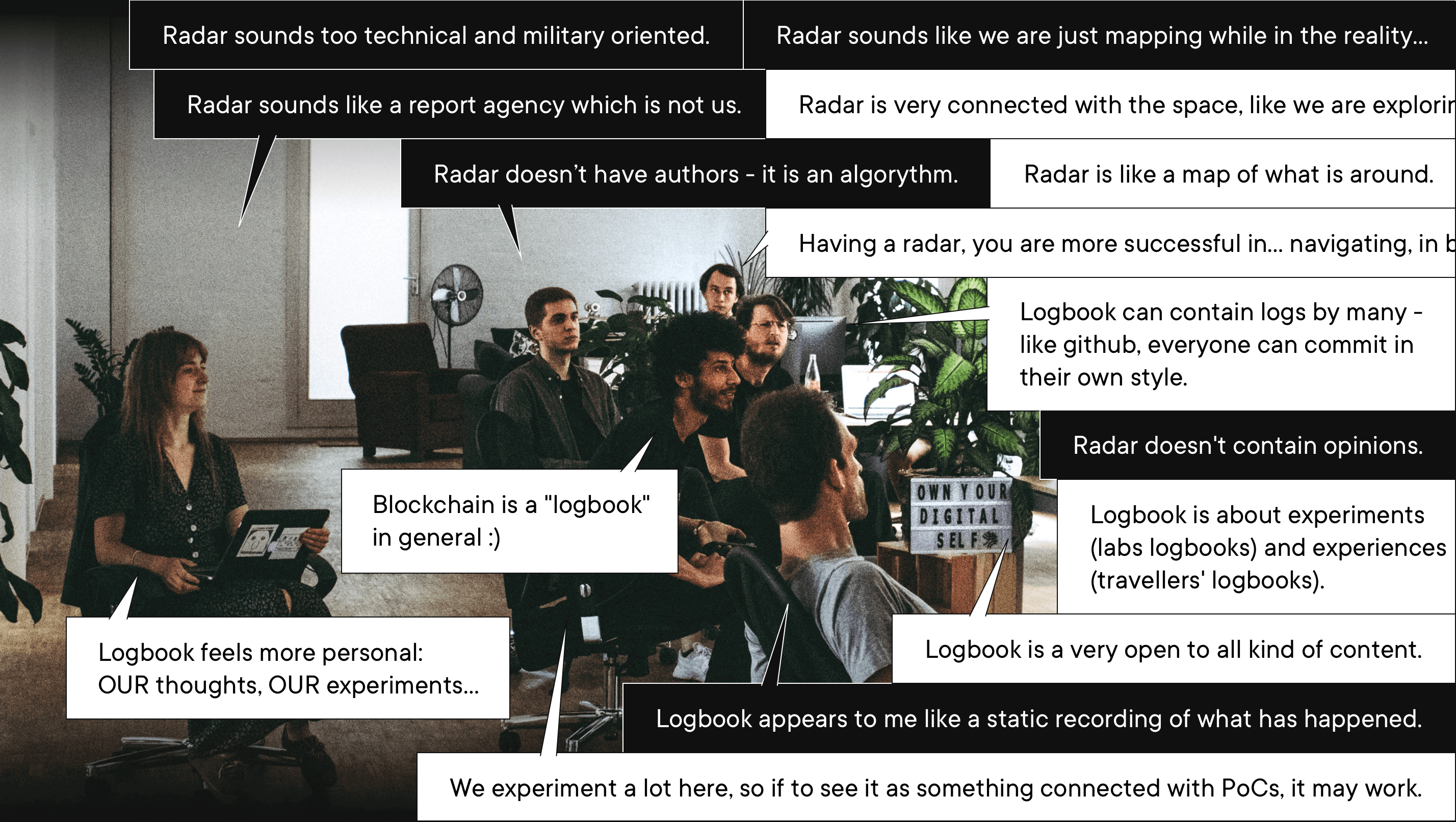
"Do we really need a name?"
Imagine Captain Kirk flying not the USS Enterprise but just a spacecraft. Or Jack Sparrow trying to regain not the Black Pearl but a pirate ship?
We didn’t simply brainstorm the names. We did a complete naming exercise, much as branding agencies do, but with a few adjustments to fit the vibe of our team. It took us just two weeks to get from “the blog” to the final voting between two winners - Logbook vs Radar.
01
02
03
Branding
How much of Jolocom-ness does Logbook have?
Approximately 30%. That’s not very much for a corporate blog.
There’s an exception to the well-known brand-building rule when you can – and should – abandon brand consistency and make a shift toward visual flexibility. It depends on what kind of blog you are launching and what emotional values form the foundation of a company’s visual identity.
Jolocom’s primary brand reflects our bigger vision and how we believe self-sovereign identity should look and feel to people outside the crypto-bubble. During Logbook’s naming workshops, we realized that we wanted our blog to have a different personality. It should be more about the diversity of views in our team, and more about the (occasionally nerdy) vibe of the open-source dev community.
This decision became the main argument for stepping outside a tightly defined lane of brand consistency. We started experimenting with the tension of two visual styles and designed Logbook as a sub-brand – with its own visual atmosphere that has a broad overlap with Jolocom’s primary brand identity.
02
03
04
Concept
The legacy of Jolocom code
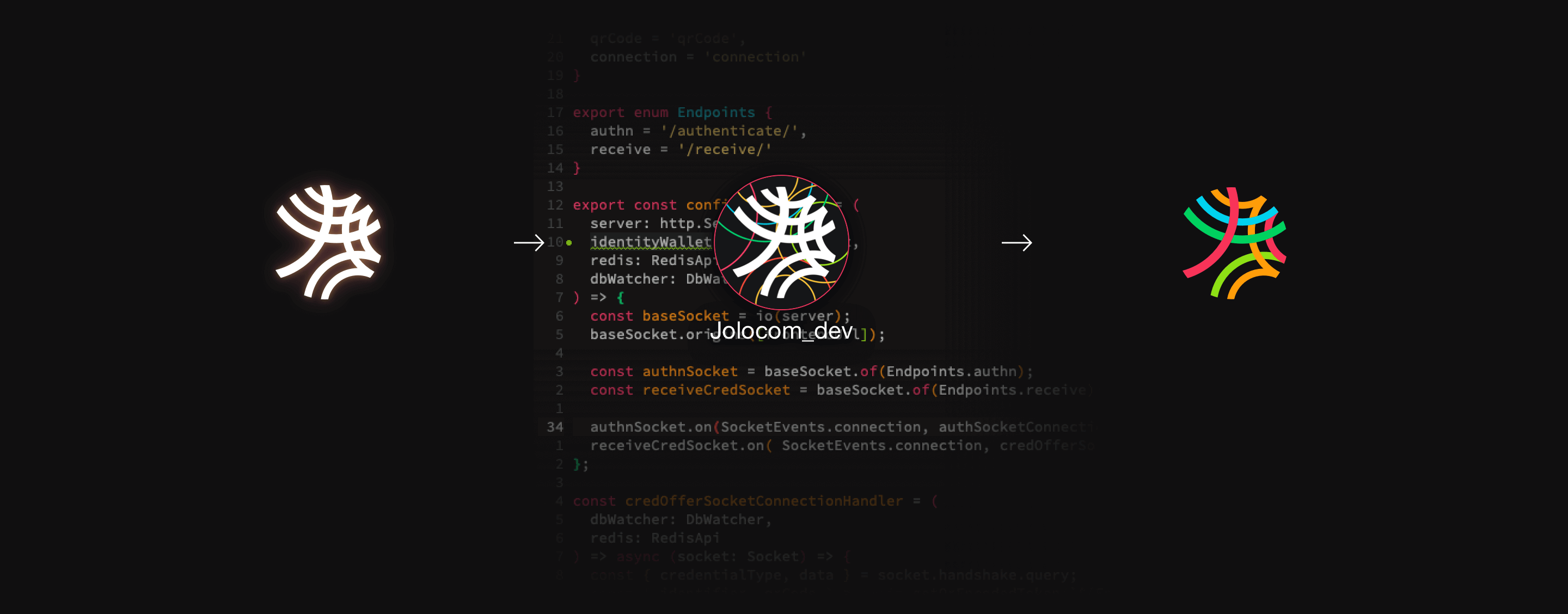
The logo concept wasn’t developed for Logbook exclusively. The recolored Jolocom mark has been already used internally as a staging app icon by our dev team for the last two years. After getting a few polishing touches this idea became one of the options to vote for and, then afterwards - the everyone’s favorite winner.


03
04
05
Reader experience
“Don’t stop. Keep reading”
In my article “From Medium to Jolocom Logbook in five steps” I wrote about the RX (reader experience) in detail - from the change in the top navigation (image above) to the reading time calculation and the line length. In this case study, I would like to mention only one element that was born at the intersection of art direction and UX design – the Author’s Pick badge.
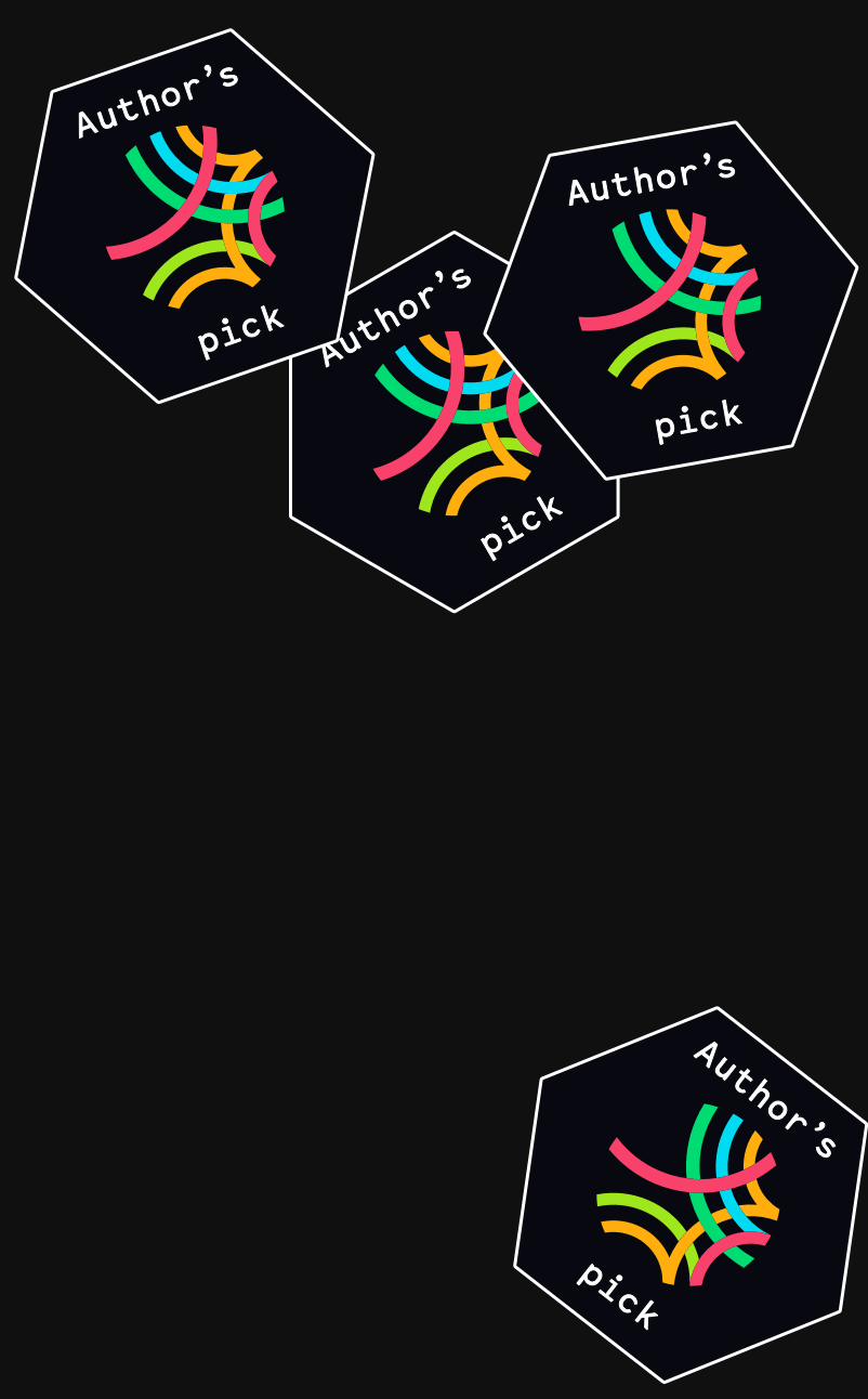
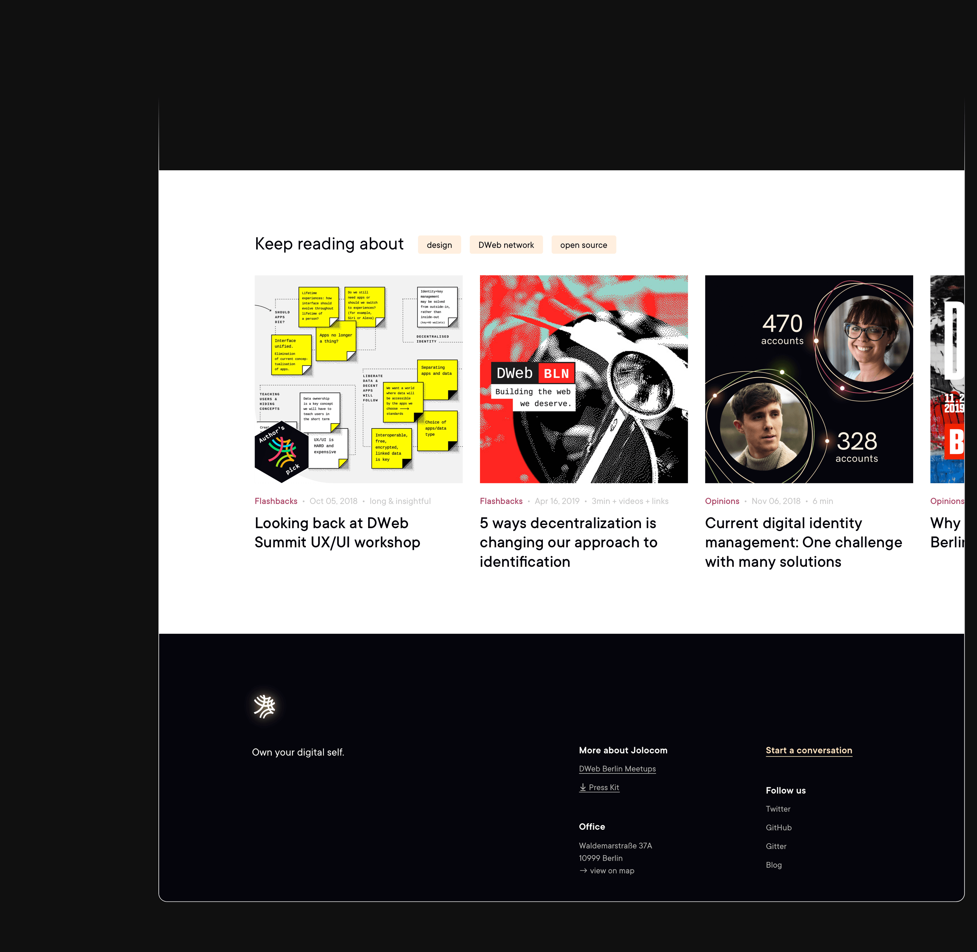
The Recommended Reading section has two parts – tag-based suggestions and a manually picked Author’s Pick.
To make the Author’s Pick stand out we gave it its own section, with a bigger cover, titles of the higher rank and another composition. This seemed logical and UX-safe. But we felt there was a lack of soul in this solution, Logbook definitely needed more details for the devil to be in.
So, we simplified the layout, merging two sections into one horizontal feed and gave the Author’s Pick not a badge, but a hex sticker!
If you have been hanging around among an open source dev community, you can easily guess the response: “We want them on our laptops!”
04
05
..
Art direction
How can we balance two styles and keep building brand awareness?
One of the Logbook reader audiences is business partners and public sector representatives who are interested in the SSI use cases and the Jolocom protocol implementations. For Jolocom, it is hyper-important to keep building strong and seamless brand awareness among this audience.
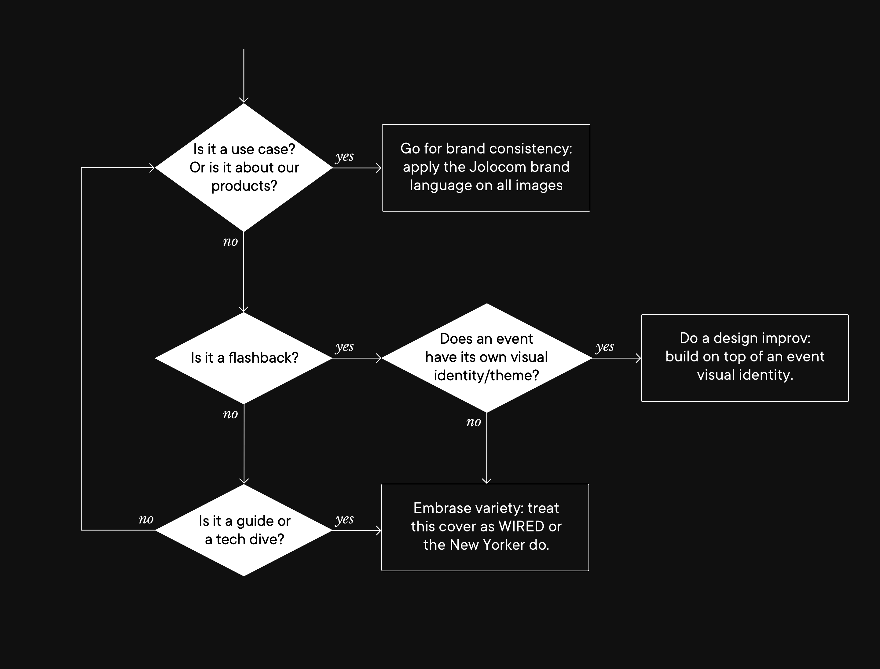
Having this in mind, once we agree on a message to convey through a cover, and a visual concept is ready, we need to choose the right graphic style - the vibrance of the Logbook imagery or the established Jolocom brand identity?
To streamline the decision-making process for all the future blog posts I created a simple flow diagram that we hope will become a framework for our imagery system:

04
05
..
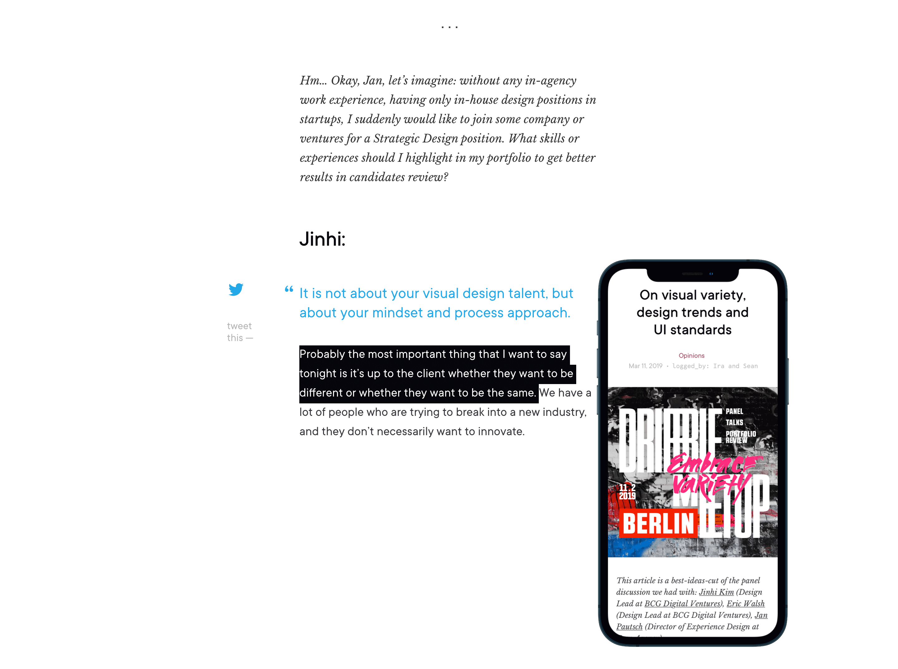
Cover as a poster.
Cover as a metaphor.
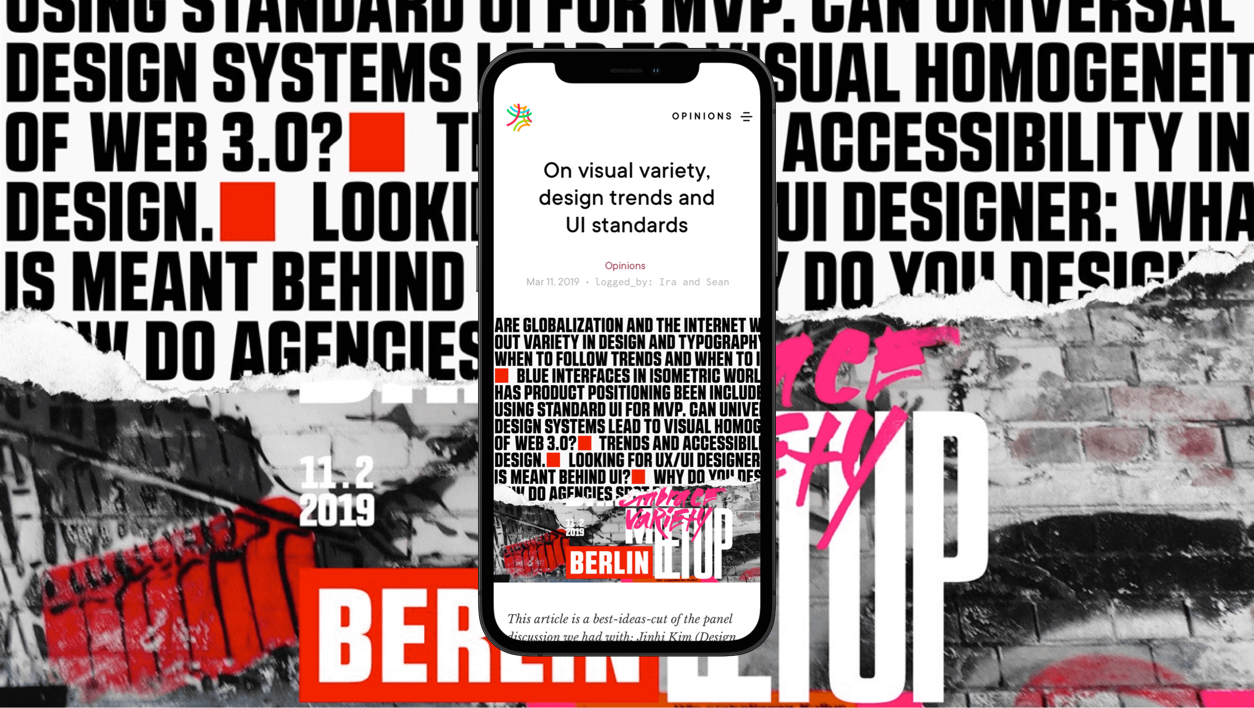
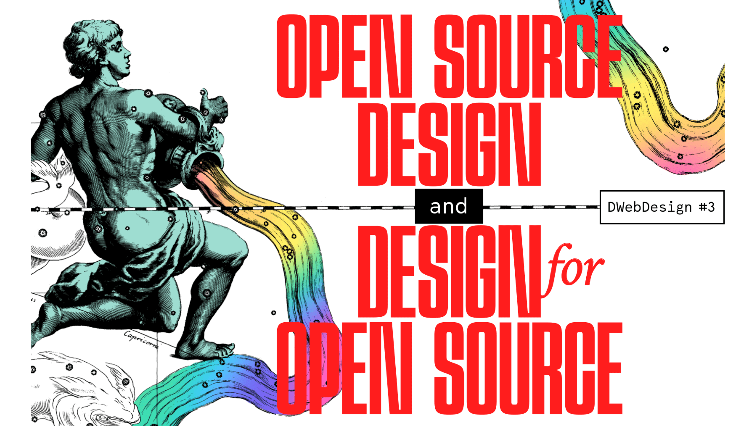
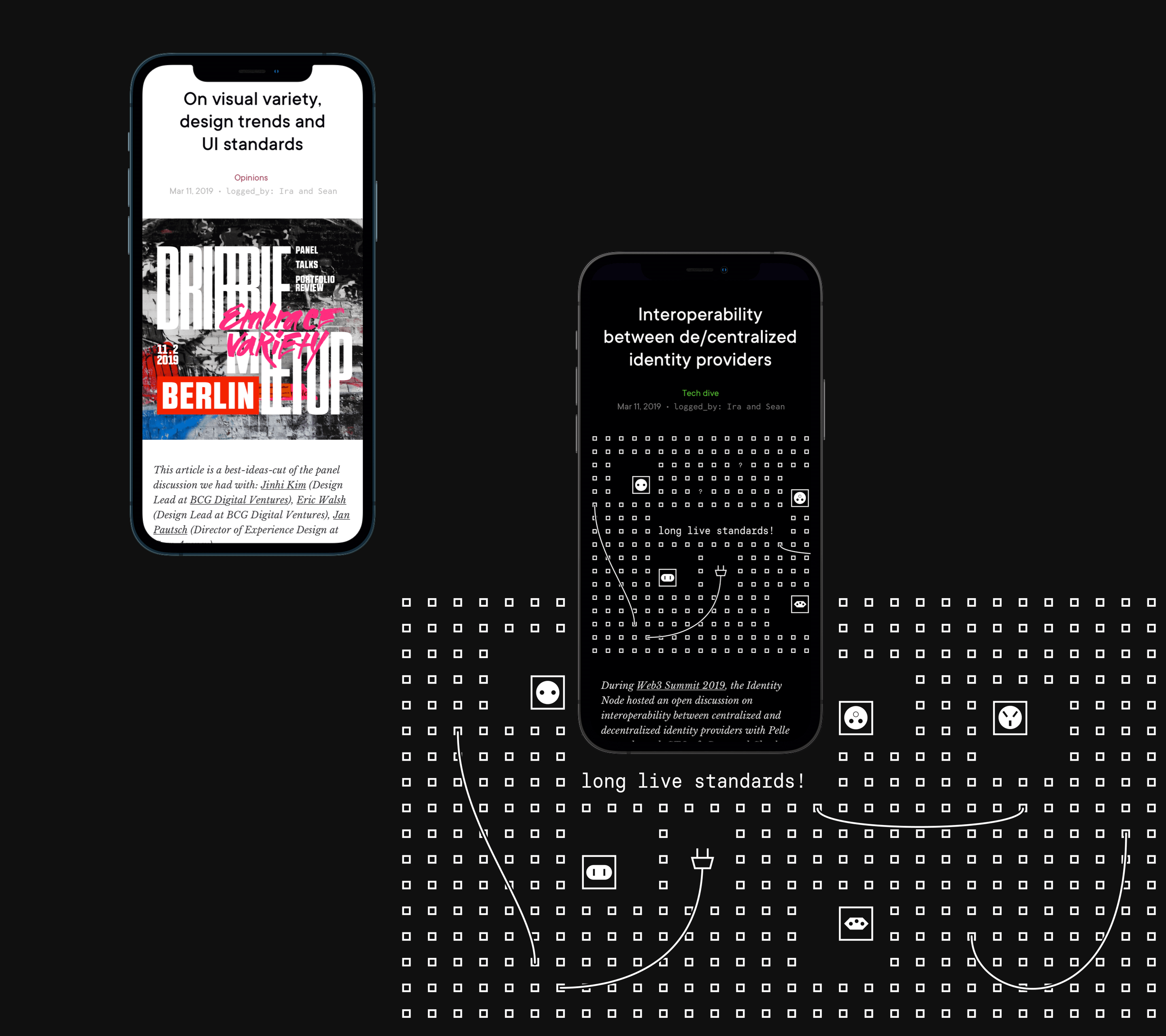
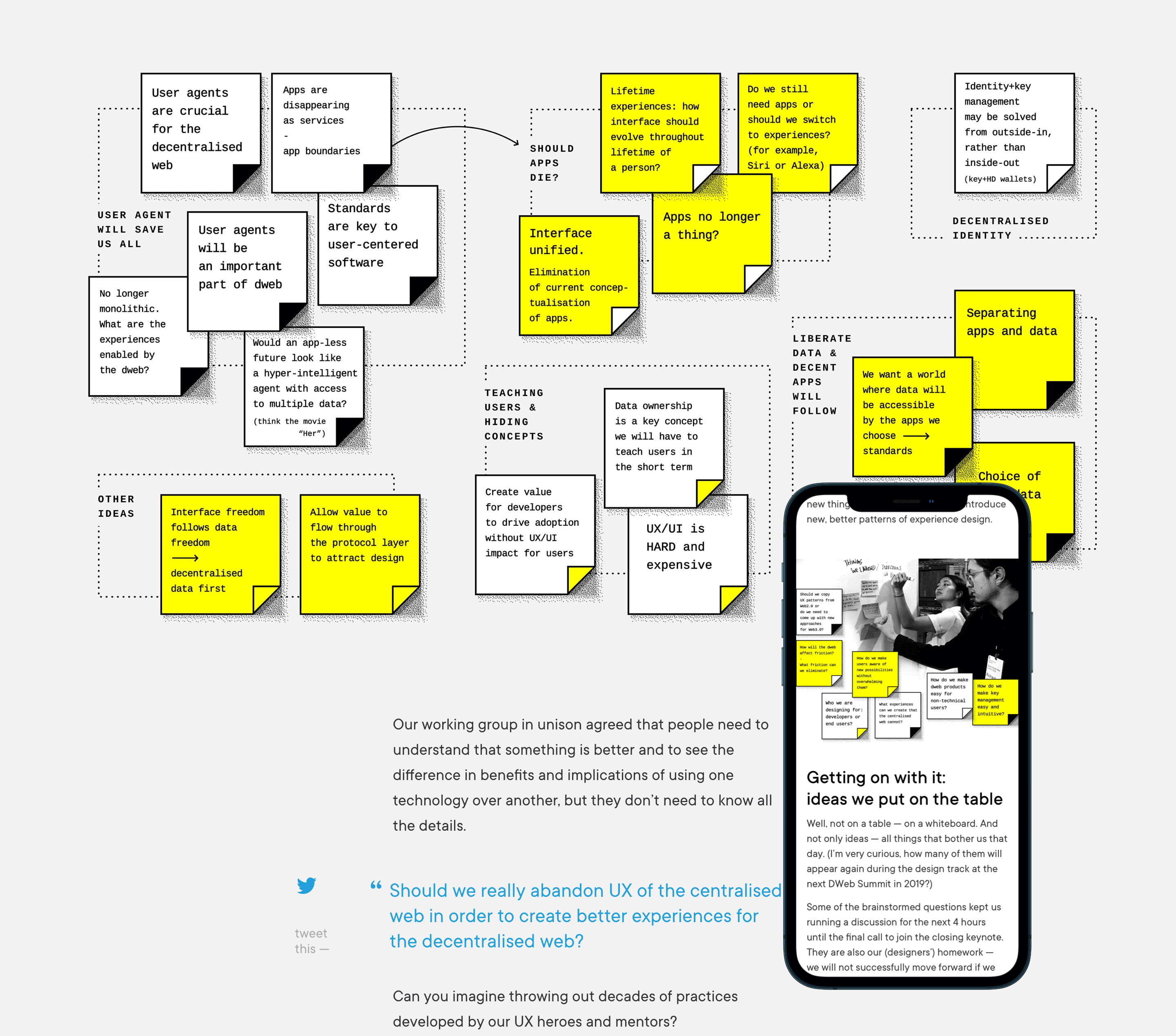
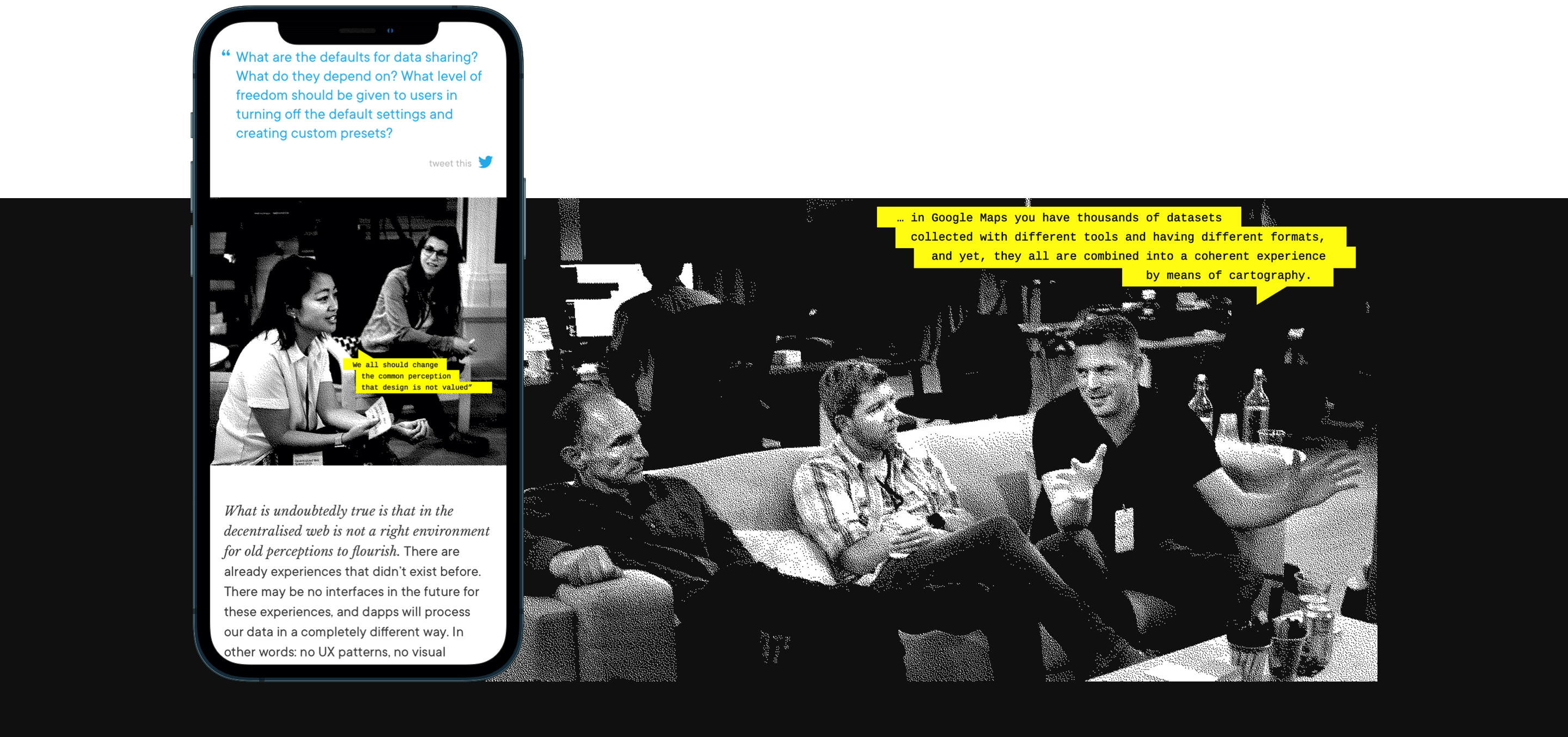
Tailoring a cover concept to an article topic is a challenging task, especially for articles from the Tech Dive category. When everything is about protocol specifications, DID methods and key rotations, things get too abstract. That is where your imagination starts doing a real workout!
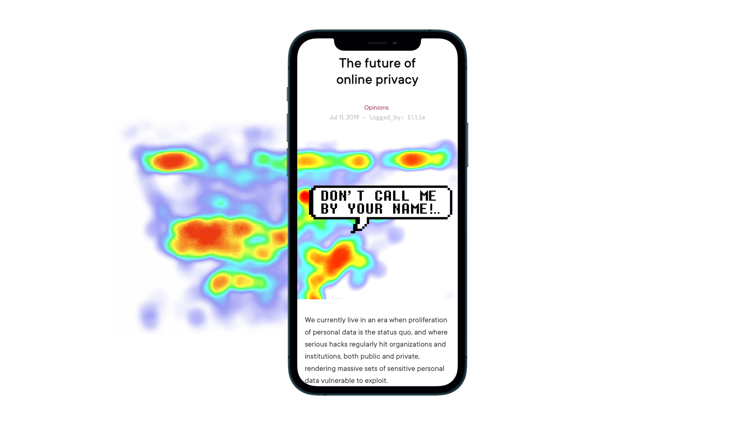
We aimed to make every cover tell… not an entire story, but make it capture a reader’s mind and ask for them to find a hidden message.
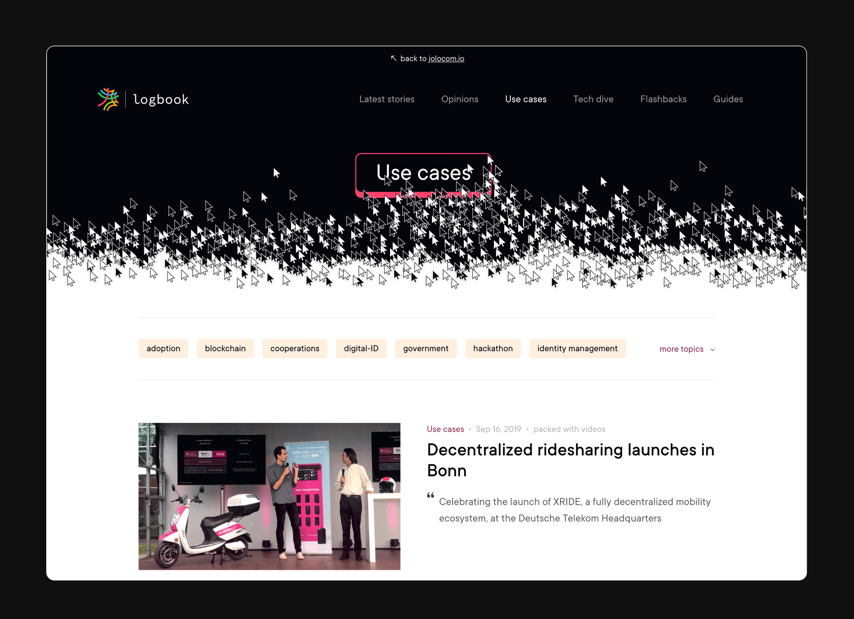
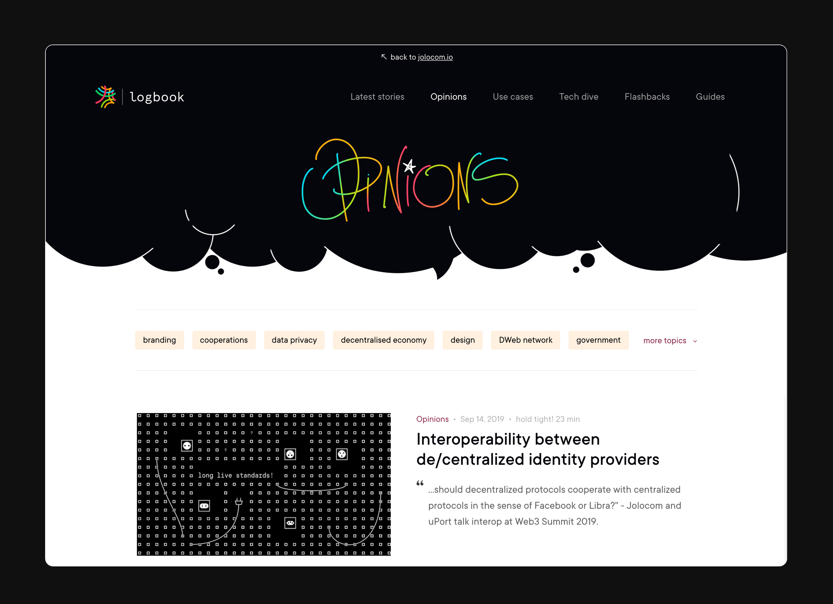
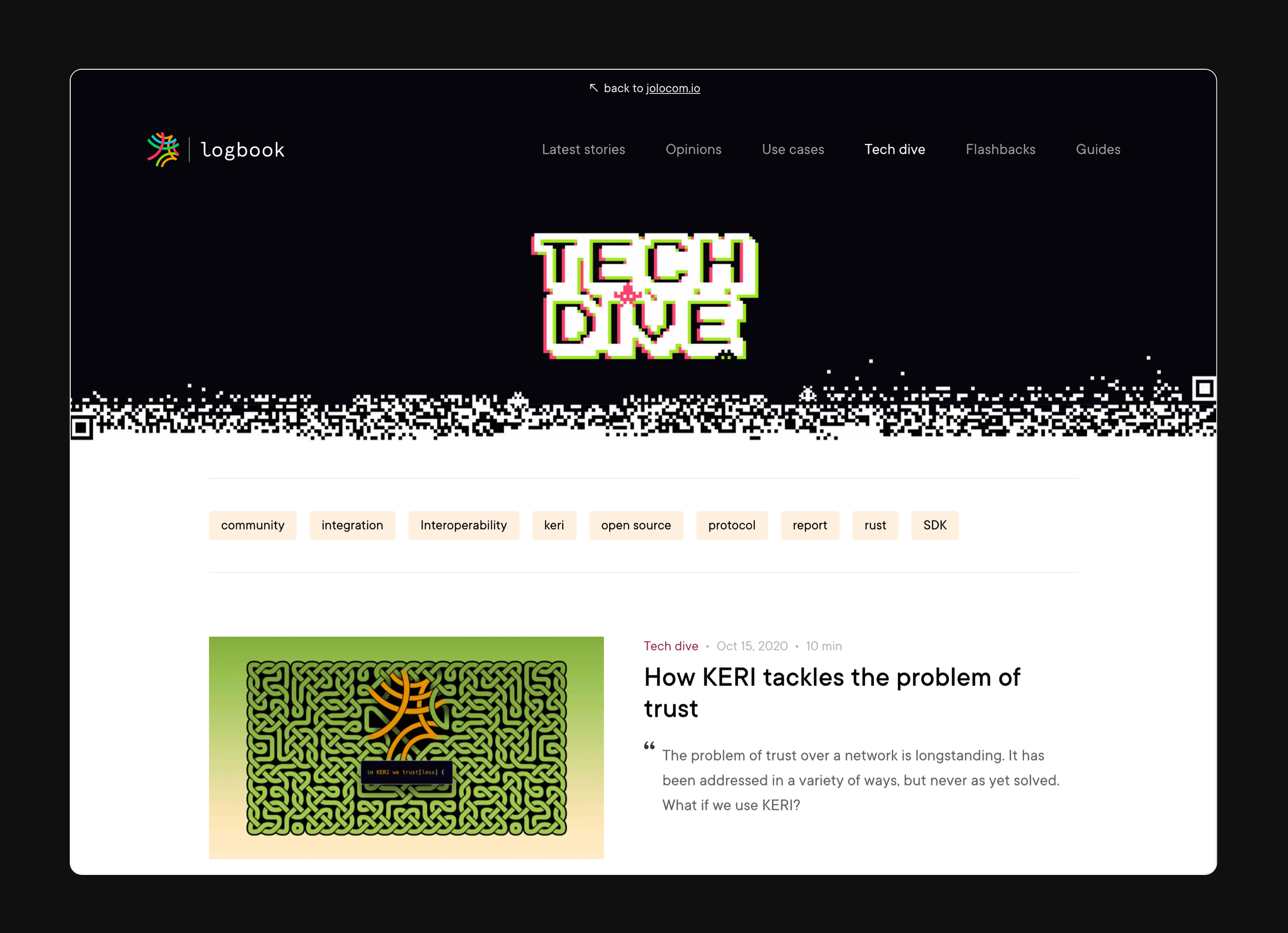
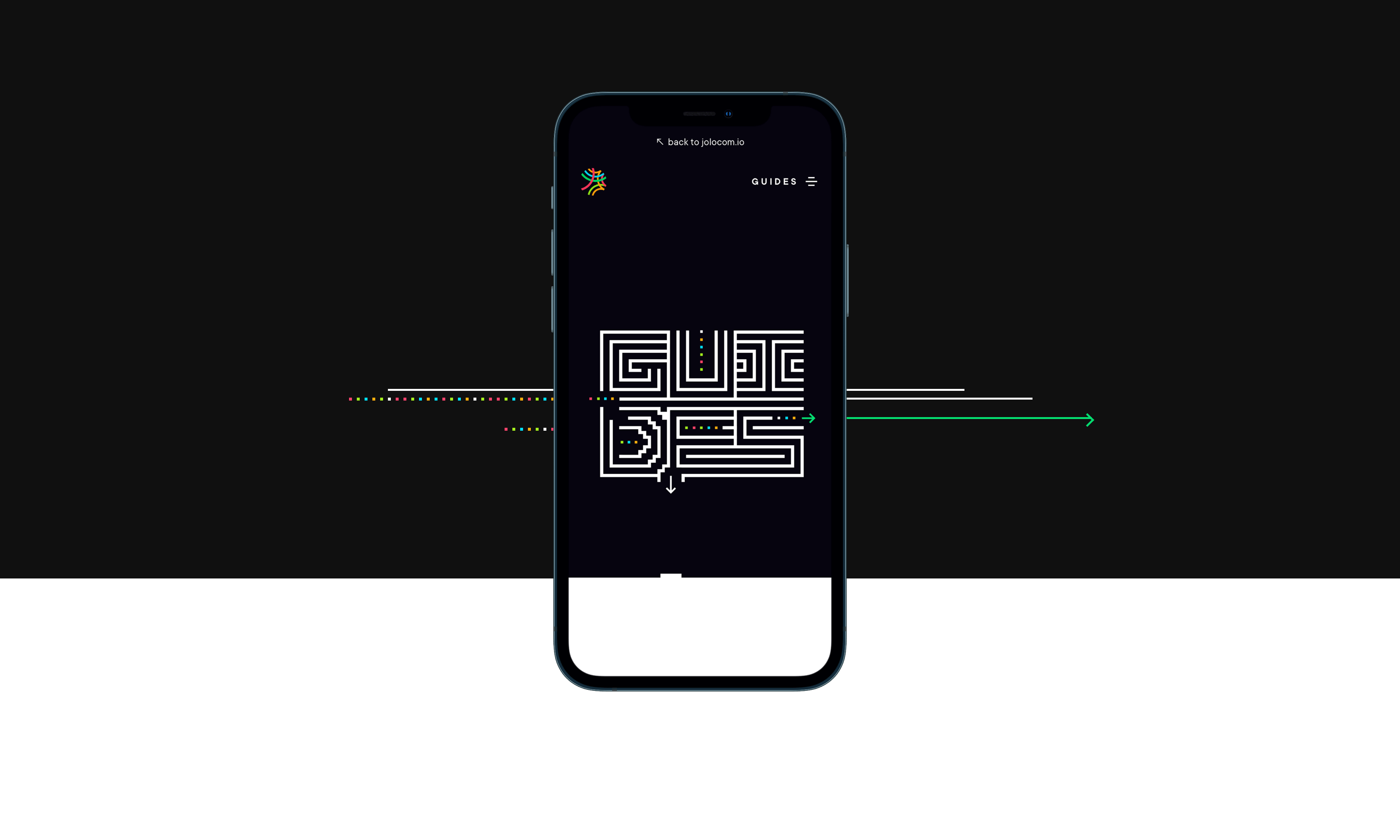
Going a step further, we gave every category
its own hero banner too.
06
..
Deep dive
Shout out to my team at Jolocom for their contribution to how the Logbook looks and reads. They got involved more than I could wish for!
■
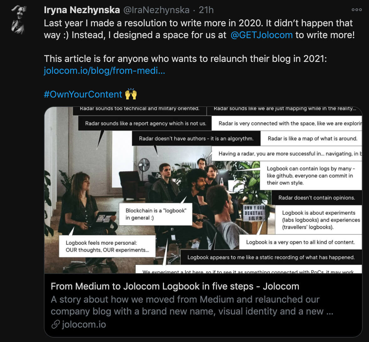
For a deep dive into the design process, read an article below. It's packed with all the tools and resources we used, in the hope these will help anyone who wants to relaunch their blog too.
next project ↓
Brand transformation of pioneers in the decentralised digital identity management
▇▇ work with Ira
Other matters: iryna at nezhynska.com
creative
ⓒ Ira Nezhysnka, 2025
▇▇ learn for free
Subscribe to Ira's Embrace Variety
-
ⓒ Ira Nezhysnka, 2025
