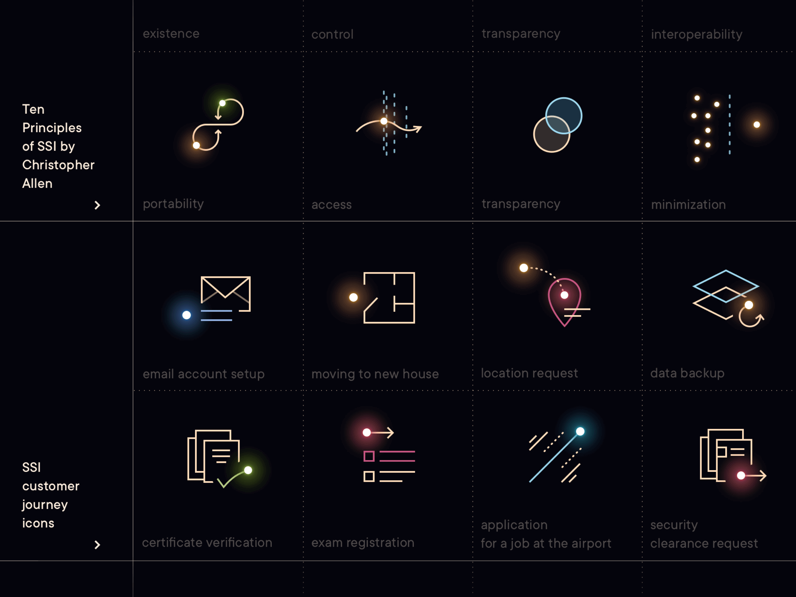
'Season 2' for the brand behind the future of digital identity
To understand where the roots of this exact visual language are, please go and check part 1 of the Jolocom brand story. And if you landed here from that page, then perfect! — you have watched season 1, let’s move to season 2.
This second part of the Jolocom brand story is arranged in reverse chronological order — from the latest updates through to those assets that followed right after we completed the first sprint.
Works in this showcase were produced or published during the period May 2019 to March 2022:
website update ⟶ March 2022
advent calendar ⟶ December 2021
white paper and product overview ⟶ December 2019
swag ⟶ June 2019 (1st edition) and December 2020 (2nd edition)
00
01
02
website
update
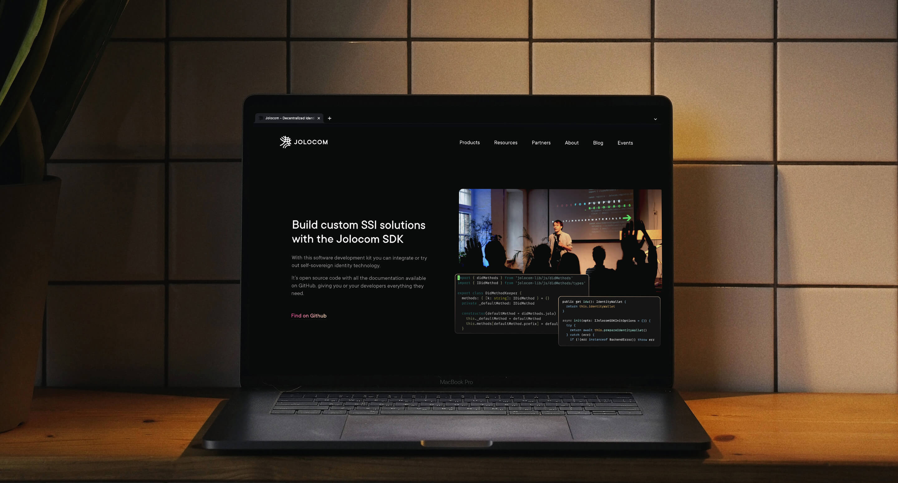
Since the launch of its first MVP version under a new brand in July 2018, Jolocom’s website has grown bigger three times.
In November 2018, we added Team Member profiles in order to communicate our team culture, and a more detailed 'Partners' page that includes details of what exactly we do in conjunction with each partner.
In April 2020, we moved the company’s blog from Medium to our own Logbook.
I wrote an article about the entire process on Logbook.
+ there is a design case study with a focus on branding and UX only.
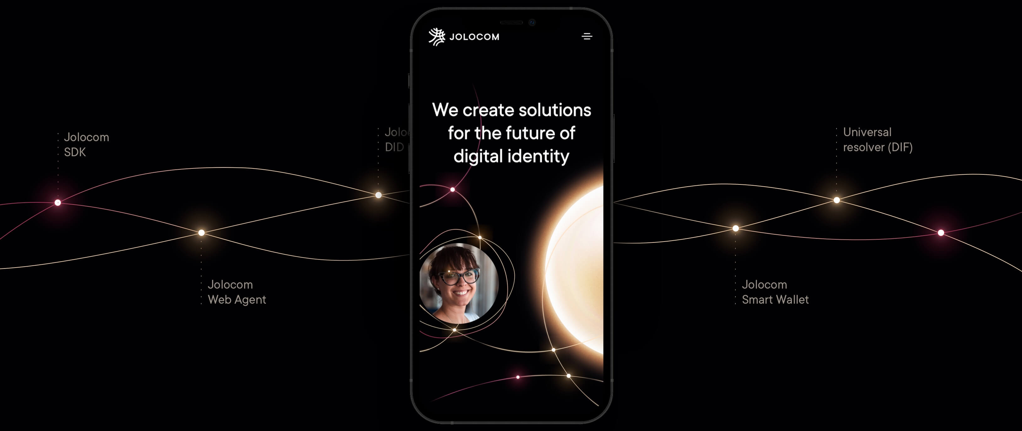
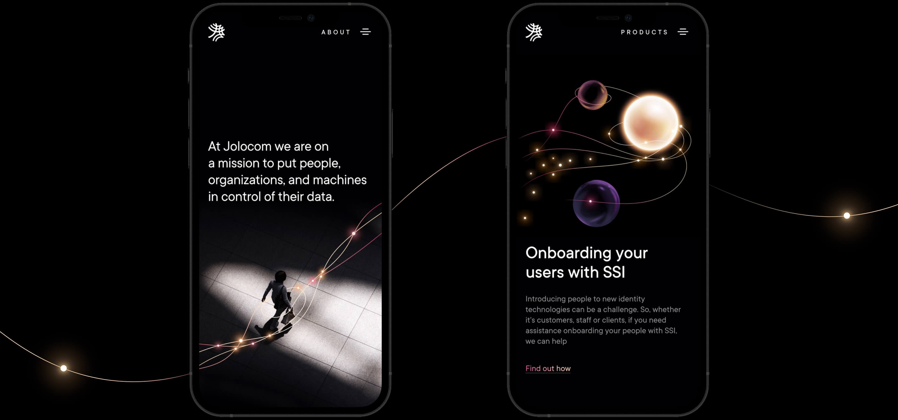
In February 2022, without any major fanfare, we relaunched 'Home' and 'Products' pages. Following that we redesigned our 'About Us' page in April 2022.

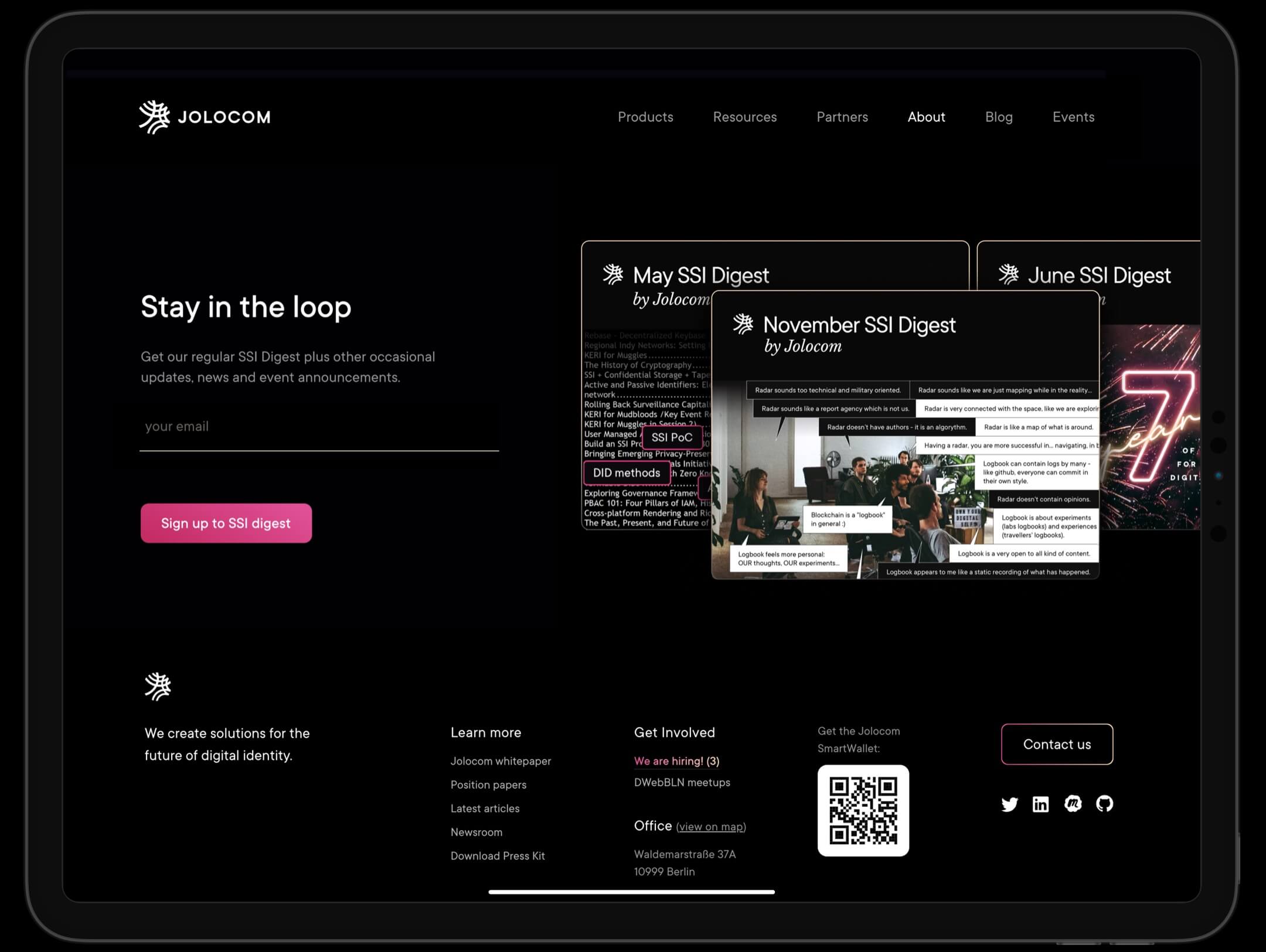
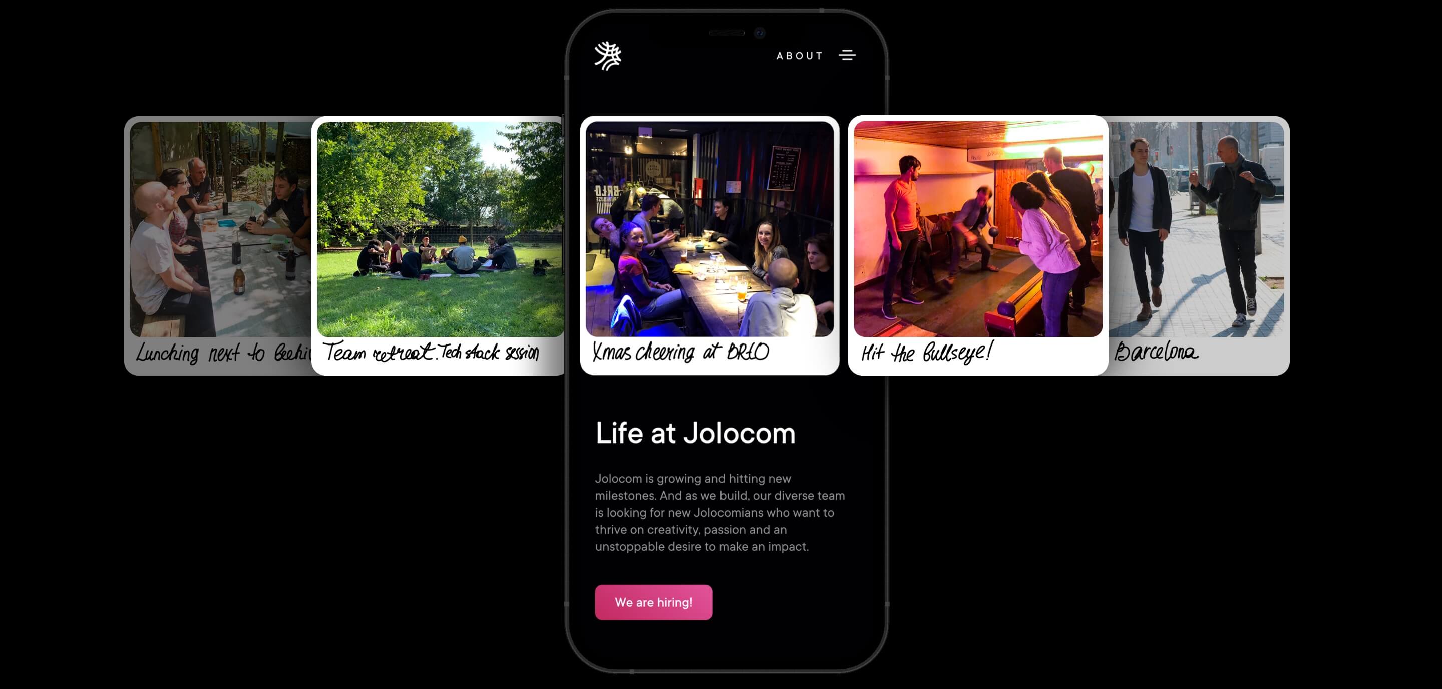
01
02
03
product overview and whitepaper
In summer 2019, in preparation for the XRide launch — a blockchain scooter sharing project co-created with T-Labs that was presented at Telecom headquarters in Bonn — Jolocom needed to have information about their tech stack handily available alongside the scooter.
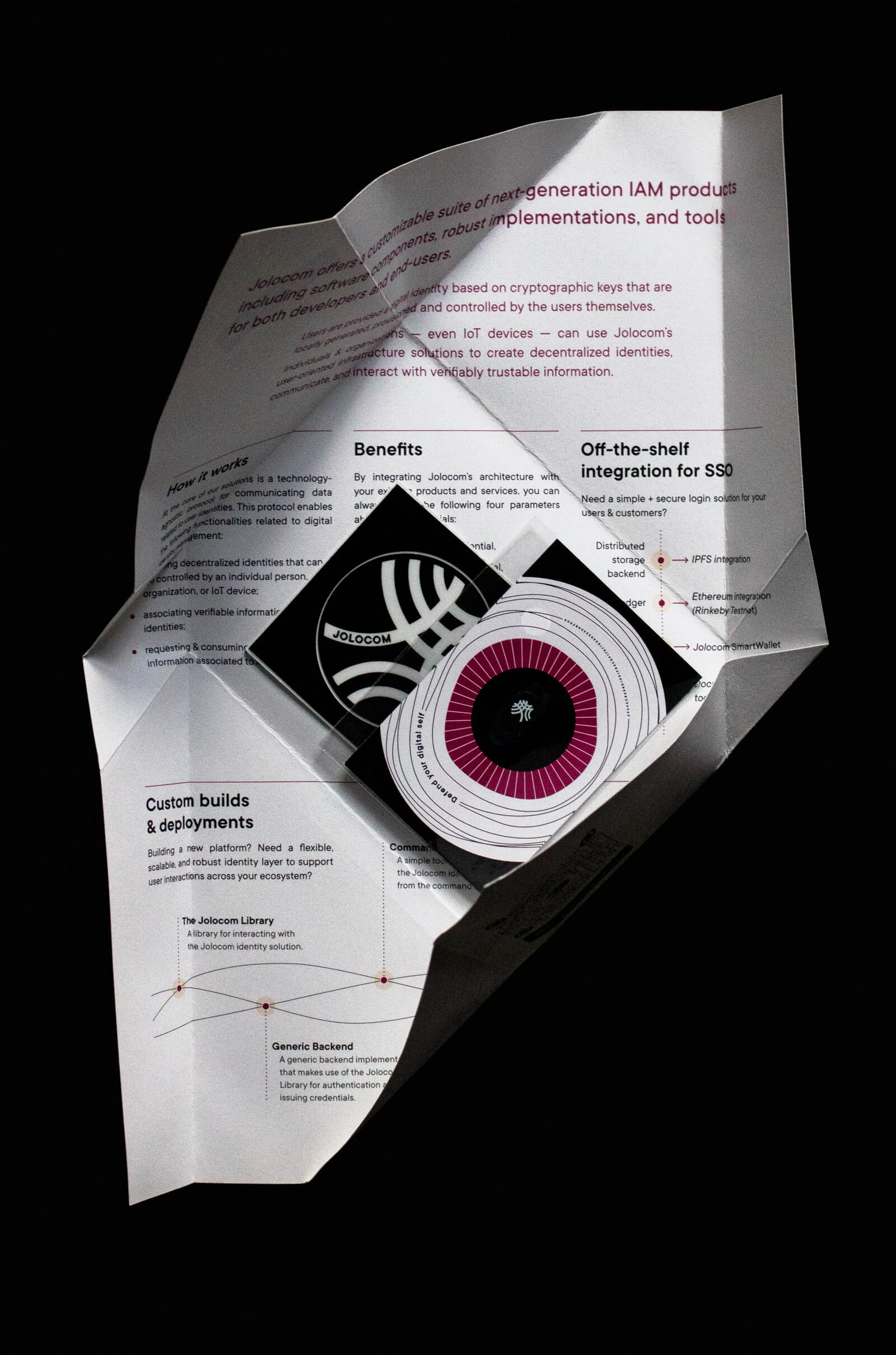
It was clear from the beginning what form this information should take content-wise — a one-pager that is easy to scan.
But what form should it take as a design piece? We wanted to bring to the booth something that visitors would love to take to their teams as a printed marketing inspiration.
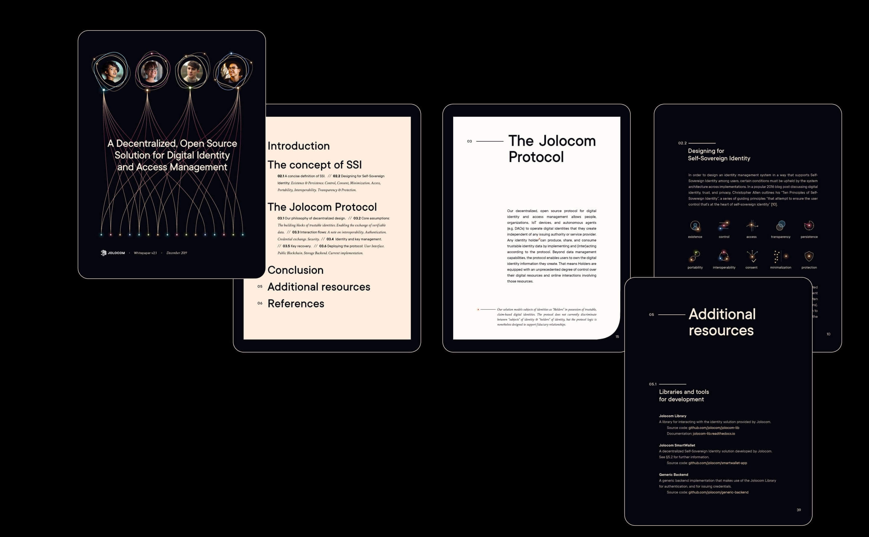
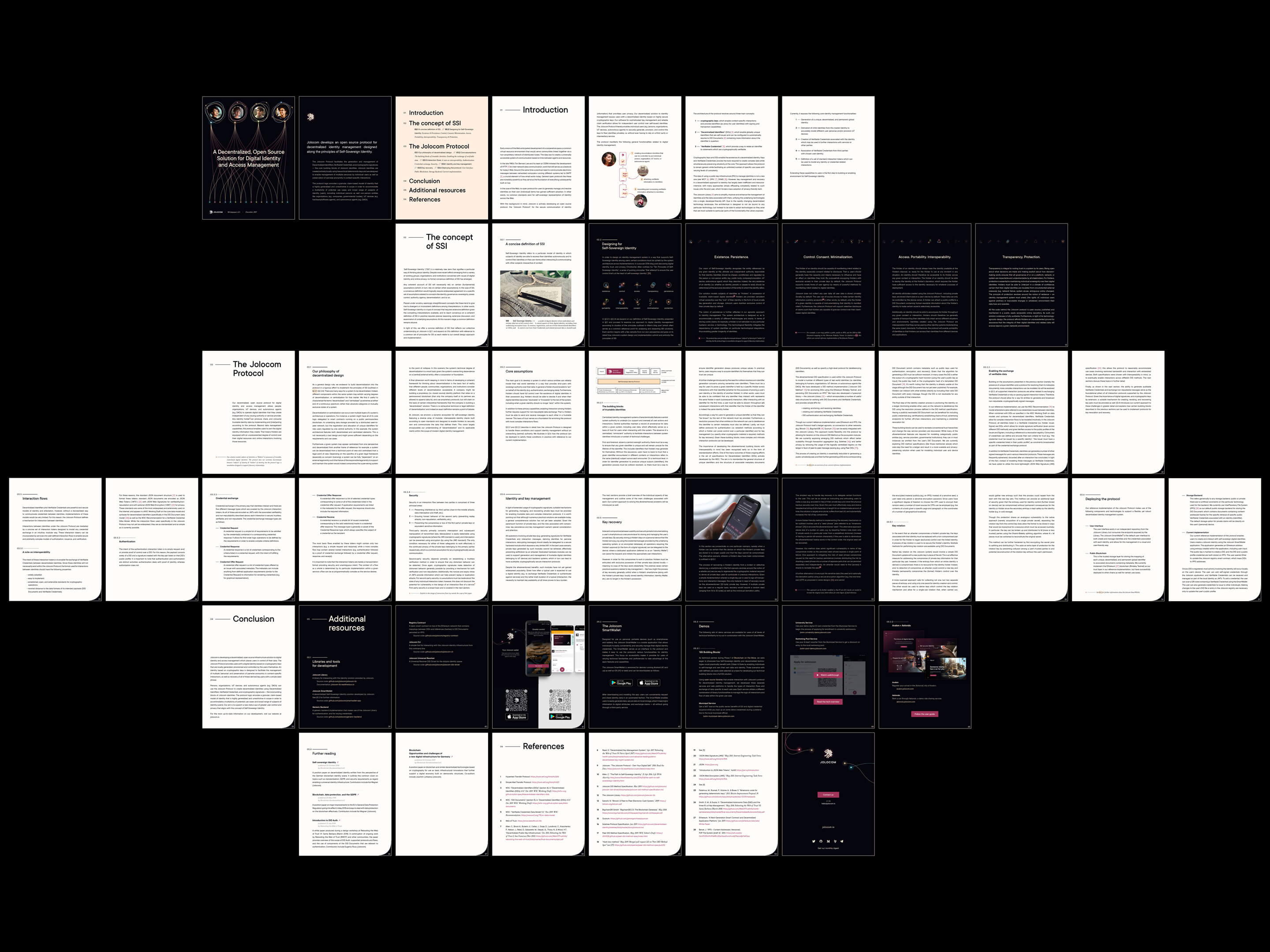
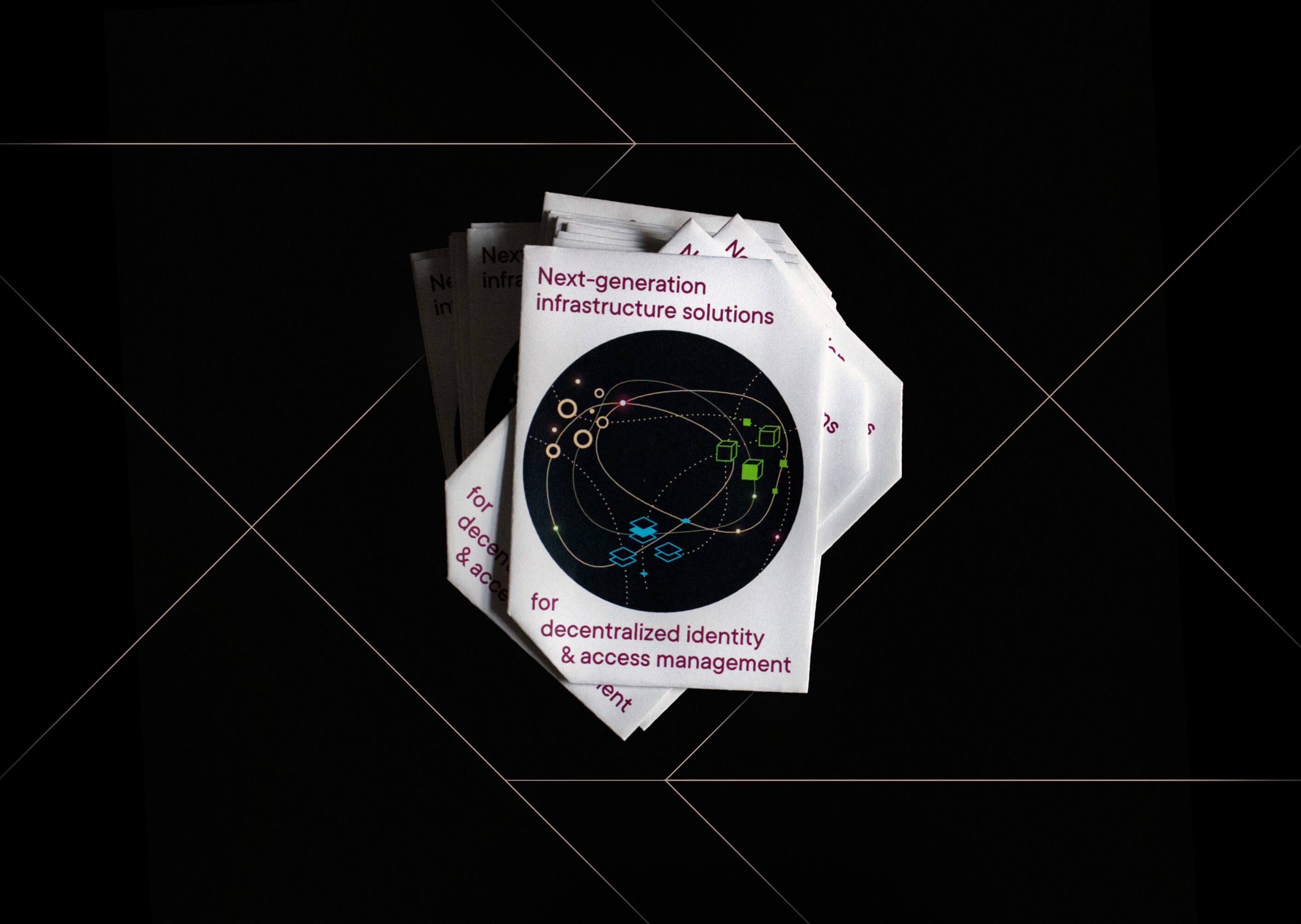
I started the creative brief with the parameters: not boring, not what attendees expect by default.
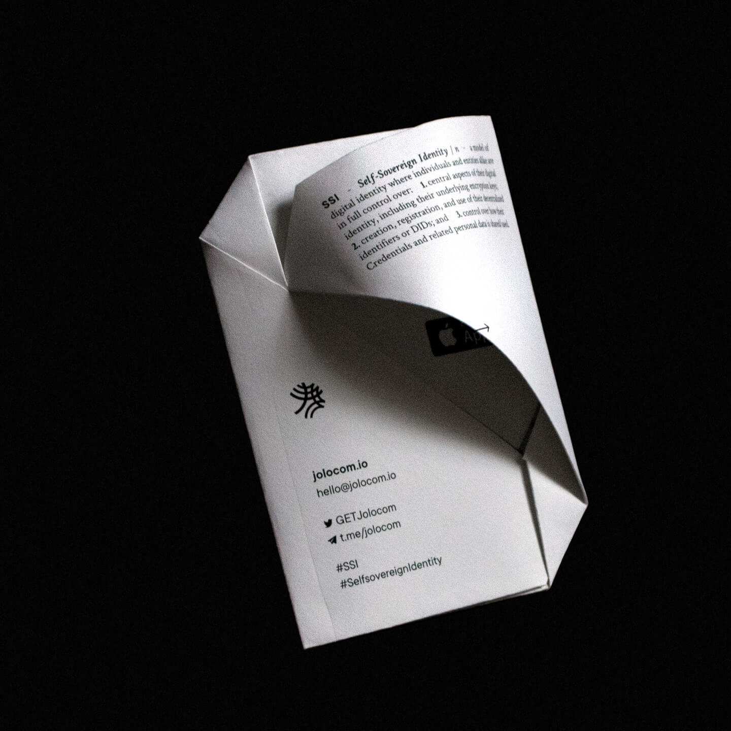
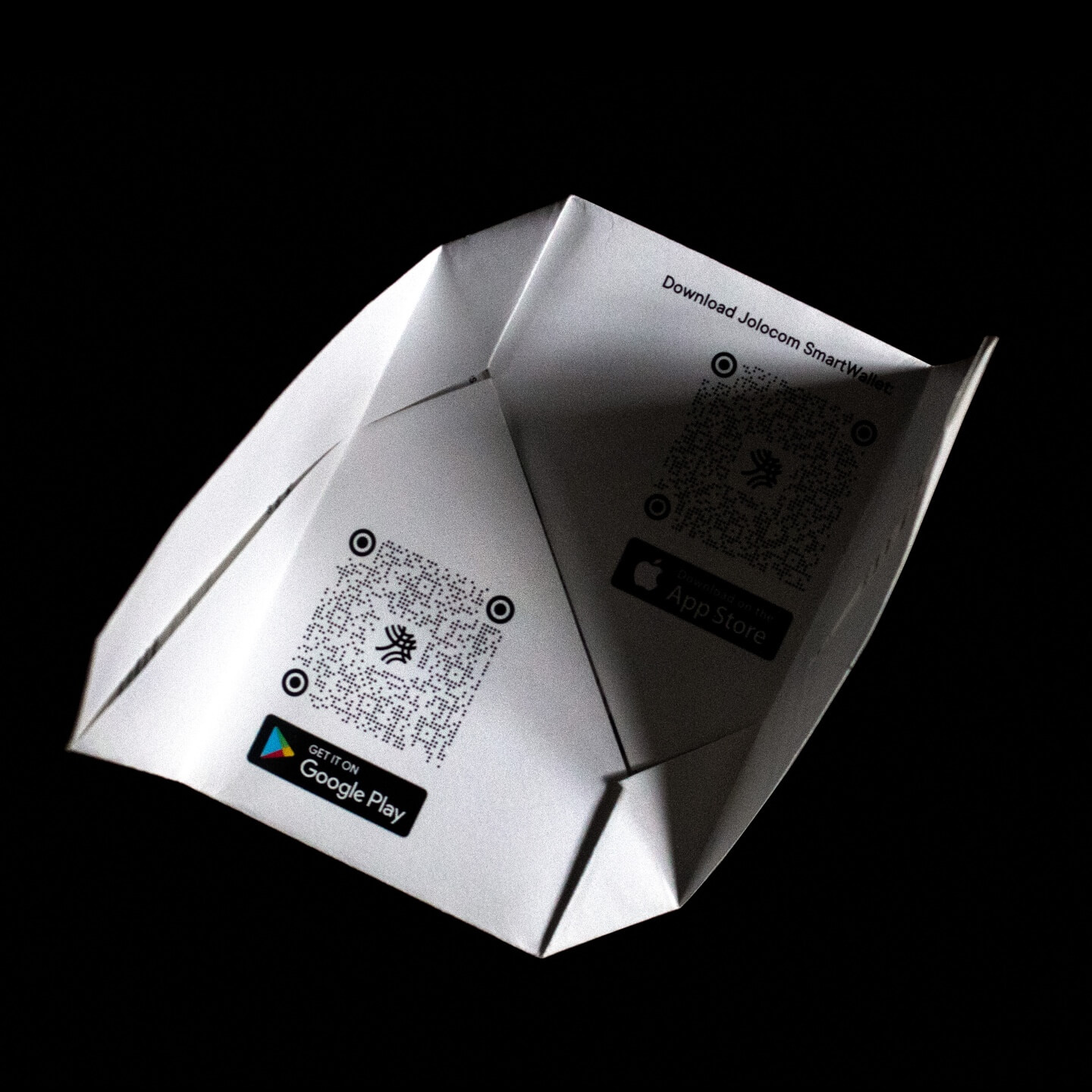
The creative process resulted in a merging of usefulness and “wow” in the shape of a Jolocom Kit. The actual one-pager we designed was an origami envelope that included a sticker and a cam cover inside.
00
01
02
advent
calendar
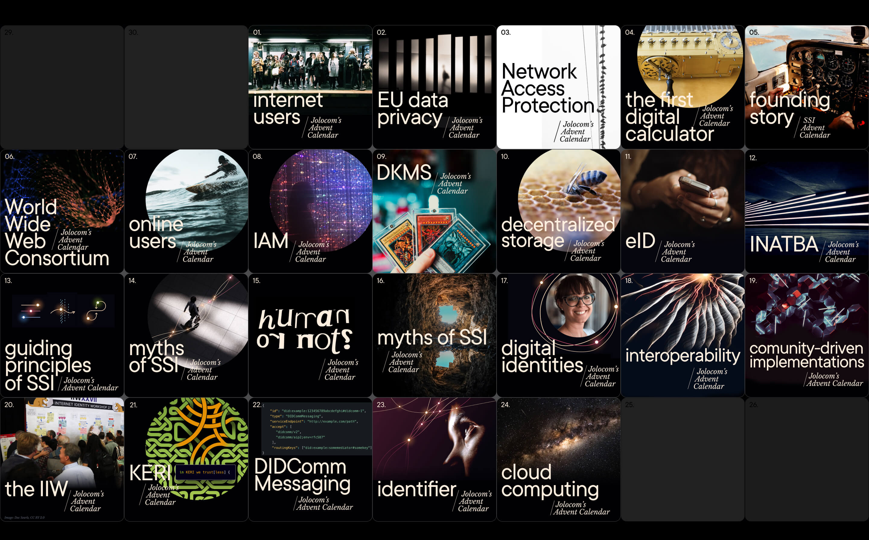
For the advent calendar campaign, the Comms team shared a fun fact or a myth or a quick quiz about SSI or data privacy on Twitter between December 1-24.
This particular campaign showed us what areas of SSI knowledge were in demand among Jolocom followers and what themes and topics it would be good to cover in our upcoming Logbook posts.


02
03
04
swag
This is my favorite part of the whole scope.
Here is not my personal belief but an old observation that I have proved through a few experiments: “If you give your swag concept & design more attention than companies usually do, going beyond a logo on t-shirt approach, it becomes a killer marketing instrument for growing brand awareness”.
And it is an even more powerful tool in dev communities. There is no better way to spark a stranger’s interest in what a company does than with a t-shirt with a cool big print — besides a nicely maintained GitHub, of course!
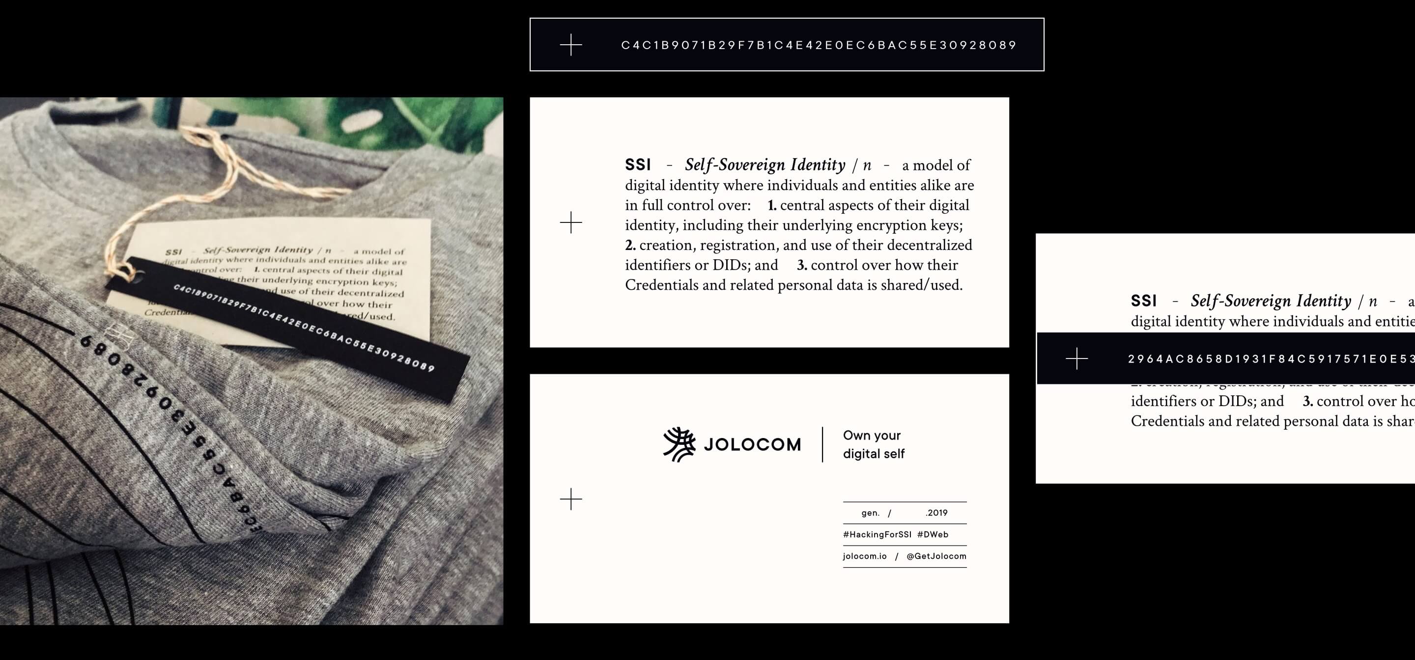
Going back to Jolocom t-shirts and hoodies: both prints consist of a HackingForSSI hashtag, a Jolocom logo, and a git hash — the number of the latest commit in the Jolocom repository on the day t-shirts were sent to be produced.
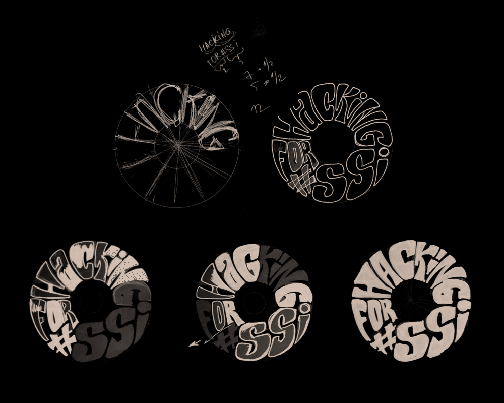
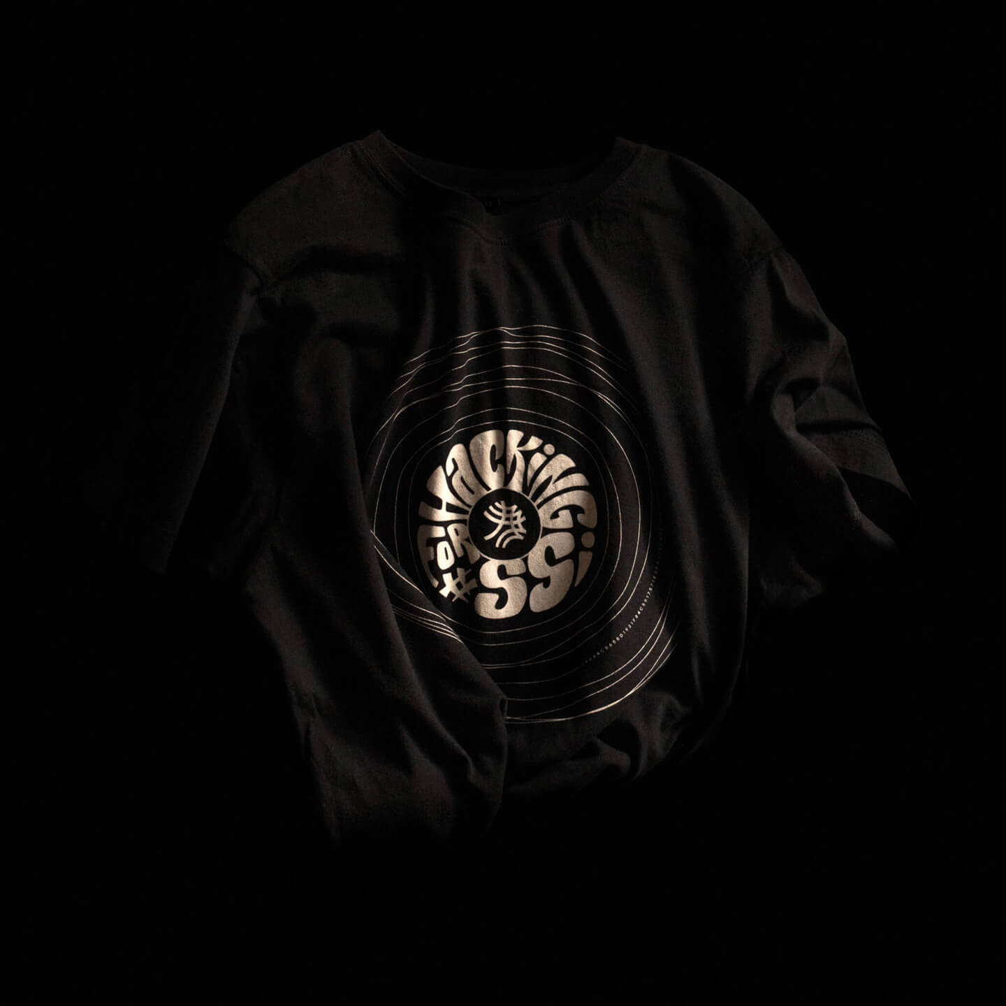
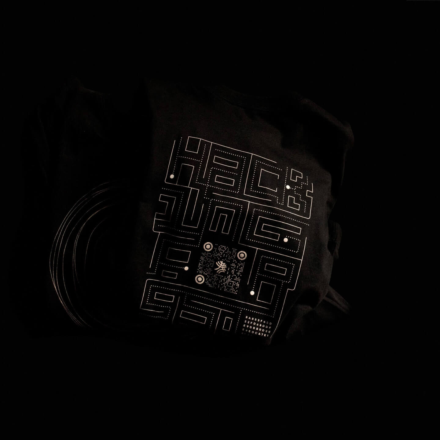
A sweet little devil-is-in-the-detail add-on is a hand-crafted label that carries a definition of SSI, company contacts, the t-shirt edition number, year of production and the git hash. ↓
Projects like the above are expensive.
Want to start lean?
Learn how to bootstrap your tech brand in less than 12 min per week, for free.
Read my brand design repository for developers-turned-founders who want to build a product image that accelerates early adoption and seed funding:
next project ↓
Brand transformation of pioneers in the decentralised digital identity management
▇▇ work with Ira
Other matters: iryna at nezhynska.com
creative
ⓒ Ira Nezhysnka, 2025
▇▇ learn for free
Subscribe to Ira's Embrace Variety
-
ⓒ Ira Nezhysnka, 2025

