How to design a North Star
▉ guide ▉ 33 min to read
The most complete guide to designing brand moodboards: from sourcing the right images and presenting to stakeholders like a pro to putting in practical use and the design handoff.

When interacting with a brand, we experience at least one type (or as I call it, "layer") of its identity:
Visual identity : the way a brand looks, the language of shapes and colors
Verbal identity : the way a brand speaks to you, words and story, the narrative
Sonic identity : the way a brand sounds
TActile identity : the way a brand sounds
These layers, regardless of how many of them a given brand has, never live separately. On the contrary, there are two requirements for each of them.
First, every layer should reflect the same brand personality and emotions. They never conflict. Imagine these layers are three horses that carry a brand chariot. When does the chariot race the fastest? When all three horses move it with the same speed and in the same direction.
Second, these identity layers should not only reflect the same brand personality and emotions but they should also do it in full. Each layer should be able to operate on its own — reflecting all of the brand’s values as if other layers did not exist at all:
⟶ Colors, images and photos trigger emotions in you even if you do not speak the language used by the brand [1↓]
⟶ The tone of voice triggers emotions in you even if the connection is so bad that images don’t load [2↓]
⟶ The soundtrack or voice of a podcast host or voiceover of a radio commercial trigger a set of particular emotions and opinions in you even if you don’t see anything.
■
In this article, as in everything across this website and my work :), we will focus on the first layer: a brand’s visual identity, the language of shapes and colors.
Starting point
So we start with a plain list of emotional values a brand promotes and how people feel when interacting with it. These are words.
A designer’s job is to first translate these words into the language of shape and color. Then, to design the brand experience touchpoints using this new visual language in a way that allows the target audience to read those values without reading the words. In a way that allows them to feel the brand’s personality from (almost) first sight.
Imagine we are at the very beginning of this process: we have just completed a brand personality workshop and agreed on a list of attributes. Our goal is to have a complete brand experience designed in one seamless and unique style within the next four months.
This will be a journey. We are here now, we want to be there at the end. There is a sky full of colors, there is an ocean of fonts, there is a forest of redwood-tall concepts. How do you make it through on time? How do you avoid getting lost?
You need a North Star.
A design North Star
“Imagine, a few months from now, you have a new website, a new design system for your product, a new social media presence, a newsletter, all-new slide decks, swag, etc. You take different parts of all this design, from here and there, and combine them together as a board of photos or screenshots. You step aside (far enough to not be able to read any words) and...
You feel it! In a well-designed brand, bits & bytes should merge together to create a unified atmosphere that evokes a particular set of emotions and feelings: your brand attributes and personality.
The board you have just imagined is born at the very end of the design process — when you already have many brand touchpoints launched. But this final board also has a twin at the very beginning of the process: a brand moodboard. Just like a mission that helps a company make business decisions, a moodboard helps a design team do the same – it acts as a North Star for all design decisions.”
This is how I explain what a moodboard is when I start working with someone who is new to the brand design process.
■
For more experienced designers I give a shorter explanation:
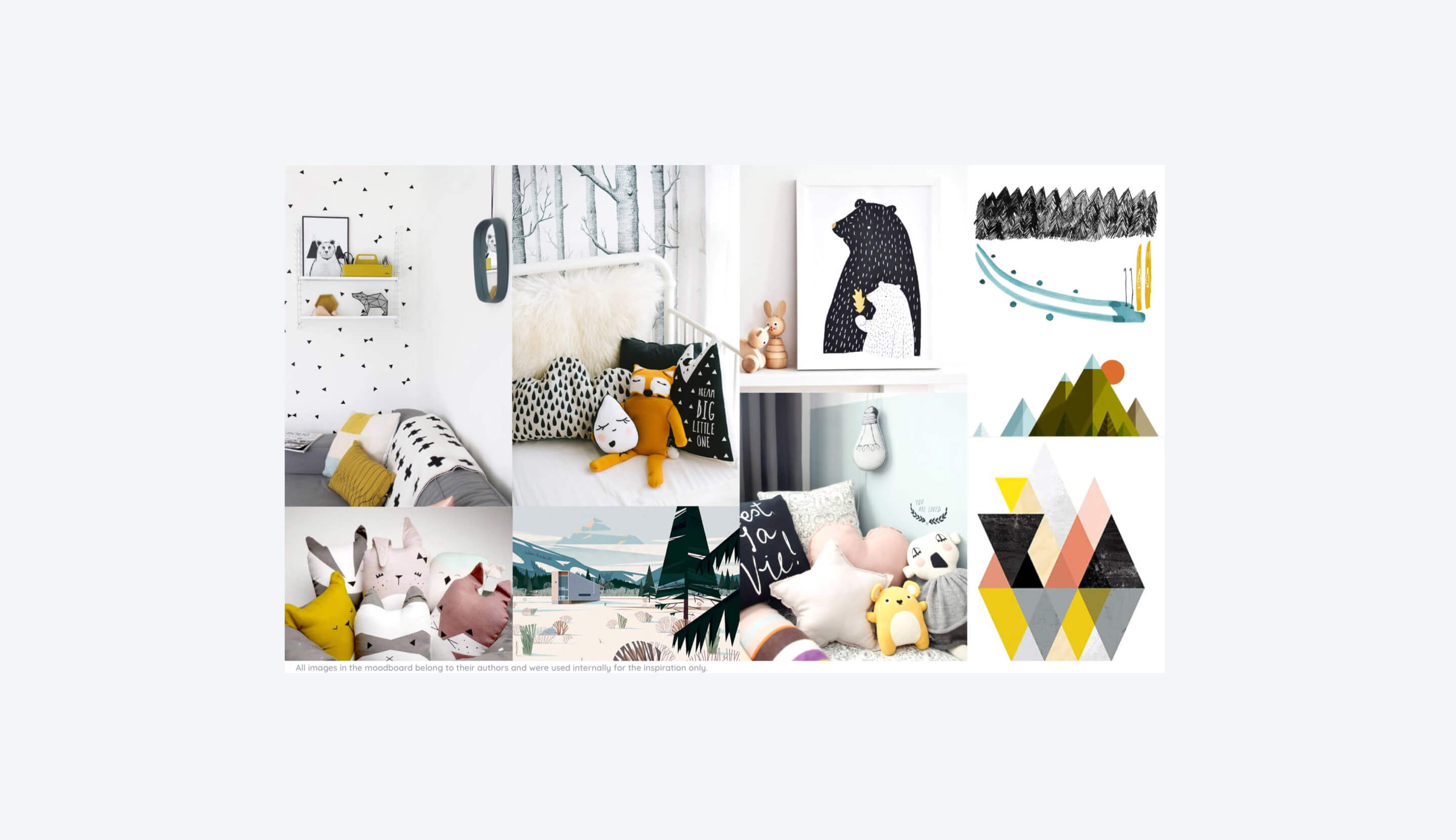
A brand moodboard is a one-page collage made of images that visualize a brand’s look and feel in an indirect way. “Indirect way” means that you will not see pieces of other websites or apps or annual reports in a moodboard. Instead, we will use other design artifacts — for example, magazine covers, posters, physical objects, architecture photography, etc. — which show how our brand’s design may feel in the future.
I usually add a few images to show how the moodboard impacts the resulting design assets:

The very first, the main, and
the blurriest design decision
The journey from a list of brand attributes to a unique visual language is a chain of design sprints, with various design decisions made along the way. The closer you get to the end of the journey, the more concrete and granular those decisions are. The closer you are to the beginning of the entire process, the blurrier those decisions are. The more “what if” questions you hear during presentations and brand personality workshops.
Creating and choosing a moodboard is the very first design decision your team is going to make, and so it is the blurriest one.
But building a moodboard is also the most enjoyable step for a designer—and a great opportunity for you to flex your storytelling skills, and build some improv skills too. It is also always full of a-ha! moments for stakeholders.
Field note
I noticed that exactly because of the blurriness of the outcome stakeholders are less driven by “like/don’t like” when making decisions and more glib when giving their feedback at this stage.
Moodboard ingredients
Going back to the core idea: visual branding is the process of translating the brand message, promise, personality, and desired perception from their verbal form into the languages of shape and color. This input information may come as a part of a Creative Brief via workshops, or even in a simple conversation with stakeholders.
Ideally, you will start working on the moodboard when you have:
1 /must-have/ Brand attributes & personality. If a brand was a person, how would they look, talk, and behave? Make sure that you have an official sign-off on the brand attributes from a client before you start looking for images. If you don’t, it may cost you an extra round of iteration, in case there are changes on the go or in case of a team misalignment in general.
2 Brand message, tagline, mission, and/or promise: Why do you exist? What do you aim to change and why.
3 /optional, because not every young company has it/ Company values: What do we stand for? What beliefs fuel us every workday?
4 Visual anchors: Does any object or visual come to one’s mind when they hear the company’s name? These are not adjectives (not personality traits or attributes) but nouns (things you are able to see, touch, or feel). Sometimes you can distill visual anchors from a founding story, sometimes an extra question or two during the workshop will give you those anchors.
5 /must-have/ Competitor analysis: If you did not exist, who will the audience go for a solution? Who is already solving a similar problem? Without a competitor analysis, you may find yourself unintentionally creating a moodboard that is too close to a competitor’s look & feel. Define your design taboo before you start designing!
■
Let’s imagine you are working on a moodboard for a digital-first brand, meaning a brand that offers a digital product (platform, web or mobile app, dev tools, SaaS etc.) and whose main conversion happens via interfaces. Here is what to include in a moldboard:
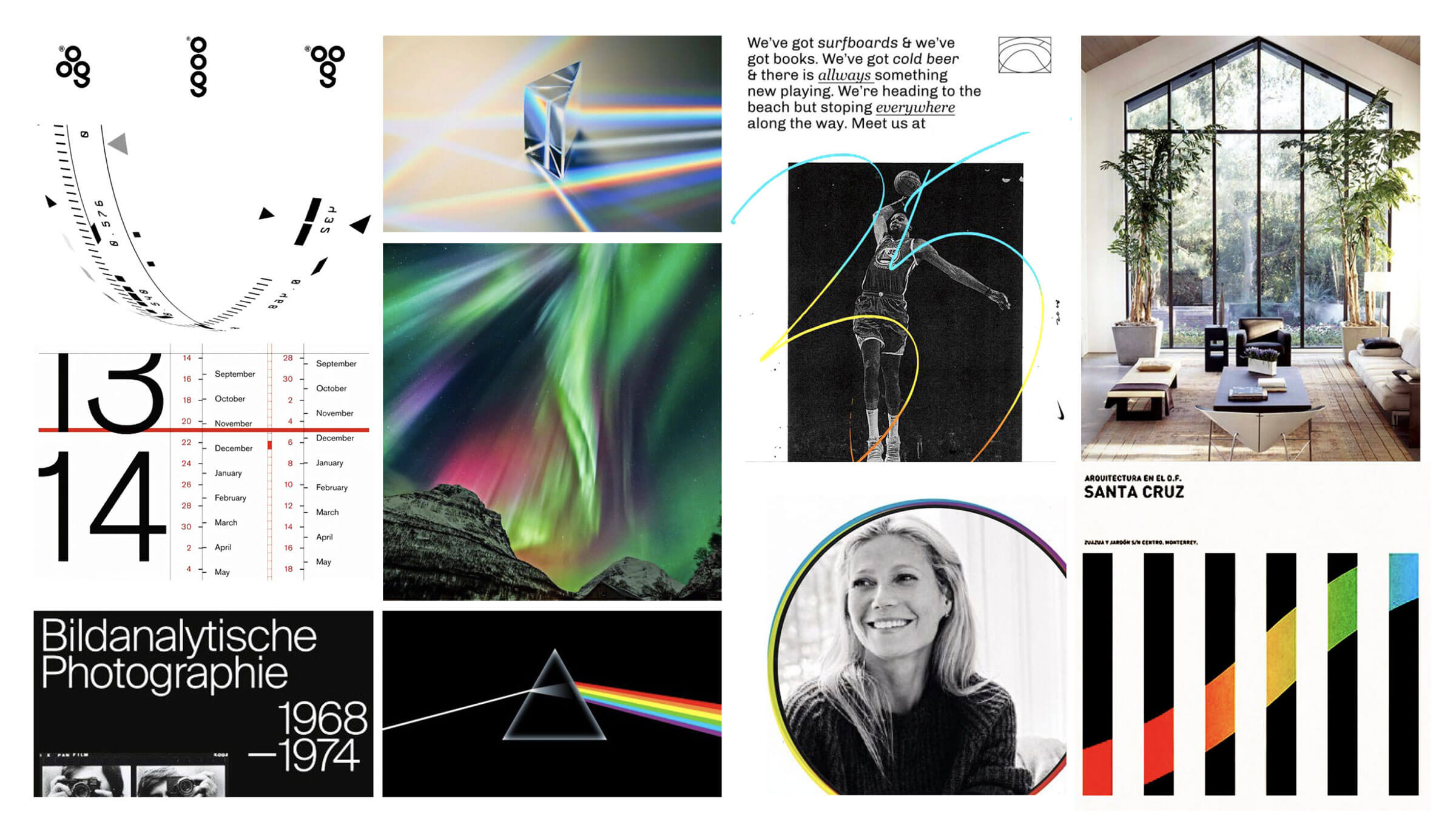
Art It carries a lot of emotions. I usually use art for colors and metaphors.
Interiors and architecture When working on websites I ask clients to imagine it as a building or a city: in addition to its functionality and aesthetics, architecture is a deeply emotional experience. I usually use photos of architecture for shapes, material feeling (wood, glass, and concrete evoke different feelings).
Magazine covers , album covers, sometimes book covers, and movie posters—for color, typography, and photography style. I always check WIRED, Wallpaper, Fast Company, and MOLD first, then other magazines.
Physical objects These are great for explaining almost everything: the shape, color, light, surface. I also find installations to be very useful for showing the possible overall feeling of a brand.
Illustrations But here you should be careful and tell the client what exact aspect of the illustration you like: Is it a use of line? A color palette? A special shading effect?
Have you noticed there are no interfaces mentioned in this list? We will cover the reason for not using them in the next section.
■
Where to look for images?
- Designspiration has a great similar-images search algorithm (as good as Pinterest, in my opinion), plus a color search and no ads.
- Niiice is an image search engine that continues to surprise me. The similar-images search always brings in something that is so distant from the source image that it would never appear in Pinterest. A lot of art from Colossal and animations.
- Design is fine is a beautifully curated library of art & design history. Inspiration from the past. A treasure I found years ago!
- Are.na which is like a magic golden tomb for creative minds who collect ideas non-stop. But, as any magic golden tomb, it is also the most dangerous website for creative minds who collect ideas non-stop. You will most likely lose track of time, and then find yourself asking, “Wait, what actually was I here for?”.
- Spotify for album covers.
Danger zone
Let’s pause here for a second and talk about the moodboard’s evil sister — the inspiration board.
While a moodboard illustrates a design atmosphere, a MOOD , or a feel for a brand , an inspiration board is a collection of images that show how the designer wants the final design to look, or what inspires them while they are working on a project.
These boards are usually created at the same time — during the design exploration phase. But they are used in two radically different ways.
A moodboard is an external strategic tool to communicate with stakeholders and keep the design direction agnostic at medium. “Agnostic to a medium” means you have mediums that a brand may never use for its brand asset — like architecture, a painting, a spaceship, or… a parrot’s feather!
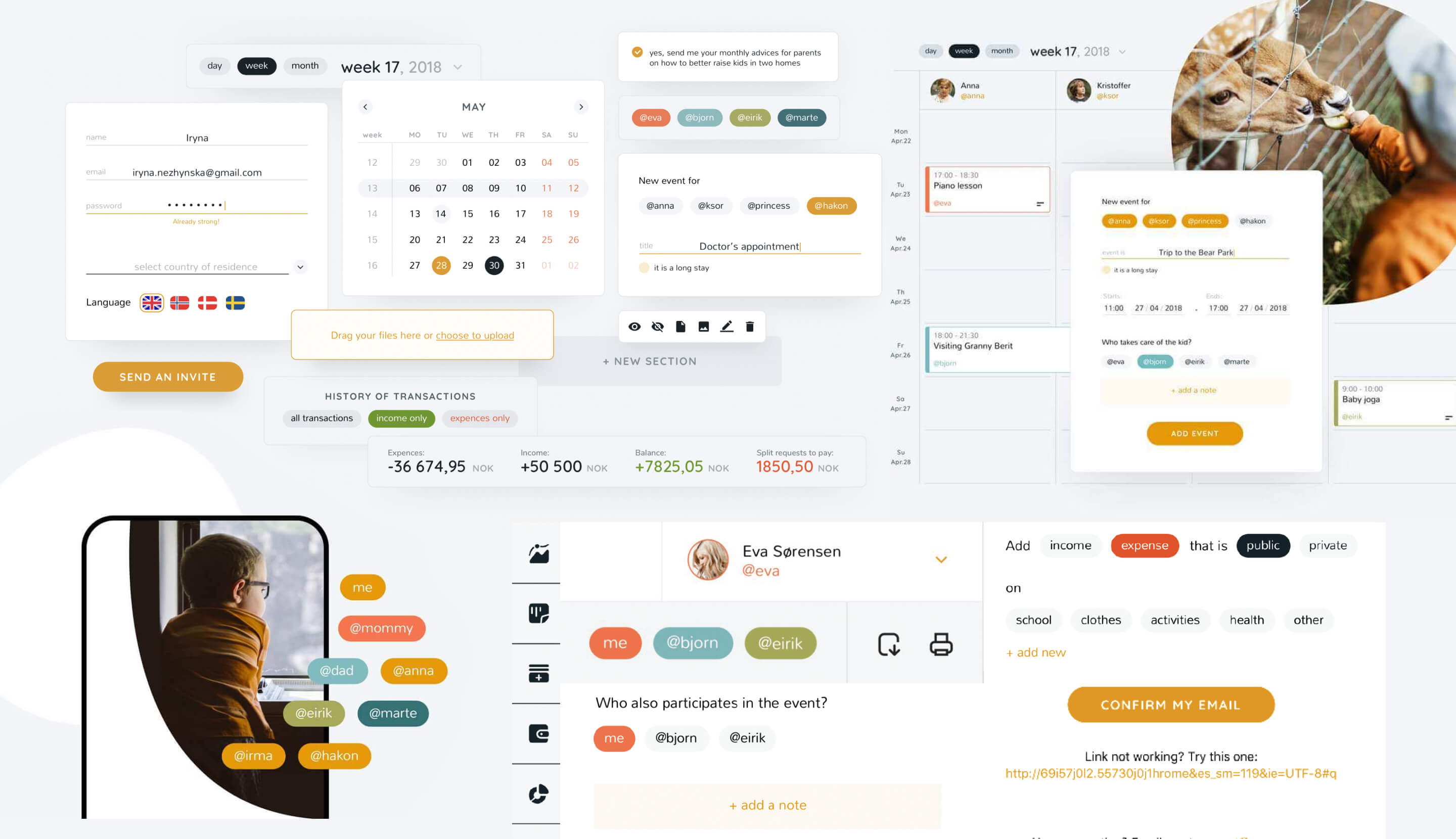
An inspiration board is a designer’s internal what-if-I-try-this collection of images for the final deliverables — parts of or entire assets that the brand will have in the future: from the overall layout to tiny details, like font combinations, hyperlink underlines, cute gradients or fancy interactions.
That brings us to interfaces.
You may have noticed there is no reference to interfaces in the aforementioned list of moodboard ingredients.
Interfaces — from small elements (for example, button states) to entire screens — are “prohibited items” in a moodboard. Including them might seem like a nice shortcut, but it will create problems for you down the line — both in terms of your own design freedom and when you present the design to others.
Why? Let’s pose the question from the opposite side: what will happen if you include “prohibited items” in your moodboard?
First, the good news, and there is some, you will spend less energy having to explain how your design will look. No “imagine if” or “feel it” presentations! It is clear from the images you show — they already contain possible final looks.
Now, the bad news, dramas. These are the top three:
1 No doubt, you probably have some award-winning designs in your moodboard :) A client may fall in love with the designs you showed and will expect you to design the exact same. These expectations will leave no space for your own design exploration.
2 You will continuously be a few pixels away from creating something that already exists. And depending on how you handle presentations, clients may push you towards shipping almost plagiarism. When these situations happen, it is very difficult to push back with: “Sorry, but the images in the moodboard are just examples.”
3 If you get through the above situation successfully and create something that is slightly different from images in the moodboard, your client may be frustrated that they did not received what they have been promised.
Fortunately, you can successfully avoid these dramas if you make sure at the very least that:
Your moodboard for a digital product does not contain UI shots.
Your moodboard for a food brand does not contain packaging designs from other brands.
Your moodboard for a festival identity does not contain swag designs or stage designs from other events.
If you strive for a joyful and productive design process and a healthy relationship with your clients, avoid mixing your moodboard and inspirations together and/or resist including any end-product images in the moodboard.
The first iteration
You can communicate the same brand personality in multiple ways. And by having one list of the brand attributes and traits, you can find multiple ways to visualize them – multiple moodboards. So, one option will look more down-to-earth than others, another might be more whimsical than others, and each of them will vary in terms of their degree of “being fast-paced”.
In the situation when you have multiple alternative images to choose from, these two questions will guide you toward ones that will be better perceived:
1 What is the graphic theme? What images relate to this theme?
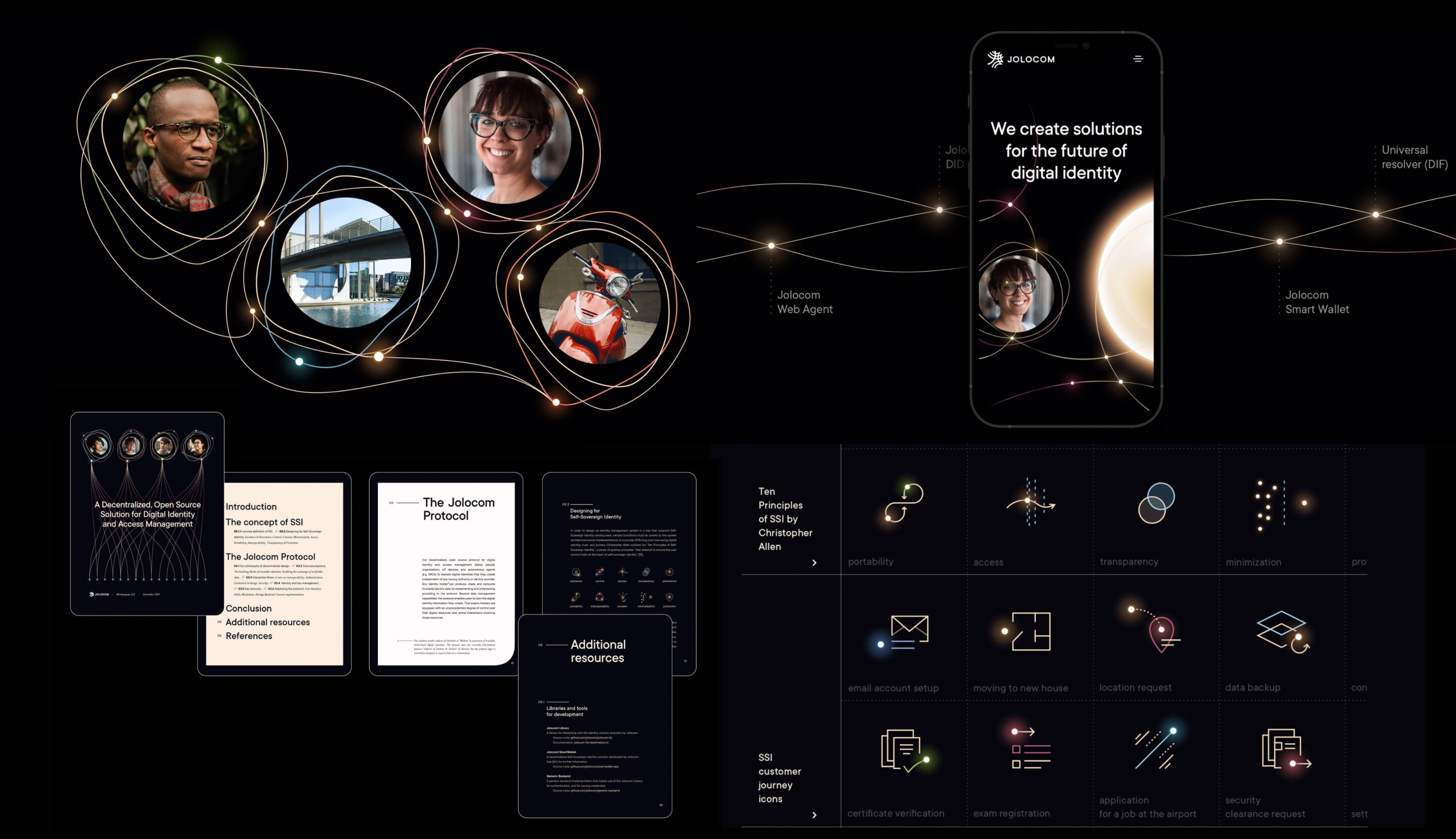
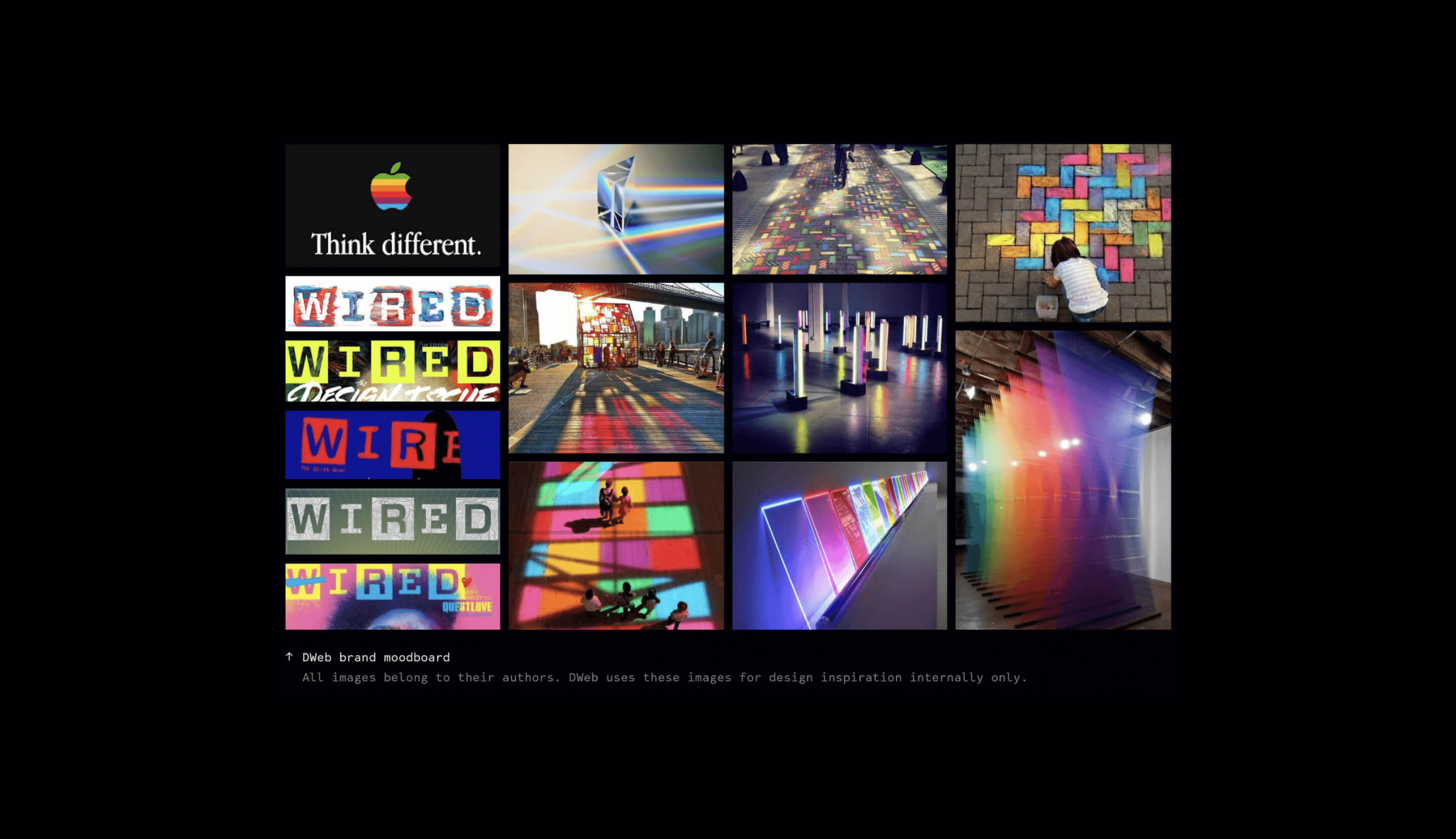
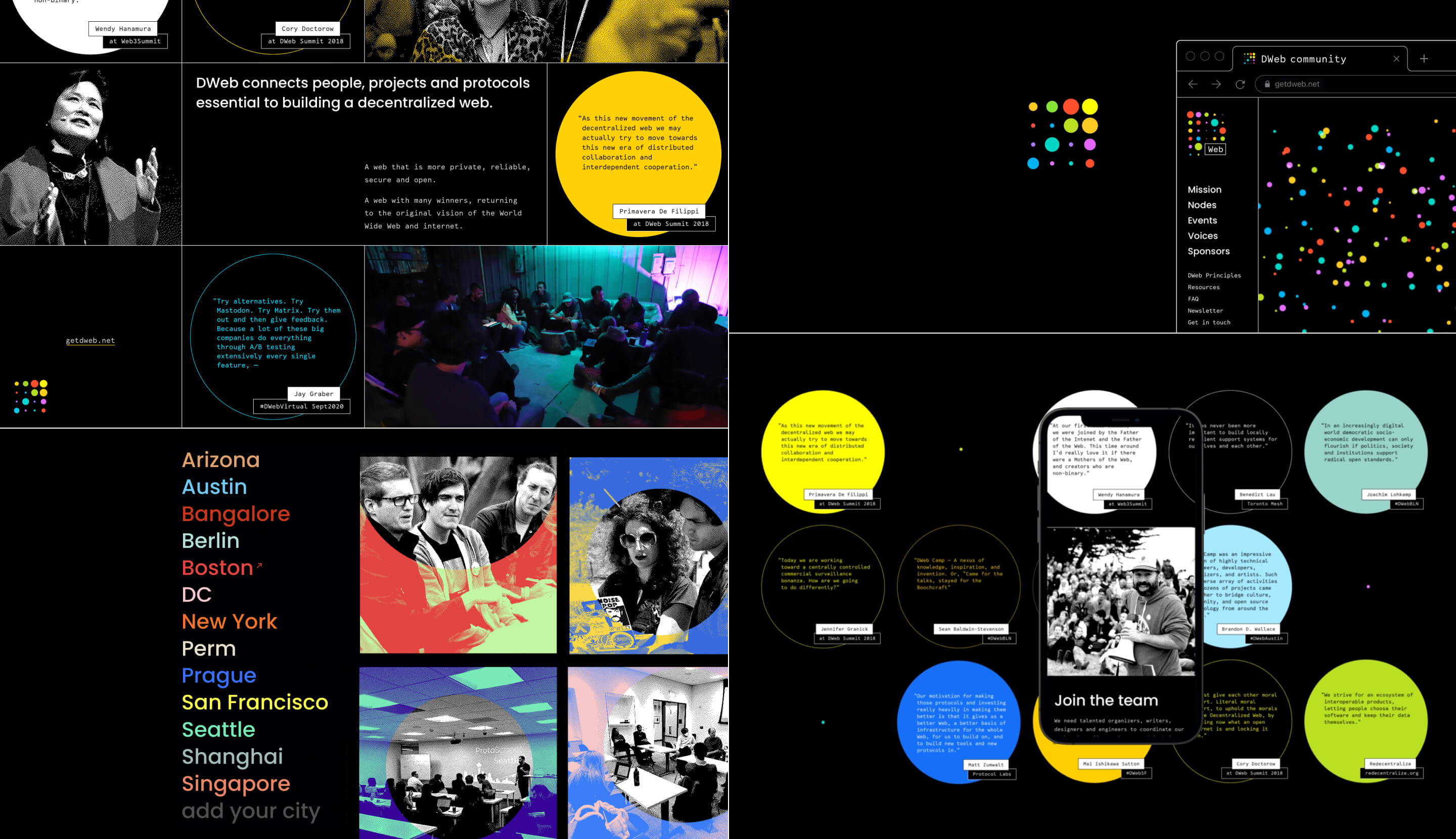
A graphic theme (I prefer to call it the Visual Heart) is the overarching visual story of the brand identity and can be represented by either one or a few elements. And they are not colors or typefaces, which are real or imaginary objects that inspire or appear in the visual language. For example, stars and threads in Jolocom, a swirl of dots in DWeb, etc.
If you have a graphic theme for your brand, try to align the images in the moodboard to that graphic theme.
2 What is considered beauty in the eyes of the brand’s audience? Do you know their visual language?
Exploring a visual theme is a creative part of developing a moodboard. Searching for the right images to reflect brand attributes is a more analytical process; you are putting on two hats at once — marketing and user research:
“Playful? What is associated with playfulness in the given industry?”
“Joyful? What stands for joy in minds of the given audience?”
Knowing a given audience is a key ingredient to overall success. And your overall success is not to make stakeholders say “yes” to your design proposal, but to make a brand appeal visually to those who are buying (download, sign up, get involved, etc.). These people should be saying: “Hey, this is beautiful!”, or “Hey, this looks energizing” and then feel curious enough to start interacting with the brand.
■
The form and layout of a moodboard are a personal preference. I have developed my own template: a simple grid with a fixed column width and variable image heights. But I have also seen moodboards in collage form that served their purpose perfectly.

IMPORTANT
When including copyrighted images in your moodboard, add the following line whenever the moodboard appears (both internally, in your presentations, and externally, in the portfolio showcase or case study): “All images belong to their creators/owners and were used internally as design inspiration only.”
■
After a few hours of work, you will have the first version of your moodboard(s). Are you ready to present them?
Presenting moodboards:
the preps and the show
Imagine that you are presenting two concepts of a design direction tomorrow. You want your client to fall in love with at least one of them. And, you want to leave with as fewer corrections as possible to a selected direction.
How do you prepare then for the presentation?
Here is an exercise I do a day before the presentation, which allows me to sleep on my narrative and sharpen it the next morning.
Step 1. Zoom out
Look at moodboard 1 and answer three questions:
1 What feelings and emotions does it aim to evoke?
Make sure that you include brand attributes in your answer. Otherwise, how will a client know that this particular moodboard was created exclusively for them? Focusing on the brand attributes is also shows you followed the creative brief. Then, — level up! — go beyond just listing attributes. Dress them up in a story. And make it sound poetic and practical at the same time. (Your advertising superpowers step in!)
2 Why will it appeal to the target audience?
Focus on what aesthetics already exist in the industry and what customers call “beauty”. It’s the moment to show that you know the audience you create for.
3 How this direction will help a client stand out in the market?
Here you should distill your market design research into just one sentence about visual patterns that are overused in the market and how your design will help your client to break through this noise.
Step 2. Zoom in
Now, you focus on each image in the moodboard individually, or, if your moodboard includes a lot of images, on small groups of them.
What is the purpose of this particular image? What does it promise for future design? Is it:
- a source of color palettes?
- the desired shape of iconography?
- the ideal sharpness of edges?
- the use of the perspective grid?
- the degree to which whimsical typography can be?
- the use of light and shadow, etc.?
In the end, ideally, you should have one short line per image. It does not mean that you will present these descriptions to a client all at once. Because, first, you don’t have that much time for a presentation, and also because you want to keep the client’s attention without overloading them with too much information.
And yet, you should be able to clearly articulate what each image stands for, in case a client decides to dive deeper into the details.
If you are presenting two moodboards, repeat steps 1-2 for the second one mood board.
Step 3. Zoom out again
How do your two moodboards differ from each other?
Start with the fact that they are built on the foundation of the same attributes, and then highlight the core differences between them. Again, be brief. Can you say it in one sentence?
This will be your summary and closing remarks before hearing the first impression feedback.
BONUS question
Are there any differences in terms of the resources needed to execute each design direction? Are there any extra production costs that a team should be aware of before they make a decision on what moodboard to follow?
Some directions may require creative coding and generative design. For some, you will need a special photoshoot setup. Others may require to commission an illustrator.
An example of how I break down moodborads when presenting for the mid-process check with the broader audience.
Under "broader audience" I mean a feedback group beyond the project working group and decision-making stakeholders.
⟶
That’s it for this part. And now that you have nailed your narrative and reasoning, you are ready to present.
Here is the flow I use when presenting moodboards:
1 Start with the brand attributes – the foundation and DNA of a brand identity.
2 Give an intro to what a moodboard is. You have read my way of presenting (see the beginning of this guide). Go ahead, steal it! And, please, let me know how it worked for you.
3 Guide the stakeholders through your moodboards (homework exercise above) and highlight the differences.
4 Open the floor to questions and feedback. I prefer to ask for a decision in a relaxed way:
“We will share this presentation with you immediately after the call, so you can discuss it internally and sleep over ideas. For now, we would appreciate hearing your first impressions: Which direction feels like your future image? What exactly makes you feel this way? Which moodboard triggered which emotions in you? What images seem to be less related to your ideal image?”
Iterate a selected moodboard and set it in stone
Do you remember I mentioned that a moodboard is the blurriest design decision that a client has to make? It sounds like a disadvantage but here is one benefit: the blurriness makes it more difficult for a client to say “no” to all your concepts and ask for one more exploration.
Now, we are into the home straight — getting actionable feedback about what needs to be adjusted. You can get it by asking questions like:
1 Which moodboard shall we pursue? Why not the other?
2 Is there anything emotion or mood that you would like to have less or more of in the selected moodboard? Which image contains this emotion, in your opinion?
3 Which images DO NOT feel like future you?
When the moodboard is signed off by a client, consider it your Design North Star and set it in stone.
This is an unskippable part of the communication with stakeholders. Everyone should understand the importance of the decision because all the design that follows will be built on top of this decision.
Two ways of using a moodboard in your own process
We are human — our memory is not a hard drive.
It may happen that a company will put all open design projects on hold because of, for example, fundraising efforts or internal restructuring. When everything is resolved, and you are back on the project, it will take some time to remember where you all were heading with the design half a year ago. In this case, the brand moodboard will be your instant memory recovery tool.
It will also help you onboard new designers to a project: going through a moodboard and the design goals behind each of its images is quicker and easier than going through all the presentations and feedback loops you’ve had within a project to this point.
When moving forward after the overall design direction is signed off — for example, when looking for the perfect typeface, working on the dashboard or adjusting a key visual — a moodboard will serve as a North Star:
Does a new design feel like a part of the destination? Or, does it includes elements that bring emotions that are slightly different?
Again, when making an internal design decision — for example, deciding which 2 of 5 concepts to show at the next presentation — look at the moodboard:
Having a design direction that is warm and sunny, does a banner you are about to present have a similar color temperature?
Having a design direction which is playful and nerdy, how will straight lines and sharp edges in your layout help support this mood?
Having a design direction which is bright and transparent, what is the reasoning behind suggesting the dark mode for the website?
And so on.
Ideally, at the very beginning of the process, you want to design as close to the moodboard’s emotional atmosphere as possible. This way, you will deliver the promised look and feel and, thus, meet the client’s expectations set at the very beginning. It will also help you create a unified brand system, and so, contribute to establishing brand consistency.
Here follows a super quick and simple exercise that you can do on the go to check if you are following your North Star.
Let’s imagine you are designing the typography system — either selecting fronts or already working on web/editorial layout. Take screenshots of your favorite concepts with the same amount of typography as in your moodboard images. Now, cover images in the moodboard that represent the typography direction of your own designs. (Remember, we have already broken the moodboard down to what images stand for what.) Is the mood changed? If no, perfect! You are on track and the North Star is guiding you. If yes, try to identify what exactly is making it feel different.
I also do regular checks when designing bigger brand assets, like a website, a social media campaign, a pitch deck or a whitepaper. Again, I take bits & bites of the design-in-progress, only but this time, I don’t replace images in the moodboard. Instead, I create a second board — a design summary of what has been created so far.
Next, I place a guiding moodboard and a design summary next to each and take 2 steps from the screen, so that you are not able to clearly read text or see distinct tiny images. Do both boards — the primary moodboard and the collection of your design-in-progress screenshots — project the same mood? Do they look like siblings? If yes, well done! You have delivered on your promise to the client. (Remember the example explanation of what a moodboard is at the beginning of this guide?)

How to hand a moodboard off to other designers
The time will come when you have to leave a project. Whether you switch to another freelance endeavor or join a new team in-house, you will be asked to stop contributing to the brand identity you have created. As the company continues to grow, more designers will work on its design universe of brand assets.
Think of yourself as a client’s design steward through a given territory. You learned what they can handle during the journey and where they want to be. You showed them a star that if they follow will bring them to their destination. You planned a route for them and walked together for a while. Now, it’s time for them to keep hitting the road without your help.
At the end of your journey together, your job includes two tasks:
1 Make sure that the North Star you defined for the brand is not going to disappear, be forgotten or create confusion. And that your client knows how to keep following the right direction.
2 Equip new designers joining the project with all the materials they need to start designing straight away, without repeating an exploration you have already finished.
To do this, you will need to over-deliver a bit. In addition to the common brand guidelines sections, like logo rules, color schemes and accessibility, create an additional section that contains a moodboard breakdown for designer eyes only. This section can easily go to the very end of the brand guidelines. Structure it in the same way as when you would when presenting it to a client; explaining the design intention and future plans behind every image.
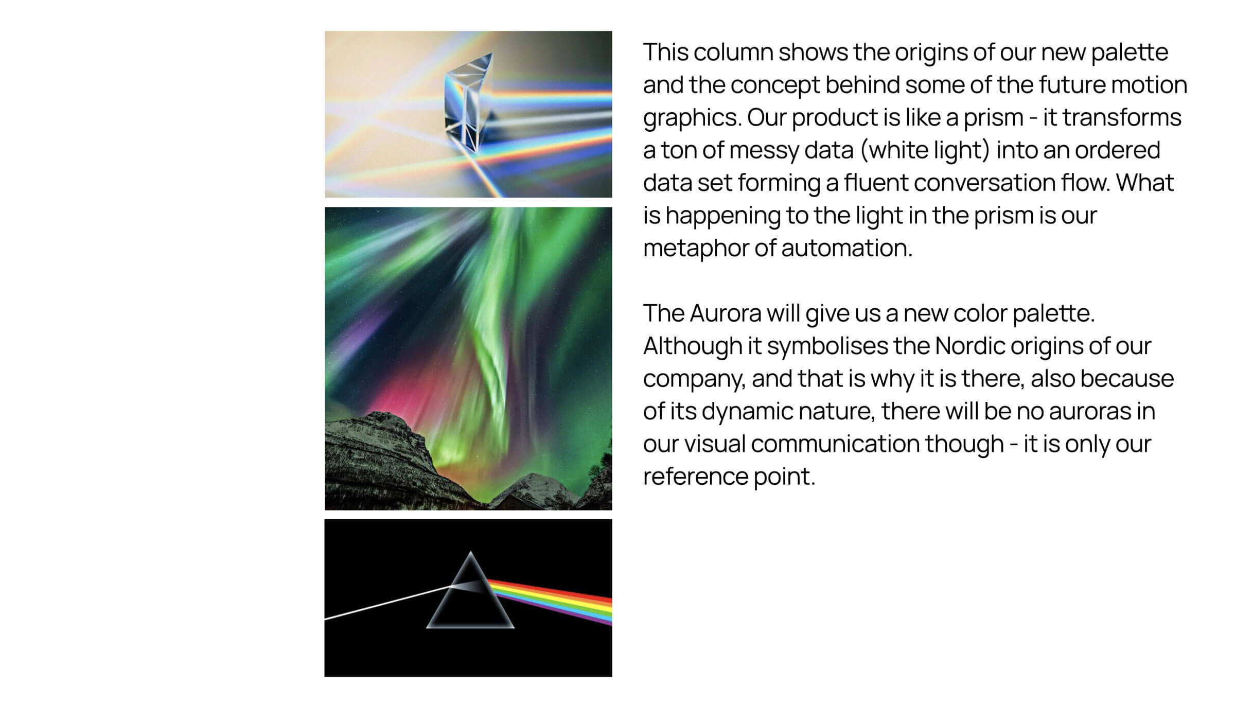
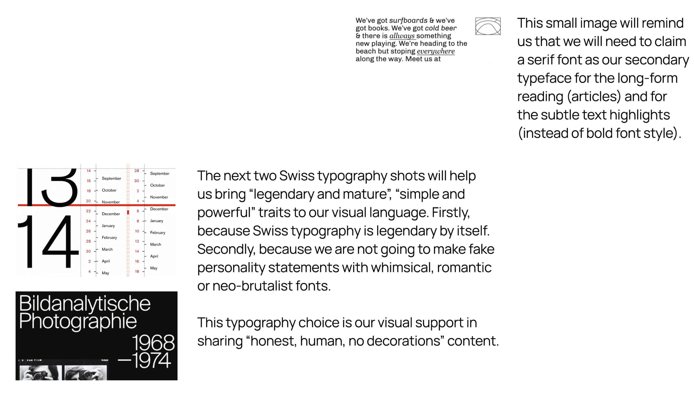
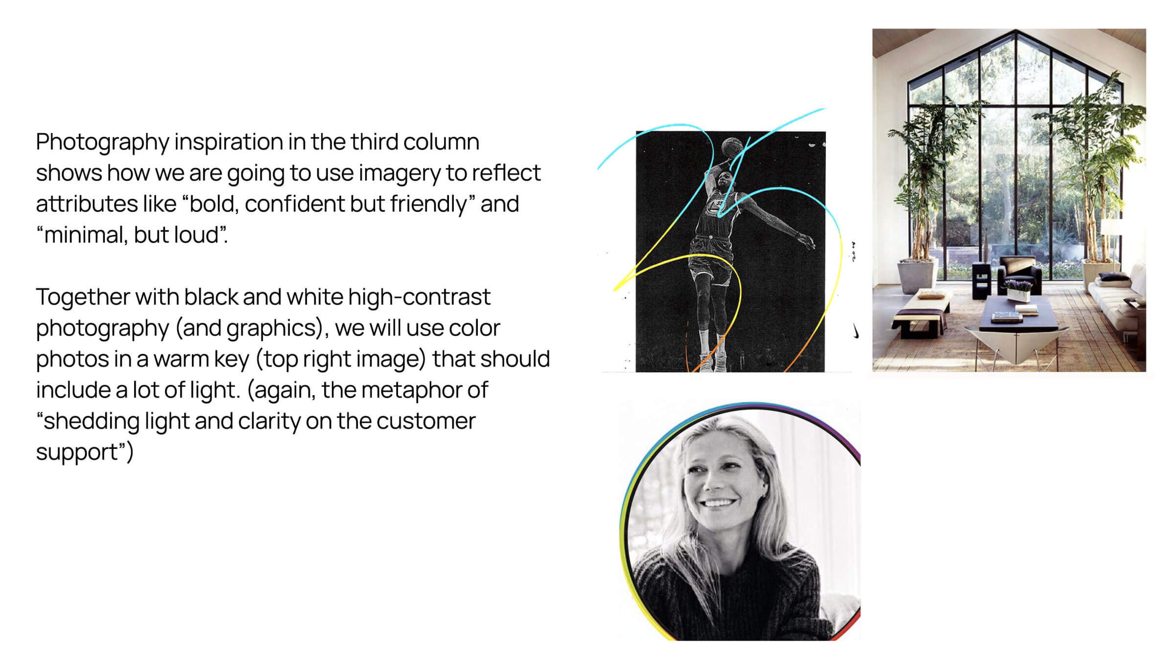
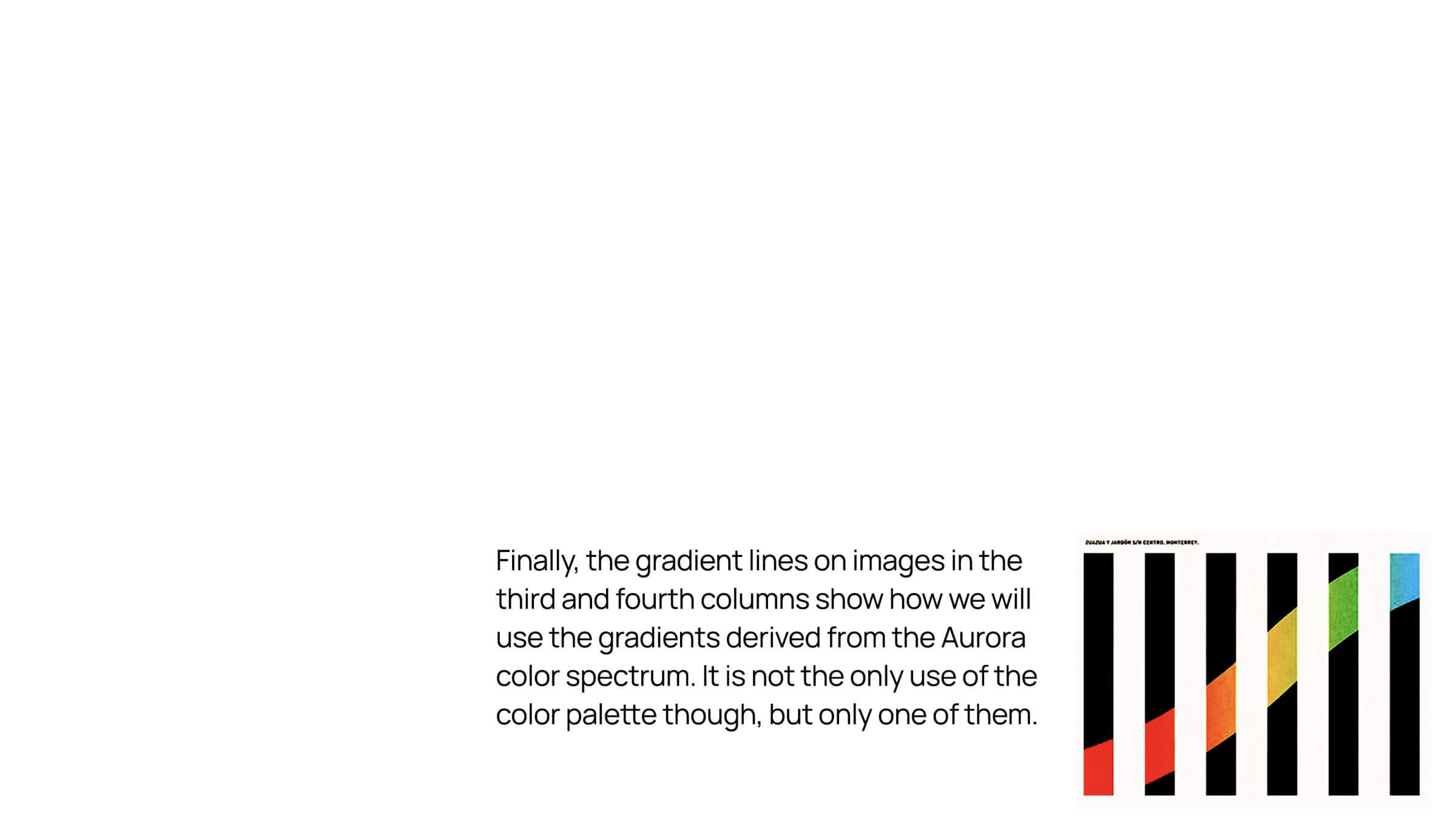
Here is an example:
You made it to the very end
Thank you for reading and for trusting me with your time.
I hope this guide sheds some light on those shadowy parts of moodboarding, and that it makes you feel invigorated, encouraged and equipped to give moodborads a try in your creative process.

Learn how to bootstrap your tech brand in less than 12 min per week, for free.
Every week, get one insight on brand strategy, one actionable technique to design-it-yourself and one curated list of aesthetic excellence. Use this 3-in-1 combo to build a product image that accelerates early adoption and funding.
Get them delivered to your inbox:
Created for developers-turned-founders.
See what's inside
more articles and resources ↓

▉ design process essentials
▉ 5 min to read

▉ guide
▉ 11 min to read
▇▇ work with Ira
Other matters: iryna at nezhynska.com
creative
ⓒ Ira Nezhysnka, 2025
▇▇ learn for free
Subscribe to Ira's Embrace Variety
-
ⓒ Ira Nezhysnka, 2025