What is your design taboo?
Or, a lost-treasure exercise
to get your product noticed
in a competitive market
▉ guide ▉ 11 min to read
If your product is one of a few alternatives, it is on a “market shelf.” This guide helps you make your customers give a closer look at your product first, and all the alternatives — later, or even never.
Three years ago, a friend took me to San Francisco's Japantown.
We stopped at a big grocery store, and I headed straight to the tea shelves. I wanted to buy genmaicha (green tea mixed with roasted rice). As I faced a sixteen-feet-long shelf full of green tea packages, my eyebrows started to raise. I counted eighteen different producers of genmaicha.
Which one should I buy?
I tried to narrow down my choices: a label should be only in Japanese (which I don’t speak) and I can afford a price higher than average. Even after filtering through the options with these parameters, I was left with a few choices. As my friend approached me asking “How are you doing here?” – read “Are you buying anything or?” – I picked the most beautiful one (in my opinion).
Was that tea good? Yes.
Was it the best one out of the entire row? I will never know.
We find ourselves in similar situations from time to time: staring at a gazillion options to choose from, in a hurry, not always having deep knowledge of the product category itself, and sometimes not speaking the language written on the labels.
For every product in every market category, potential customers face the same difficulty choosing among hundreds of brands. Tech, retail, leisure, investments — it does not matter.
What is a shelf placement test?
In a branding agency, when you work on a packaging design for a physical product (imagine, any food item — cereals, juices, oat milk), you start by reading a creative brief that the marketing team shares with you. One section there is called “Product Positioning.” It outlines the target audience, desirable perception in relation to competing brands, price group and — what is important for us in this article! — the planned location on a store shelf.

Once you have an internally accepted packaging concept, before presenting it to a client, you do a shelf placement test. You create a mockup of how your design will look on the shelf, right on its defined-by-marketing-strategy location, when produced and launched. Then, you step back and try to answer two questions:
1 Will a prospective customer with a prior buying experience (usually a competitor’s customer) notice the new product on the shelf? What are the chances that they take your package from the shelf to read the product information?
2 Will a prospective customer who has never bought anything from this category stop to look at your design during their first scan of the shelf? (Just like me when buying genmaicha.)
If, looking at your mockup, you answer “no” to either of those questions, then your concept must never see the light of the presentation room. Do not show it to a client. (A level-PRO marketing team will never allow you to.)
I hear you saying: “But what if my design is beautiful?”
Being beautiful does not mean getting noticed. If your concept is strikingly beautiful but not radically different, then your product's chances of being noticed rely solely on the customer’s visual literacy. Is your understanding of beauty the same as the users’? Visual literacy is an unstable ground. We will talk about the nuances of working with it in the upcoming articles.
For now, what you’re aiming for visually is a product that stands out. A product worth checking out first.
There is always a market shelf – in stone or in digital
If your product is one of a few alternatives, it is on a “market shelf.” But a shelf for a digital product looks different from one for a physical good. How exactly?
How do you search for a new bike? Googling “best city bikes,” scanning a few overview articles, and opening every link from there in a new tab?
How does a customer support lead look for the best solution to automate their processes? Googling “customer support automation solutions” or visiting G2 for a list of top providers and then—again—opening every company website in a new tab?
What if an investor wants to put money into the Next Big Thing, but is not familiar with the category? Will they google “Metaverse projects to watch,” open a few articles with the same name, and open links in a new tab? (By the way, this is nothing close to the best way to find a good project.)
Open browser tabs during research are one of the many ways we view a digital shelf. Every tab is a product. And every product asks for your attention.
Have you ever been to any industry expo or a startup festival where your company is one of the exhibitors next to other companies? That is another representation of a market shelf.
In both situations, people rarely buy right away.
When shopping online, you will save a few items to review in detail later, after a bit more research. (Guess how many photography blogs I read before deciding which camera, out of three favorites, to buy.)
In the case of meeting at an in-person event, it takes more time for a sales team to check out details like features, integrations, and pricing of all companies met at the event before considering them and signing a contract. And yes, having thirty alternatives to choose from, people don’t review all the options, only those that stand out.
As you can see, the question is not about which product you will choose to buy. The question is: what will you give a closer look and what will you skip?
The answer is rooted in our primal human instincts; the way our ancestors experienced the visual world. If something stands out against a background, it is either a potential partner, a potential danger, or a potential dinner. All eyes are on it.
The same rules of spotting apply to aspects of our life beyond basic survival.
In order to earn the most precious part of a customer's attention, a product must visually stand out against the background pattern of the market noise.
As a designer, your job starts way before sketching the initial concepts of a new brand identity. It starts with studying a product’s category background noise and patterns of visual design.
It starts with analyzing a product’s competitive landscape.
A product’s competitive landscape
top priority
— direct competitors
If your company is trying to enter an existing market category, there will always be others offering a similar—if not almost exactly the same—product. Features and prices might vary, but their products will be built to solve the same problem as yours. Think about Webflow versus Squarespace. Or Open Sea versus Foundation. Or Sketch versus Figma.
These companies are direct competitors. They are the closest to your product on the shelf. They are the first to compete for customer attention.
That is why they are on the radar of your client’s marketing team 24/7. They must be on your radar too.
When you start working on a project, you should get a list of direct competitors as a part of a creative brief.
Here is a detail that you need to watch out for: many creative brief templates (available online, that your client may use) ask you to list three to five top competitors. But five names are not enough. You need a complete list of all direct competitors—both those who do not reach your product’s level and those who are way greater than you.
How to get this list?
Ask a client. Ask their marketing team. And do your own research.
The easiest and fastest ways to get a more extended list of direct competitors are:
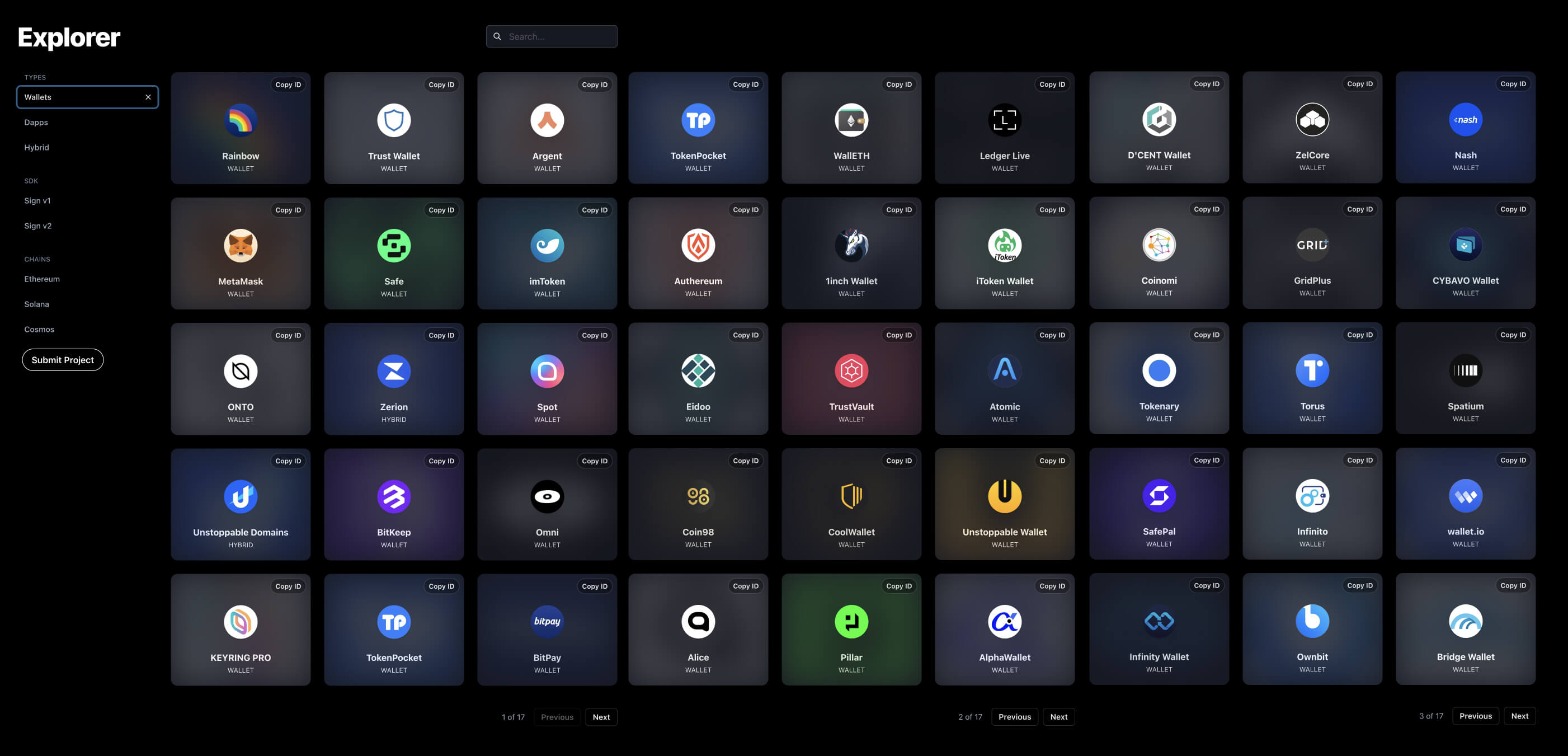
1 Online directories or explorers of products like WalletConnect for web3 wallets (see screenshot above). G2, Angel List and Crunchbase work for both Web3 and Web2 companies.
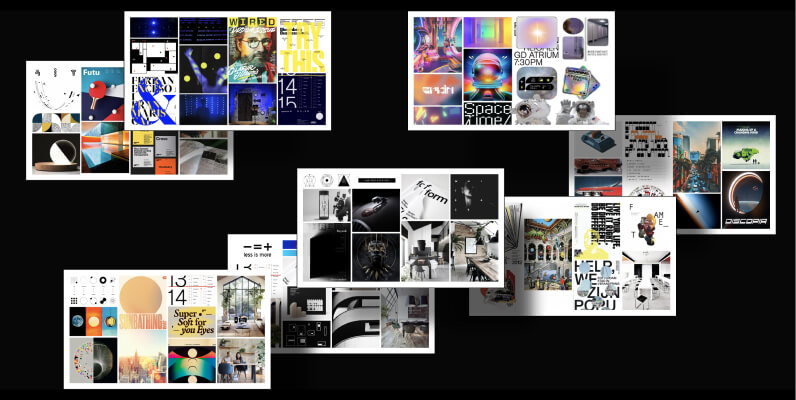
2 Find a few industry reports or landscape overview articles. They usually contain market map images (here is what I mean).
3 Check out industry expo websites for a list of exhibitors by categories. Knowing what surroundings your design will be viewed in during in-person events will give your ideas a more strategic direction.
A product’s competitive landscape
secondary priority
— indirect competitors
If your client is trying to invent a new market category, every alternative option that is capable of solving the same problem is their competitor.
For example, years ago the first no-code website builder had a main outside-category competitor — hiring developers to program the website. Every new website builder has both direct competition (all existing website building tools) and indirect (yes, the same – hiring developers).
Try to find at least two to three competing alternatives.
Now you have two lists ready. Up next: design research!
Get specific
The scope of your research depends on the scope of the project. Usually, there is no need to go beyond the essentials.
Let’s imagine two scenarios.
Scenario 1 You are working on the overall rebranding, or, at least, the brand identity foundation and design direction.
In this case, you are going to shape an entire visual language of a product, so you need to research the entire visual presence of each direct competitor from your first list.
I prefer focusing on these design assets per company:
1 logo. Collect logos separately. You may want to present them during the design presentation as the insights of your research.
2 screenshot of a product website homepage, first fold only. (First fold is the very top part of a webpage that you see on a screen when opening a website before you start scrolling.)
3 screenshots of spot heroes and product features, or services.
4 social media: avatar + header combo (Twitter and LinkedIn)
5 images published on Twitter, LinkedIn, and Instagram during the last few months.
6 cover images of a few recent blog articles
7 front covers of e-books, reports, or whitepapers
8 key visuals for webinars or online events
9 icons, if there are any on the website. If you do not work on product UI, you don’t need UI icons, you need ...
10 ... app intro-screen / onboarding illustrations and a few other screenshots. Empty states and promo pages work the best here.
Scenario 02 You are asked to develop an illustration system.
In this case, you are not interested in logo research or what typography is used by competitors. You are focusing on the illustrative part only:
1 logo. Collect logos separately. You may want to present them during the design presentation as the insights of your research.
2 screenshot of a product website homepage, first fold only. (First fold is the very top part of a webpage that you see on a screen when opening a website before you start scrolling.)
Once I was asked to update the main brand color which mostly appeared on website CTA buttons and in the app. The only element my team focused on at that time was the CTA button color of direct competitors. Nothing more. This is how it looked:

In all of these scenarios, you are collecting bits & bites of competitors’ communication. Try to keep all images and screenshots in one file, not in different folders with images. With one file, you can zoom out and spot visual patterns faster.
Do you see patterns?
As I’m writing this section I’m thinking about a purple cow. Not Milka’s cow (although they did an outstanding job with their mascot!), but Seth’s Godin book Purple Cow. Add it to your reading list.
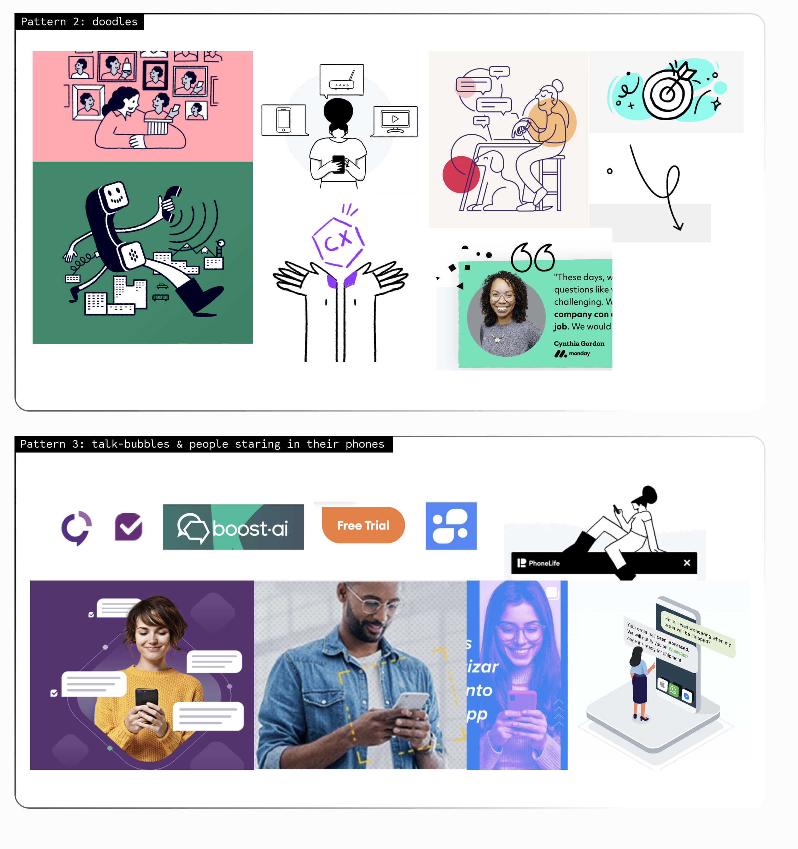
Many saturated markets — markets with severe competition — nurture visual patterns and cliches. These patterns keep circulating because someone saw them as “best practices,” and mistakenly took “most used” for “best performing.”
From time to time, industries get flooded with trends. Some trends fade away quickly, leaving almost zero trace. Check out predictions versus reality for glassmorphism in UI, for example. Other trends shape the way our tech ecosystems look. You could not help but notice the result of overusing isometric illustrations in an early DLT (blockchain) space.
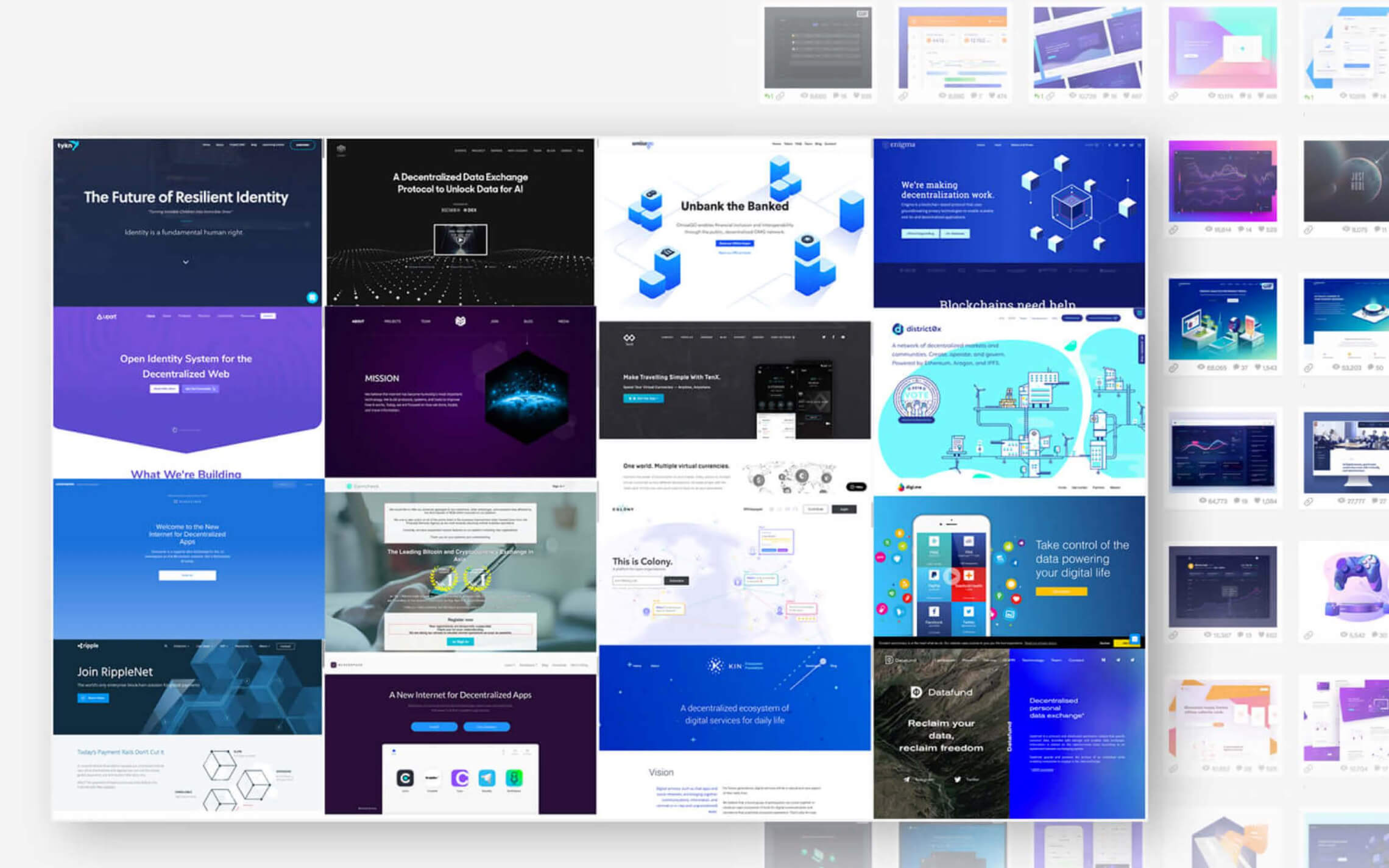
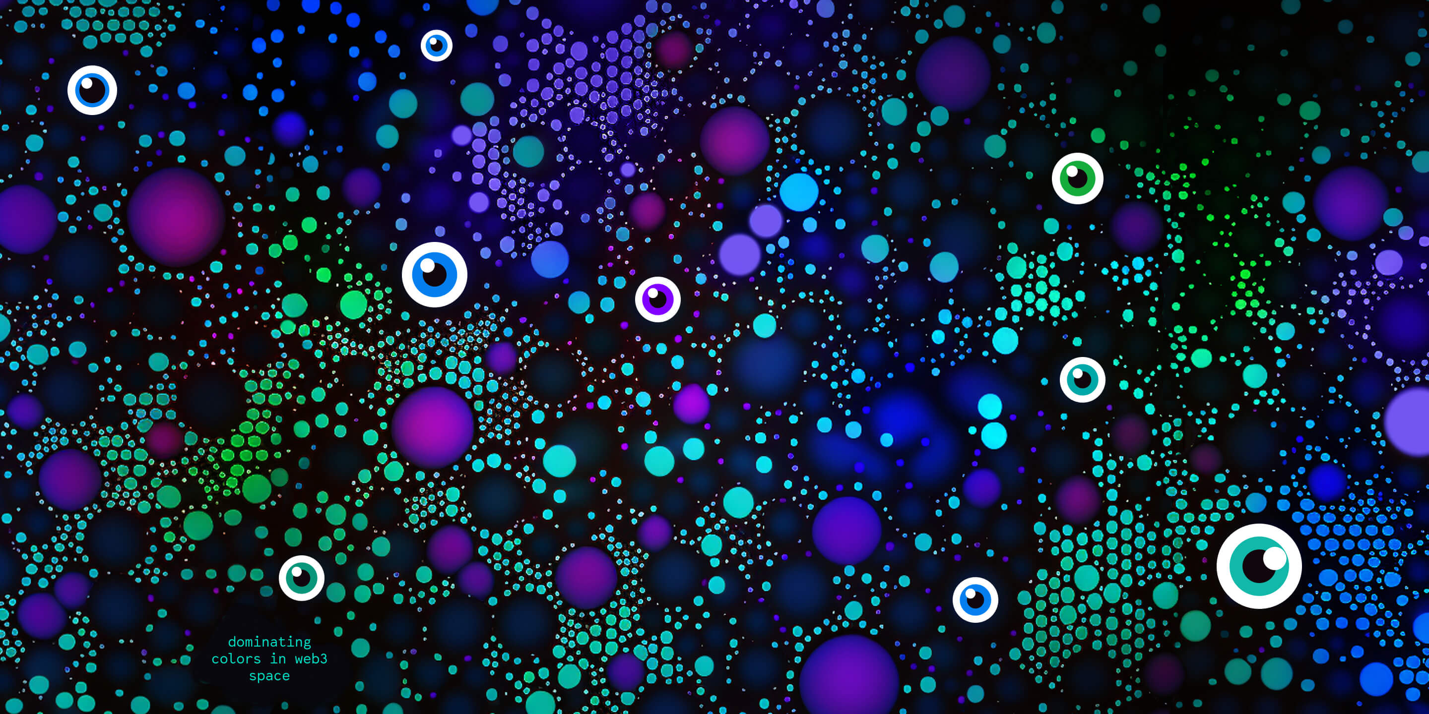
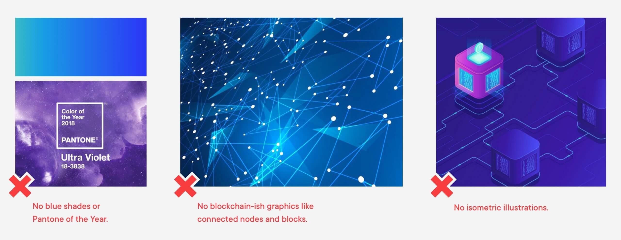
Within your research, do you see any patterns emerging? It may be a dominating colors range (the use of blue-purple in Web3, for example), the use of ALL CAPITALS (a common pattern among design agencies), or pixels for NFT space.
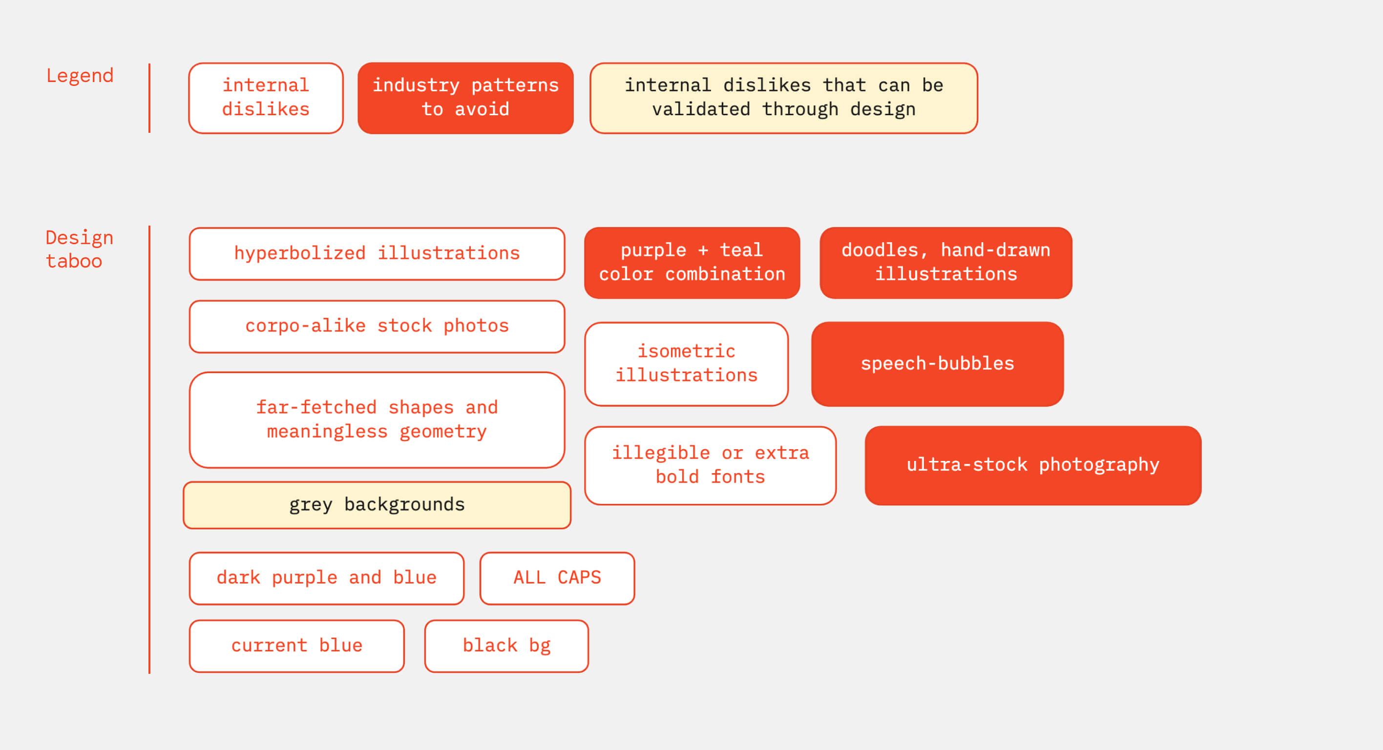
Design taboo one-pager
Now, the only step left is to organize the design analysis findings in a way that will be easy to include in the presentation.
If used as an internal tool by the in-house design team, a plain list of discovered patterns-to-avoid works best because it does not limit the creative range.
When introducing the analysis to clients, be detailed and descriptive. Present pattern by pattern over a few slides, and then close with a one-page summary.
Tell them why they will never see these elements in your design. Talk about your ultimate goal of standing out in the market, and that you will help them do it by avoiding these design directions.
Once you have this one-pager, call it your design taboo, and, from then on, treat it like one.
Pro tip
Your brand may not be the first one aiming to break through the noise. There may be one, or a few, direct competitors that have already done it — and they look different from others.
Take note of these competitor brand identities, and include them in the presentation. But because they are single cases, not patterns, there is no reason to add them to the design taboo one-pager.
What about personal dislikes?
Sometimes decision-making stakeholders have strong opinions about particular design styles or elements. They may not like ALL CAPITALS, dark mode, grey backgrounds, pink colors, you name it.
Before you start designing, ask a client if there is anything they can’t stand.
If these dislikes are aligned with the design taboo you created, perfect! You’ve got it covered.
But what if their dislike is NOT an overused pattern AND your expert opinion tells you that this exact style may boost their marketing? Should you include it in the design taboo just because a client does not like it?
Yes and no.
My primary answer is “No.”
Every opportunity that can boost a business should be considered. Your ultimate goal is not to please clients, but to contribute to their business success. And if it requires you to have a difficult conversation about overcoming their personal dislikes, consider it a part of the creative process. Try to not skip it. This does not always work. But it is always worth trying.
And because you do not always have extra time for conversations that may not work out, my second answer is “Yes.”
Include the client’s personal dislikes in the project design taboo and just move forward. This will increase the chances that your concepts will be accepted. You may miss some opportunities, but this will allow you to focus on alternative design ideas. You may find gold there.
TL;DR
To sum it up, here is a checklist of design to-dos that will help you design a look & feel that breaks through the market noise:
- Get a complete list of direct competitors from a client or research it.
- Find a few indirect competitors, add them to the list
- Define the focus of research based on the scope of your design project
- Collect bits & bites of competitor visual communications according to the scope & focus
- Look for patterns, sort screenshots in groups
- Give each pattern a name and a one-line description
- Present to client, add their personal dislikes to the design taboo.
- Create a final one-pager.
Your design taboo is ready to use.
■
Thank you for reading this guide. I appreciate your attention and grateful for a chance to share an my experience with you.
If you start practicing tactics from this guide in your creative process, let me know how it goes.
Good luck in designing focus-point brands!
Learn how to bootstrap your tech brand in less than 12 min per week, for free.
Every week, get one insight on brand strategy, one actionable technique to design-it-yourself and one curated list of aesthetic excellence. Use this 3-in-1 combo to build a product image that accelerates early adoption and funding.
Get them delivered to your inbox:
Created for developers-turned-founders.
See what's inside
more articles and resources ↓
▉ design process essentials
▉ 5 min to read
▉ guide
▉ 33 min to read
▇▇ work with Ira
Other matters: iryna at nezhynska.com
creative
ⓒ Ira Nezhysnka, 2025
▇▇ learn for free
Subscribe to Ira's Embrace Variety
-
ⓒ Ira Nezhysnka, 2025

