Making data ownership look different and human
Brand transformation of pioneers in the decentralised digital identity management.▉ Done for Jolocom, 2018-2019.▉
When the world had just stepped into 2018, everyone was talking about blockchain technology, nearly every startup wanted to add #crypto to their business offer, but only a few were looking beyond this momentary hype. And almost nobody knew what SSI was and how it was going to change our digital future.
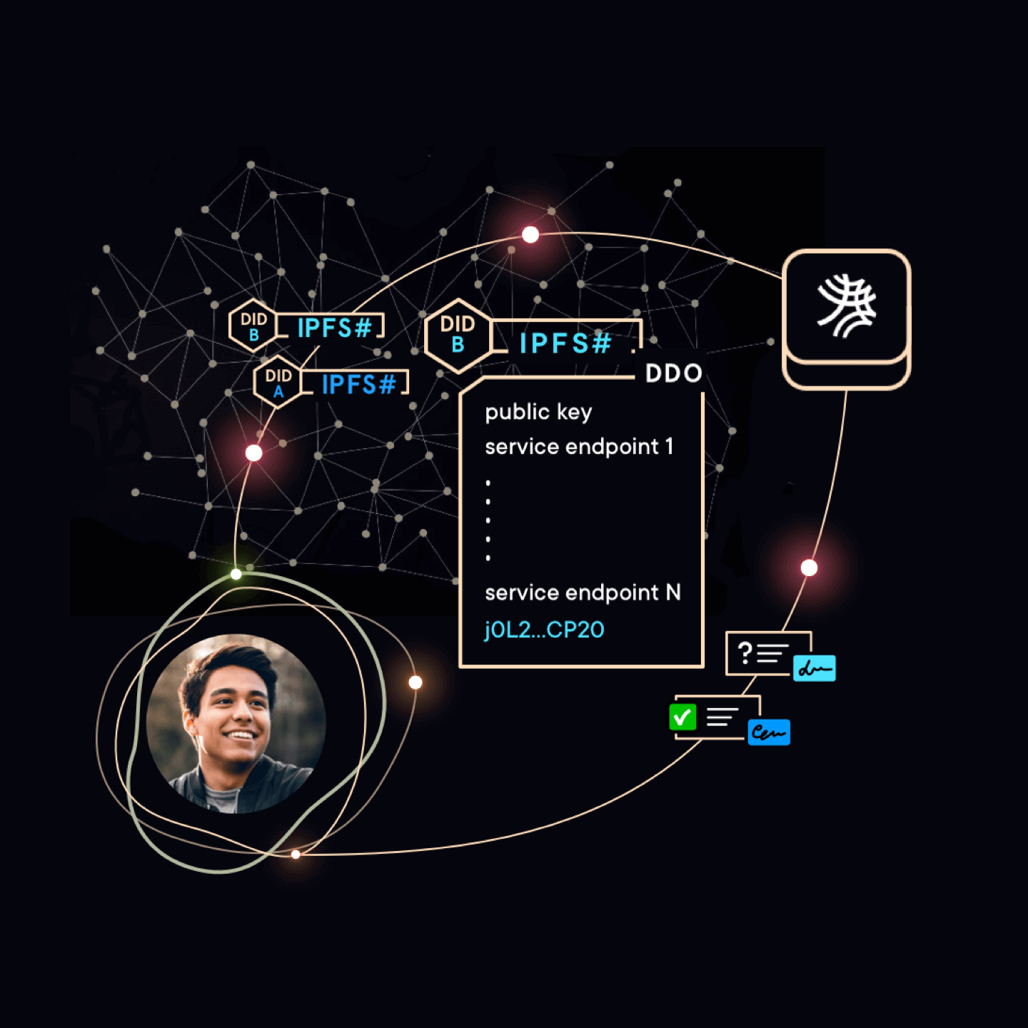
Jolocom is a Berlin-based company that develops open-source technology for decentralized identity management.
I joined their core team as a Visual Communication Designer in February 2018 to help them break through the noise of the increasingly crowded blockchain space and make the new digital identity concept universally understood and impossible for enterprise-level businesses to ignore.

00
01
02
approach
I approached this design challenge using the lean branding methodology. It allowed us to immediately test the emotional response to our new look and feel among the external stakeholders during the course of three industry events - SXSW, Digitaler Staat and Decentralized Web Summit.
↳
But first, we needed to answer one vital question: just who exactly do we need to target to get the emotional response we are looking for?
However, this might not be an easy question to answer because Jolocom has a very intricate stakeholder relationship map.
Being a B2B2C and B2G2C company we work with private sector business partners, research projects and public sector organizations.
On other hand, open-sourcing the code made Jolocom protocol mass adoption impossible without ongoing contribution and support from the dev community.
Moreover, by providing the mobile app - the Jolocom SmartWallet - we added end users to an already long list of stakeholders. A more detailed overview of this category depends on the service that uses SSI technology (as they are the end customers of this service) and may range from tech-savvy people to non-techies.
A deeper look at the business strategy and the first use-cases roadmap directed us towards two primary audiences:
1. business partners from the private sector and their in-house dev teams as primary audiences for the Jolocom Protocol and
2. the end customers of these business partners as early-adopters of the Jolocom SmartWallet.

So we mapped brand awareness journeys for these two audiences. It helped us divide the extensive touchpoint wishlist into three groups: an identity pilot, first sprint (public launch of the rebranding) and second sprint (that covered the remaining touchpoints).
This case study presents everything we completed within the first design sprint. The second sprint included the blog redesign, branded merch and a new technical whitepaper.

When working on (re)branding of a product in a saturated category, I design in such a way that a company must meet a checklist of three criteria at launch:
- stand out (both from direct competitors and alternative solutions from other markets)
- be memorable
- resonate enough to trigger the desired action
The next two steps - design research and the brand personality workshop - enabled Jolocom to meet these criteria at the end of the rebranding process.
01
02
03
design research
At Jolocom we conducted two types of design research:
- competitor analysis (among other companies working in the area of digital identity management)
- landscape visual research (a general overview of design trends in the blockchain space and among dapps)

The results of our design research showed us what visual directions are already overused in the market and thus would make Jolocom invisible. So we turned these analyzed results into an internal “design taboo” for the new brand identity.

02
03
04
brand
foundation
While I researched the design trends in the blockchain space, the key stakeholders completed the brand personality survey.
Then I facilitated the brand discovery workshop to bring people on the same page when answering the following two important questions: “What emotional values should Jolocom promote?” and “What would Jolocom’s personality be like if it was a person?”
Next we turned the resulting board of values and traits into a board of images - a moodboard - that communicates brand visual atmosphere and acts as a North Star for any design that follows.
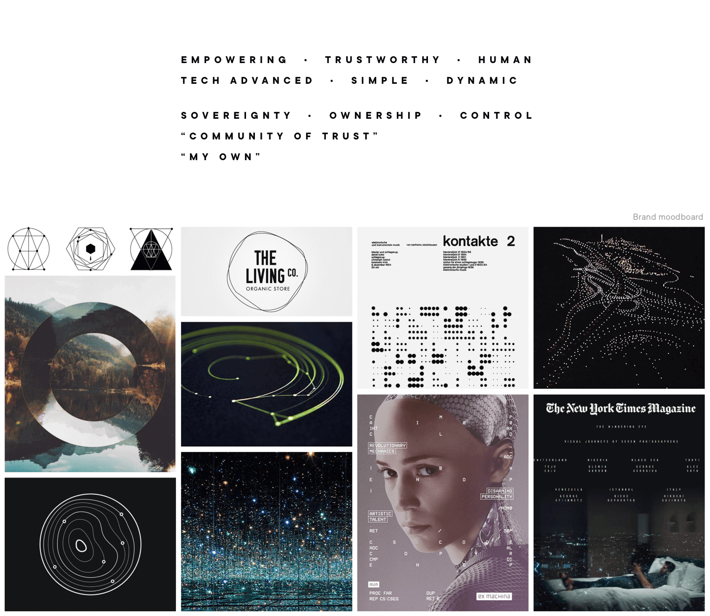
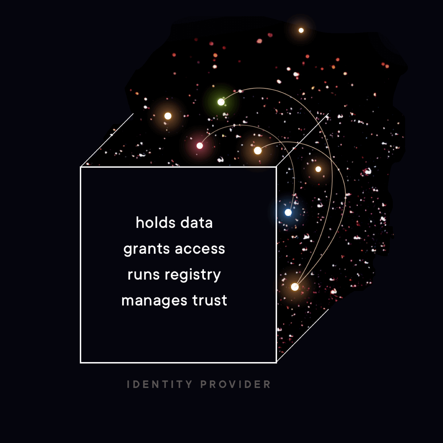
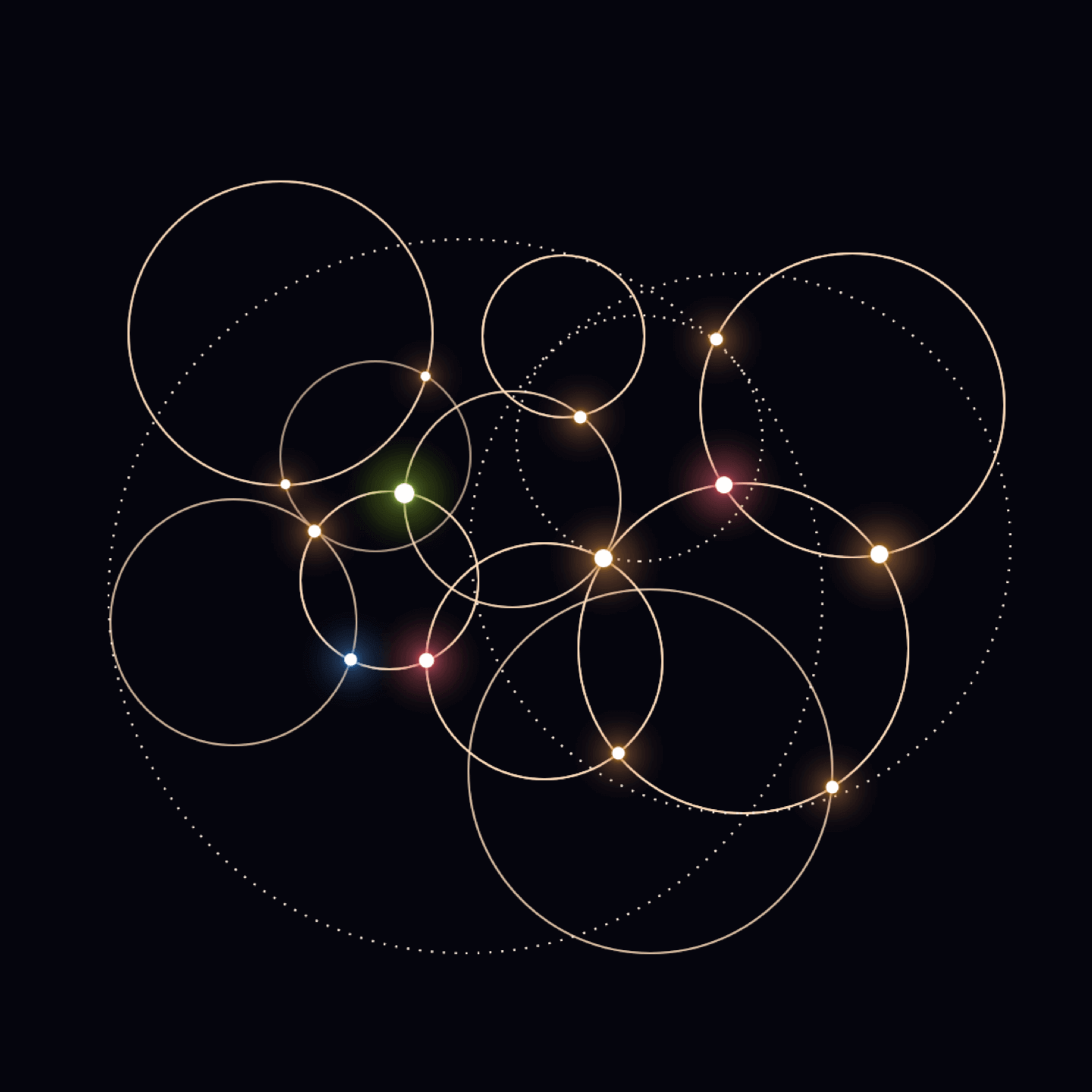
Using this visual design guide, I put forward a design hypothesis with regards to what graphic elements should constitute the “heart” of the new visual language:


03
04
05
rebranding pilot
The first opportunity to test my rebranding hypothesis came with Jolocom’s participation as one of the 8 most innovative Berlin startups at SXSW-18.
We created a new pitch deck, updated the company’s appearance across social media channels and printed marketing materials to test the first impression to Jolocom's new look & feel amongst SXSW's diverse audience. They gave us a resounding thumbs-ups, as did the attendees at the following der Digitale Staat '18 conference.
So we knew then that our design hypothesis was a success.
This meant that the identity pilot phase was complete, and it was time to move on to the next stage.

04
05
06
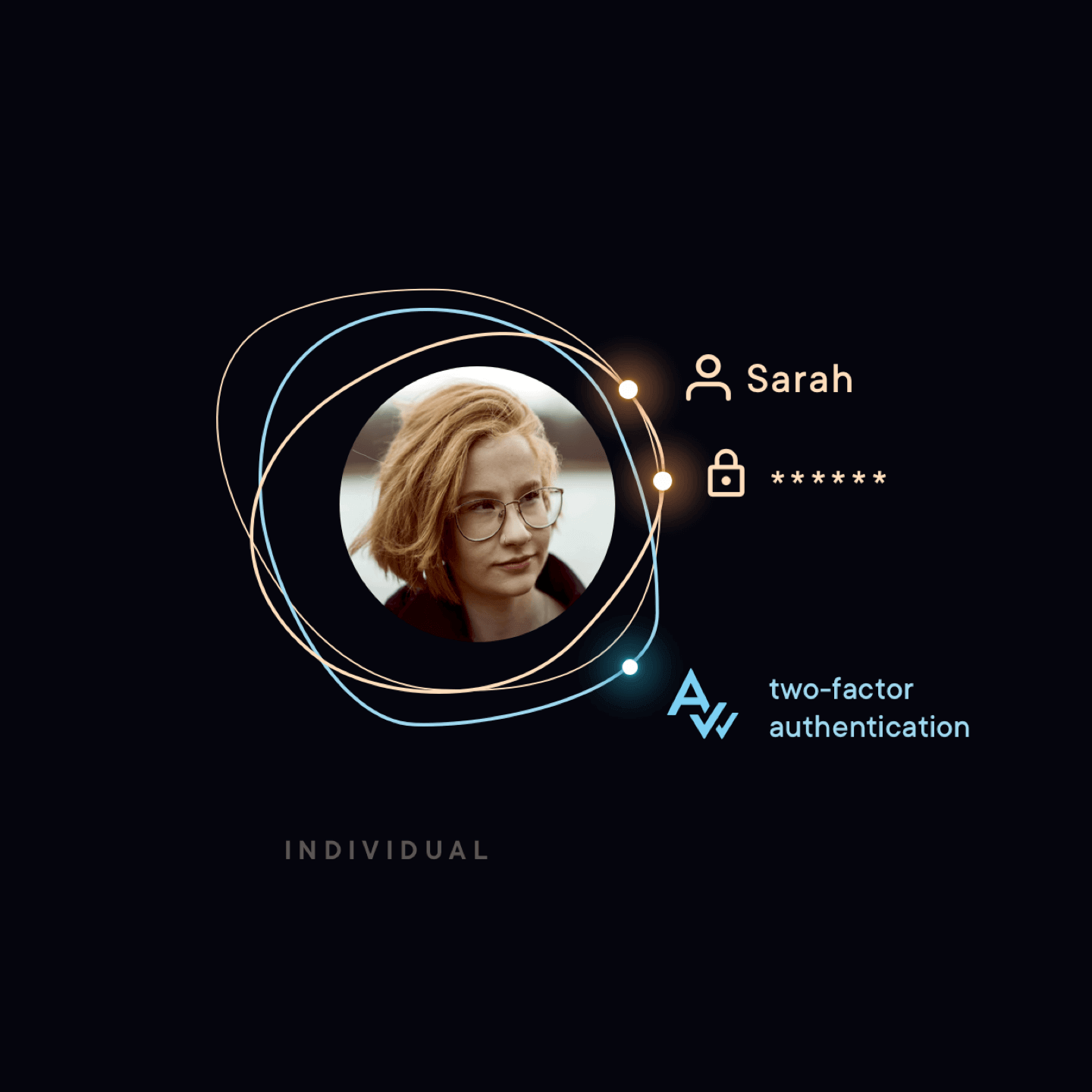
SmartWallet update
Jolocom SmartWallet is a dapp that acts like your physical wallet but in the digital world. It allows you to manage your digital identity documents like for example, your ID card, health insurance, driver’s license, student card, gym memberships and etc. It also evolves with each new use case Jolocom develops.
During the first rebranding sprint we refreshed UI and improved UX of the existing user flows.

05
06
07
website redesign
We also applied the lean approach to the website redesign, breaking down the entire scope into two sprints:
- we started with the typical pages (Home, Solution, About, Resources, Events and FAQ) using a new story flow, refined brand message and a new visual language, which we launched
a day before the DWeb Summit 2018
in San Francisco. - following feedback from the DWeb community and partners, we enhanced the web copy on existing pages, added team profiles, a product roadmap, a contact form, a media kit and launched our newsletter - SSI Digest.


So many tech brands blur against the background of competition by trying to be brighter, more blue and with an increased gradient.
Jolocom has avoided this by speaking its own visual language and as a result has become easily recognized in the market.


06
07
..
brand
guidelines
We developed our brand guidelines in 2021 — way later than companies normally do when rebranding.
We did so because I wanted to avoid having the two most common forms of immature guidelines:
⟶ those that are short, meaning they cover only the basic, only the foundational tokens
⟶ those that are “hypothesis-driven”, meaning they are illustrated with graphics created for the brand manual itself, without being tested in real-life scenarios.
Both approaches above are beneficial in cases where you need to “ship” the delivery. However, a brand guide that is developed like a summary — not a future vision — functions more reliably as a rulebook.
The Jolocom brand manual only includes designs that are real-life based and time-tested:
⟶ every example in 'Incorrect logo use' section and every typography crime are actual mistakes I saw the team tends to make
⟶ every photo in the 'Photography' section is originally for & from a published communication
⟶ every infographic has been iterated and presented many times over at various events.

Projects like the above are expensive.
Want to start lean?
Learn how to bootstrap your tech brand in less than 12 min per week, for free.
Read my brand design repository for developers-turned-founders who want to build a product image that accelerates early adoption and seed funding:
next project ↓
Branding, UX design and art direction of a new editorial space at Jolocom.


▇▇ work with Ira
Other matters: iryna at nezhynska.com
creative
ⓒ Ira Nezhysnka, 2025
▇▇ learn for free
Subscribe to Ira's Embrace Variety
-
ⓒ Ira Nezhysnka, 2025