From Wayback to way forward:
Internet Archive turns 25
Branding and art direction for the anniversary campaign.▉ Done for Internet Archive, 2018-2019.▉
In October 2021, US-based non-profit Internet Archive — an Alexandria of the digital age — celebrated 25 years of providing Universal Access to All Knowledge.
Being a good friend of the Internet Archive team and a committed user of their digital library for some time now, when Wendy Hanamura invited me to join the campaign team to create the dynamic identity for the campaign and lead its design direction, my only natural response was: “I’m all in!"

00
01
02
campaign
brief
The campaign had two core messages that needed conveying:
1. “From Wayback to way forward” — reflecting on the period from when the first books were made available, to the launch of the Wayforward Machine, to the (hopefully) bright future of Open Knowledge.
2. “Universal Access to Knowledge” (the primary mission of Internet Archive ) — solving current and future challenges around access to knowledge.
01
02
03
approach
The first task was to design the "visual heart" of the campaign. This was challenging because while Internet Archive has a well-established brand reputation, it does not have a visual system of brand identity in use. In other words, we had very little to reference or from which to build upon.
I suggested kickstarting the campaign design with a brand personality workshop as if we were creating a brand identity from scratch: “How should Internet Archive be perceived based on this campaign alone?”
We narrowed down the workshop results to six attributes:
open and caring
community-minded
approachable and down-to-earth
whimsical.
→
After a few iterations, we presented two identity concepts to the leadership of Internet Archive’s various departments and their design choice was unanimous: we are moving forward with an extra-dynamic logo system and a bright, colorful moodboard.

02
03
04
campaign
identity
The main reason for choosing the dynamic identity was the amount of public domain content we were intending to use — both from the distant past and current material. When put together, the content actually resulted in a visual mess, so we needed a system that sorted it into some sort of logical order.
The dynamic logo has two constant elements (back and forward arrows) that are used as a link between three “narratives”:
1. What from the past do we want to use as a reference?
2. What exists now and can be found in the digital library?
3. How access to this knowledge will impact us in the future?
.
I went a bit more attitudinal with the typography that balanced a very logical and practical logo concept.
Mainly, I wanted to align the typography choice with Internet Archive’s “Universal Access to Knowledge” mission so that it would become open-source/open-license typography when translated into a visual language.
Everyone has fallen in love with two typefaces created by Colllectttivo:
“…Funk aesthetics, .. softer personality … tense, unstable, twisted” — this is how we felt about Ribes Black with its “smiling” nines. We used it only for numbers and for selected taglines.
We used Apfel Grotezk for the body text. It’s extremely legible, while its shapes also offer something extra-friendly and rough-edged (in a nice way, not over-polished).

Together with black and white (Internet Archive’s brand colors), we used blue as a main color because of its relation to the idea behind Internet Archive’s Wayback Machine, named for Mr. Peabody’s WABAC machine, which is stored in room where the dominant color is blue.
(Yes, while working on the design concept, I watched both the original series and a new Pixar movie, for research purposes alone, of course!)
There was also a second reason for using blue as a main color: lights on the archiving servers blink blue each time they conduct a web crawl.
In addition, we introduced a morphing gradient to soften the effect created by the photographic tiles.


03
04
05
timeline
design
A Timeline was the first proof of identity concept — a massive set of 80 key dates in the history of Access to Knowledge. My task was to design the social post templates for the milestones and the UX/UI for this Timeline section on the anniversary website.


04
05
06
art direction of 2046 campaign
The first wave of the social campaign celebrates what Internet Archive is and what it has achieved over the past 25 years.
The question remains, though: will things keep progressing in a positive sense if Internet Archive loses the lawsuit brought by the corporate publishers?
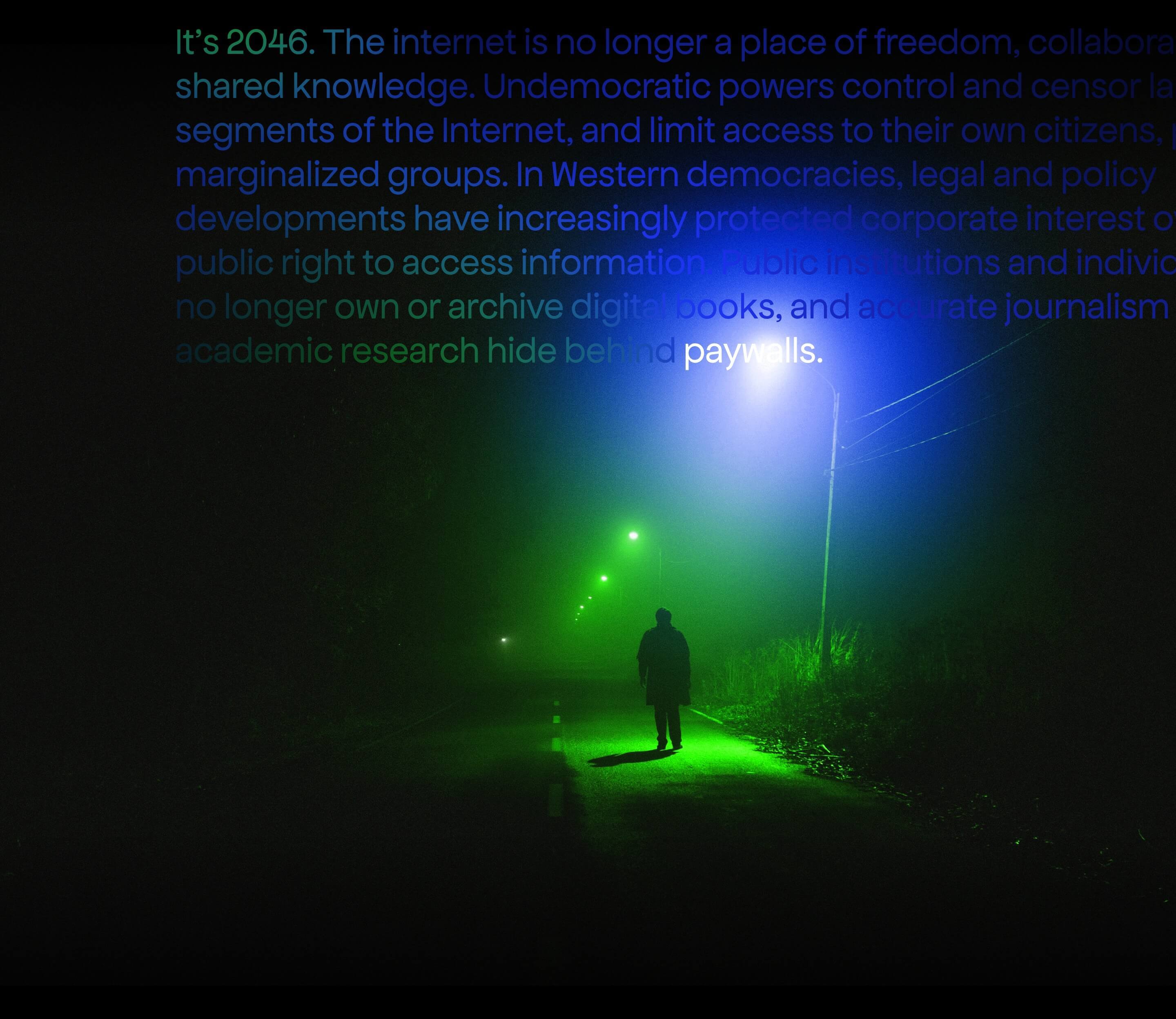
To answer this question the team created the Wayforward Machine, an interactive tool that takes you 25 years into the future, to the year 2046, to show the many ways our online world is being threatened by censorship, paywalls and political firewalls.
My contribution to this endeavor was art directing the shift from the light mode of the birthday campaign identity to a darker dystopian look & feel and designing the @IA2046 key visual and new templates for social posts.
To explain how the look & feel will change from light to dark mode, we created a new moodboard, a “dystopian” twin to the primary one. It acted as a North Star for all “from the future” social images. To enhance this shift, we also replaced the deep blue with an oversaturated, even toxic, green:

Hey there, this is the default text for a new paragraph. Feel free to edit this paragraph by clicking on the yellow edit icon. After you are done just click on the yellow checkmark button on the top right. Have Fun!

→ key visual for the 2046 campaign
↓ concept for @IA2046's tweets
(these images didn't go live)


05
06
07
anniversary ceremony
The Internet Archive also hosted an anniversary celebration that took place both virtually and at the Internet Archive’s headquarters.
I helped with the design of the stage graphics and reel concept.
Wrapping up, @brewster_kahle asks all of us, "What do you want in 25 years?" and then think how to pull us in that direction.
— Internet Archive (@internetarchive) October 22, 2021
So what do you want in 25 years? Comment below 👇 #InternetArchive25 pic.twitter.com/2uWaQCGXEz
07
..
credits
Campaign Producer: Wendy Hanamura
Campaign Associate Producer: Nick Norman
Branding & Art Direction: Iryna Nezhysnka
Graphic Design (not in this case study): Jasmine Parker
Motion Design: Josh Kalven
Campaign Concept & Strategy: Alice Bridgwood and Charlotte Kelly
Wayforward Machine & 2046 Website: Bgn Agency, Paul Bailey, Adam Beecham, Ashley Dutton, Antonio Giansante, David Newton
Wayback To Way Forward Content Team: Alice Bridgwood, Charlotte Kelly, Lila Bailey, Madeleine Dye, Erin Cunningham, Nick Norman, Wendy Hanamura, Jin
25th Anniversary Website by: Dmitry Kulahin, Jim Shelton, Isa Herico Velasco, Brenton Cheng, Mark Graham, Kenji Nagahashi, Nick Norman, Wendy Hanamura
Public Relations by Josh Baran
Illustration & Animation: Josh Kalven, Lone Pine Creative
Live Video Production: Argus Hd, Tim Kay, Jeff Mcginnis, Toni Tru
Closing Video Produced by Rory Mitchell and The Mercantile
Additional Videography by Brad Shirakawa and Kyung Lee
Videos Editing by Alice Bridgwood, Kyung Lee, Kristin Tieche and
Ace Volkov
next project ↓


Learn how to bootstrap your tech brand in less than 12 min per week, for free.
Every week, get one insight on brand strategy, one actionable technique to design-it-yourself and one curated list of aesthetic excellence. Use this 3-in-1 combo to build a product image that accelerates early adoption and funding.
Get them delivered to your inbox:
Created for developers-turned-founders.
See what's inside
▇▇ work with Ira
Other matters: iryna at nezhynska.com
creative
ⓒ Ira Nezhysnka, 2025
▇▇ learn for free
Subscribe to Ira's Embrace Variety
-
ⓒ Ira Nezhysnka, 2025