How can we foster a community that builds a decentralized web?
Branding, art direction and web design for the decentralization movement.▉ Done for DWeb, 2021.▉
DWeb is a global network of builders and dreamers working to create a web that is more open and secure – Web 3.0 or the decentralized web.
In order to create momentum, DWeb’s leaders wanted to give the community a brand that exhibits the aspirations of its members and one that engenders a feeling of belonging and unity among them.
I joined the core team to help with creative direction and the brand launch. The first design sprint included:
↳ a brand foundation
↳ a visual identity system
↳ a new website (+ management of its development)
↳ social media promo materials
↳ event visuals design.
00
01
02
brand foundation
The DWeb visual world is built on three pillars:
↳ Personality, which defined the design direction,
↳ Legacy, which gave us the core components of the visual language,
↳ Scale, which keeps us from designing something ultra-finished or from choosing too narrow a style.
Our vision has always been to create a brand that echoes in the hearts and minds of everyone who is already active in our network and those considering joining it.
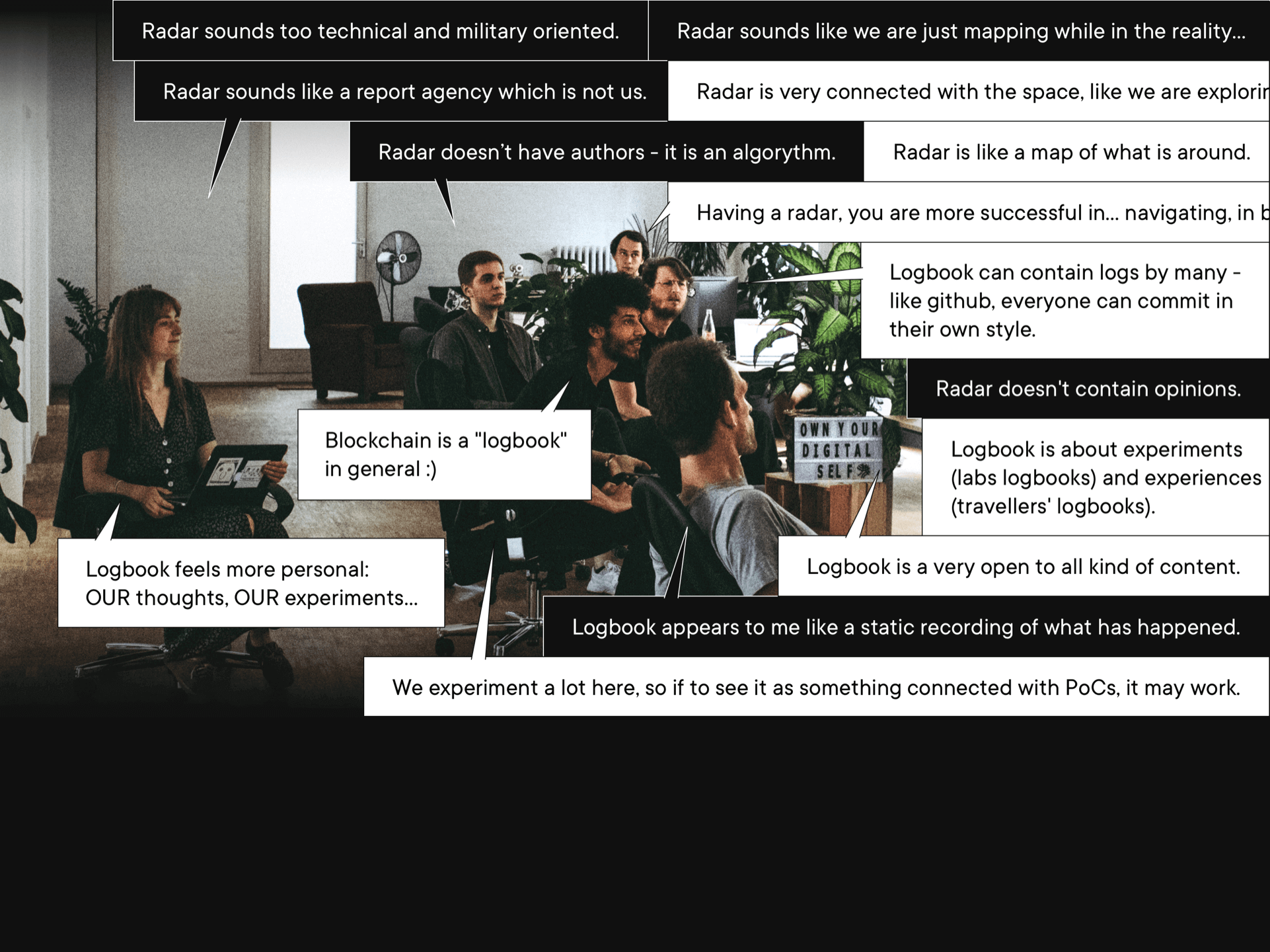
The brand personality workshop with the DWeb leaders and most of the active community members revealed that in order to stay true in the years to come, the brand should reflect the following attributes:


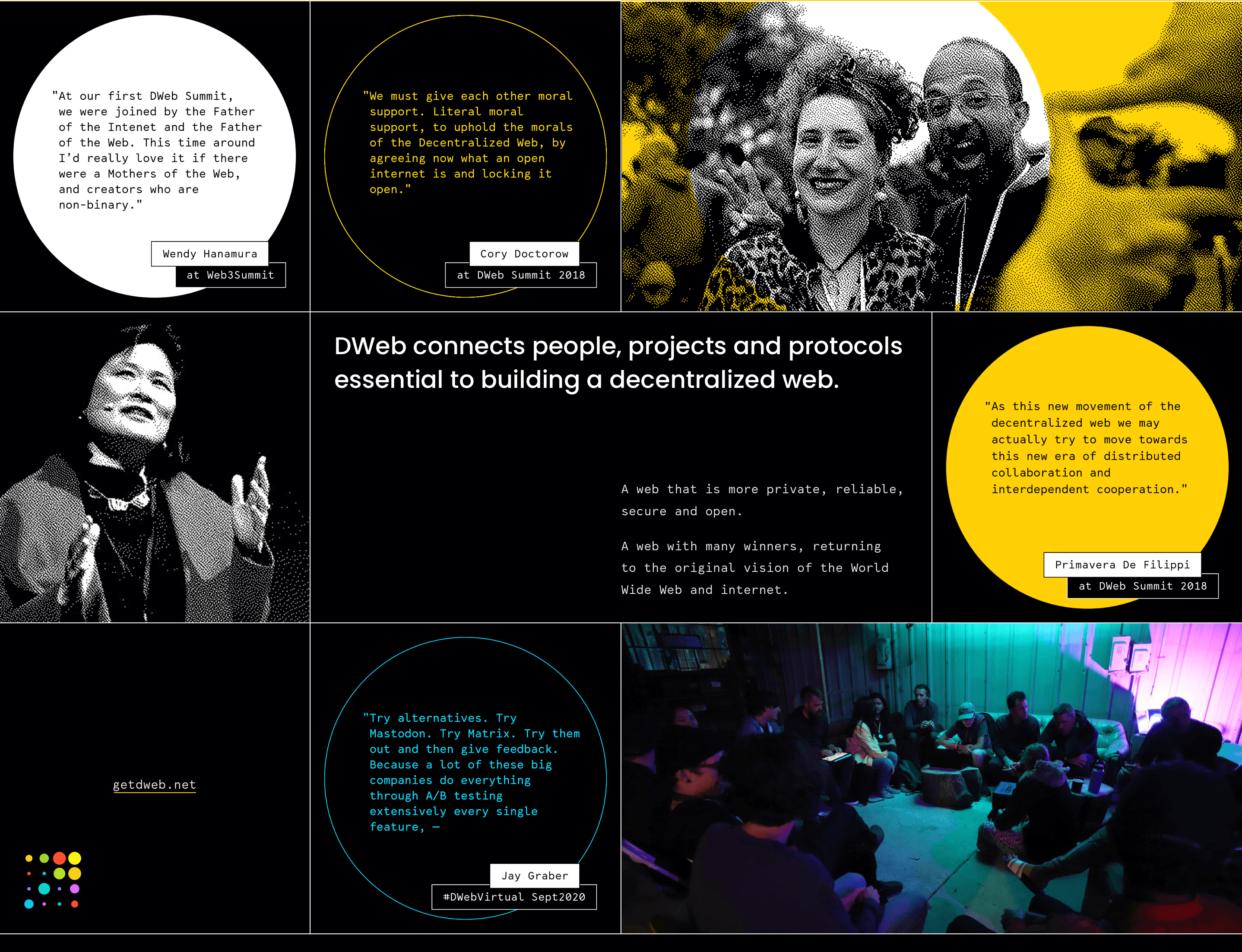
Another requirement was to honor the legacy and the original spirit of the Internet’s creation. In other words, the DWeb brand identity should be anchored and not simply be created out of thin air.
Therefore, I knew that when translating a set of traits and values into a brand moodboard, I needed to suggest a visual atmosphere that would feel familiar and yet different at the same time, one that would resonate with Internet pioneers but also be adopted by the zero-generation. In other words, it should be flexible enough to withstand experimentation.
→
this moodboard was to become our guiding North Star on all designs that followed.
01
02
03
design concept
The greatest challenge was to step aside from overused “blockchain” graphics, even though these are still the most popular, most shared and the first to be associated with DLT (Distributed Ledger Technology).
I was inspired to take a closer look at the dotted grids and the concept of variable “breathing” patterns by mottos such as “everyone can make an impact”, “connecting people and protocols” and “global movement”.
→
logo origins:
decentralization
+
people making an impact
(big and small)


Our aim is to make the logo as dynamic as possible and make it evolve in parallel with growing brand awareness.
In the stage of brand launch and identity introduction we enabled the dynamics of the logo by turning it into a container with only one variable - the dot color or style. In the future we envision one more variable - the size of the dot - that will allow the logo to breathe & its heart to beat.
Finally, the logo should eventually become a fully customizable asset serving as a tool for expressing the diverse identities of people within our community.
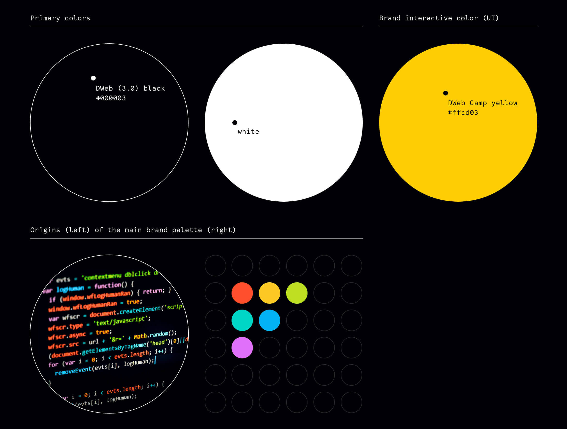
We needed to answer questions like:
- When the movement comes to involve more people how can we ensure that the brand design doesn’t exclude anyone?
- How can we ensure that the brand echoes in the hearts and minds of everyone who is already active in our network and those considering joining it?
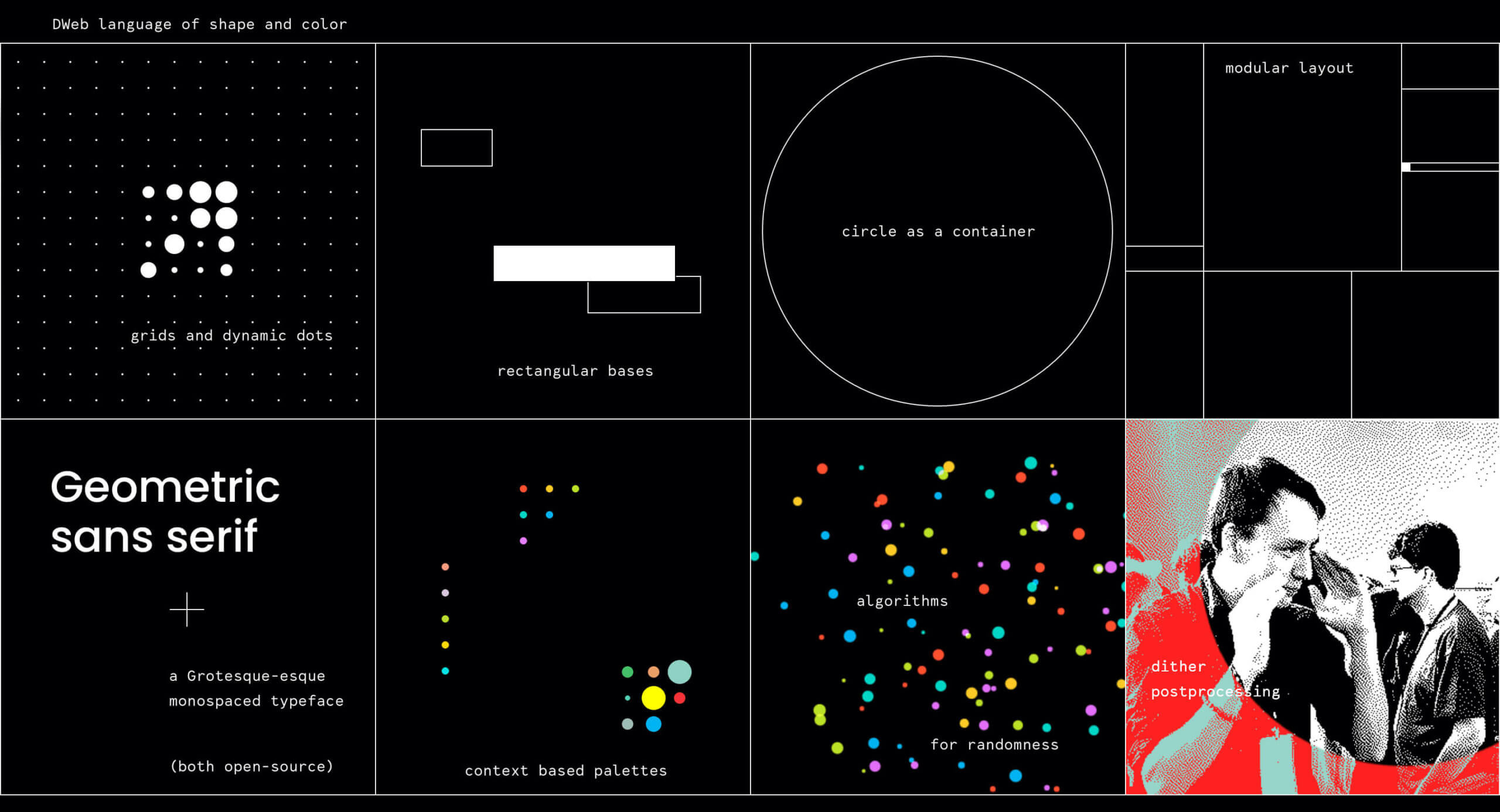
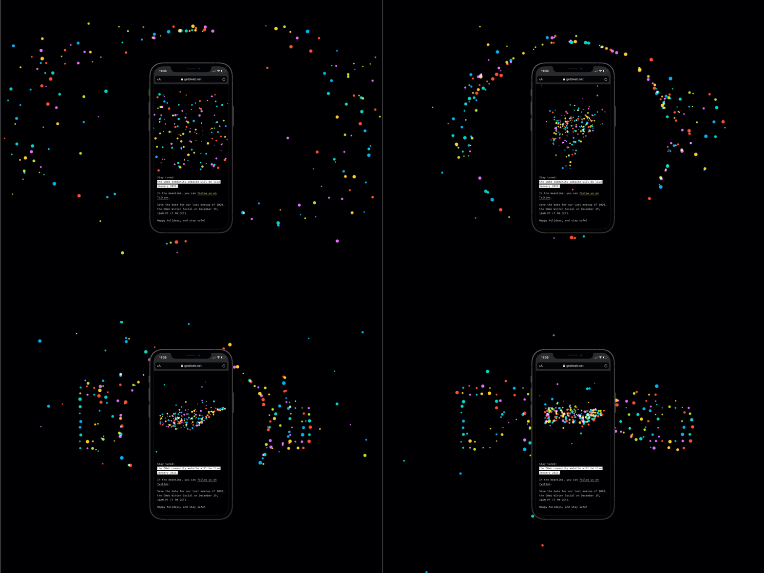
To achieve agreeable solutions we have made sure everything is open and customizable, putting it all together in a Lego-set-alike visual language:
02
03
04
website as city,
website as building
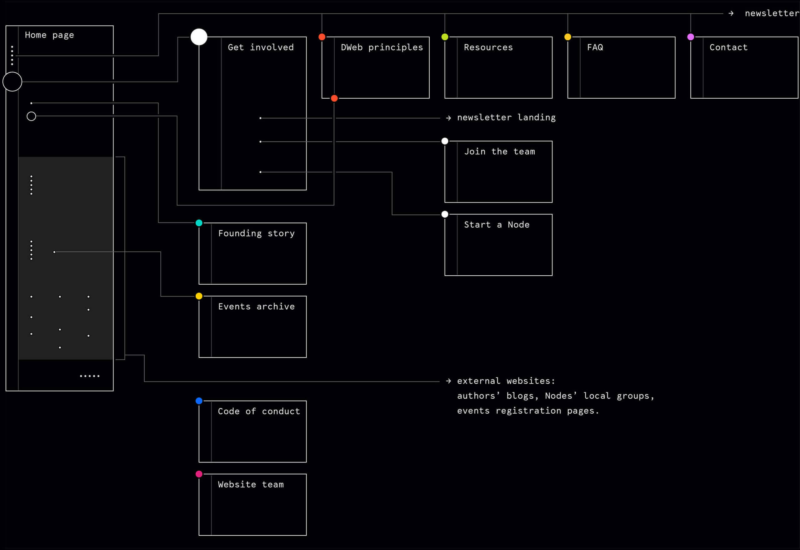
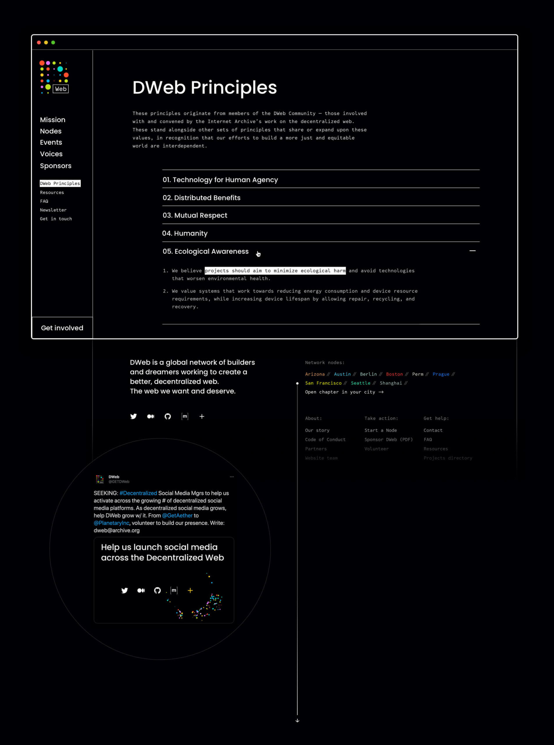
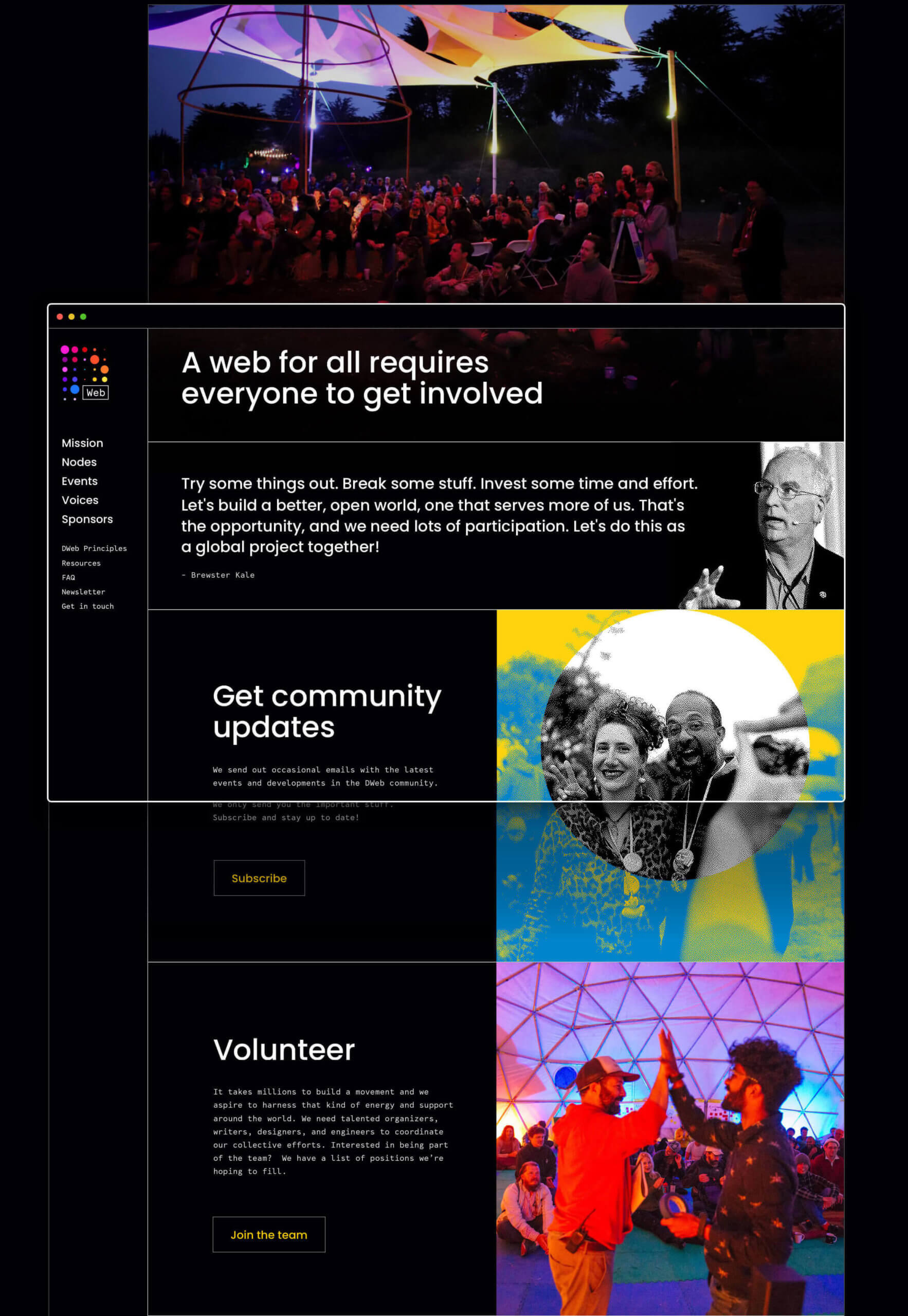
From the very beginning it was clear that the website should be a community hub - an entry point where you can find all ideas, concepts and resources critical to moving the Decentralized Web forward.
To achieve not just an overriding vision but also just the right amount of detail, we invited attendees to take part in a UX workshop when DWeb Camp 2019 was at its peak. Within 4 hours we had mapped the website’s visitor needs via user stories - a tool very simple and one so familiar to developers.
Later on, when turning insights into user flows, I introduced the team to the “website as city, website as building” concept (more about it in the upcoming article), which we took as the main approach to the website’s architecture.

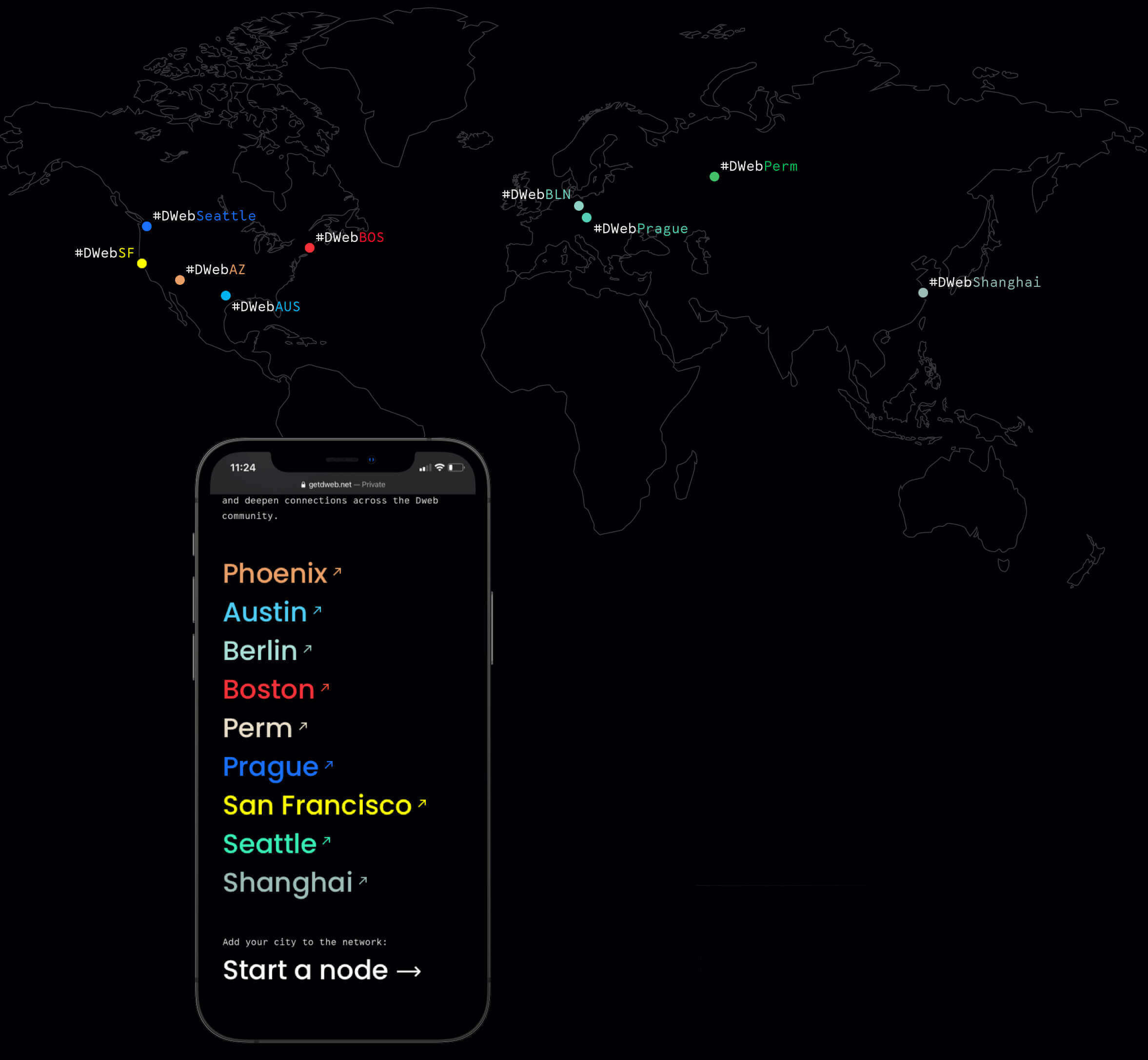
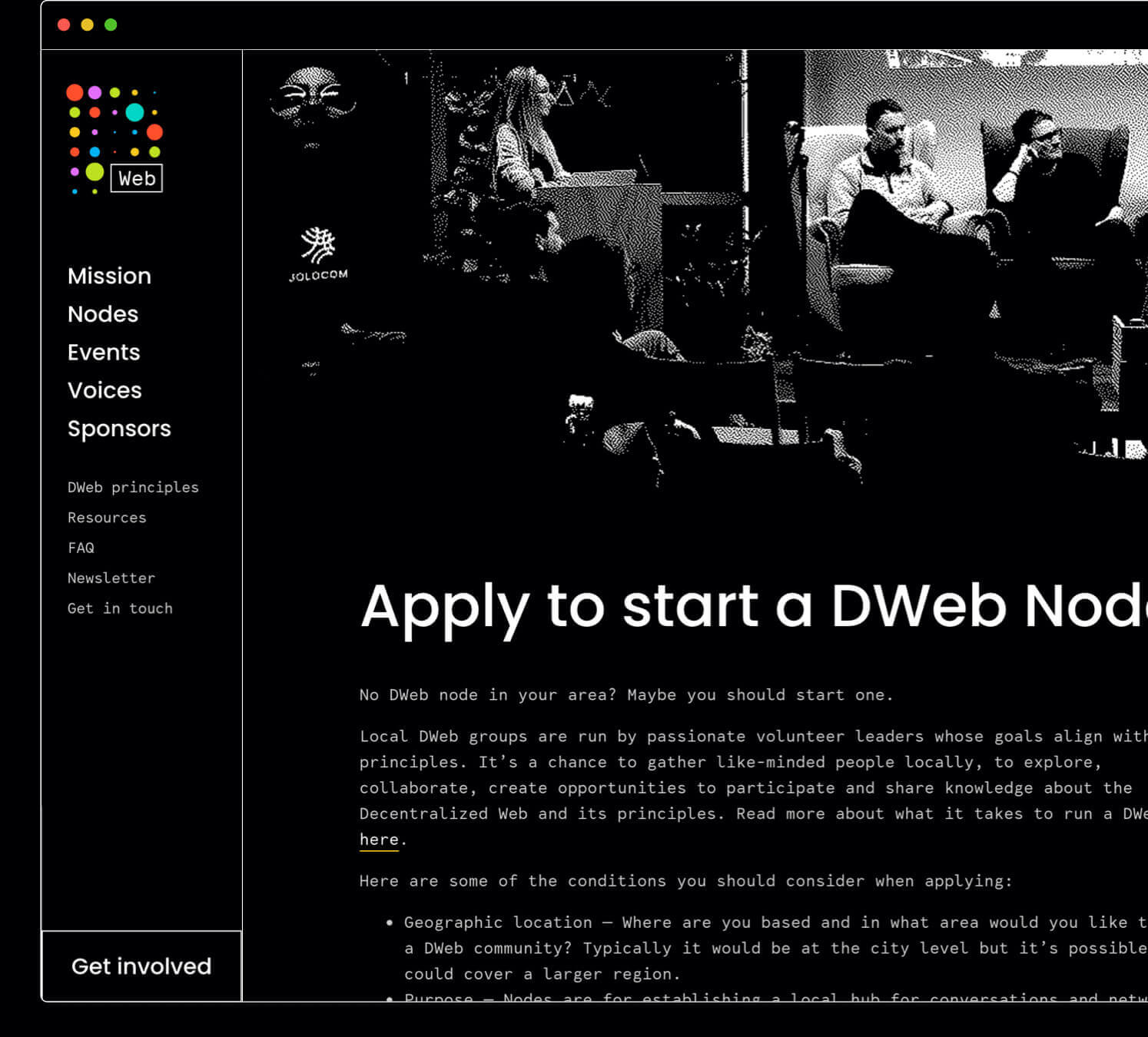
Another strategic decision we made was to divide the sub-branding process into two steps - the launch (teaser and sketch), and a collaborative sprint with node leaders so as to finalize the identity framework together.
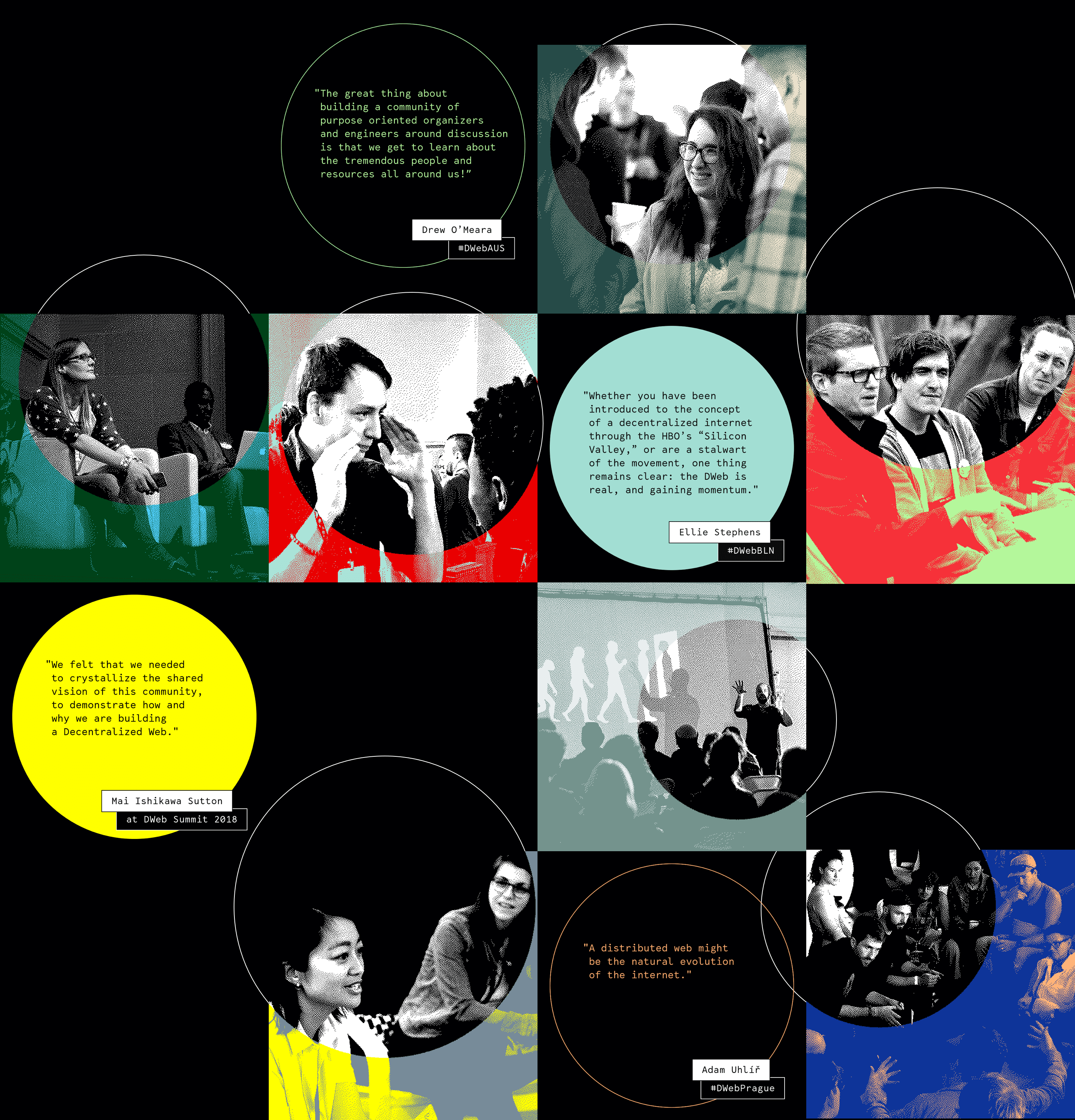
We kickstarted with only one variable of the Nodes’ visual identity - the duo-tone dithering.
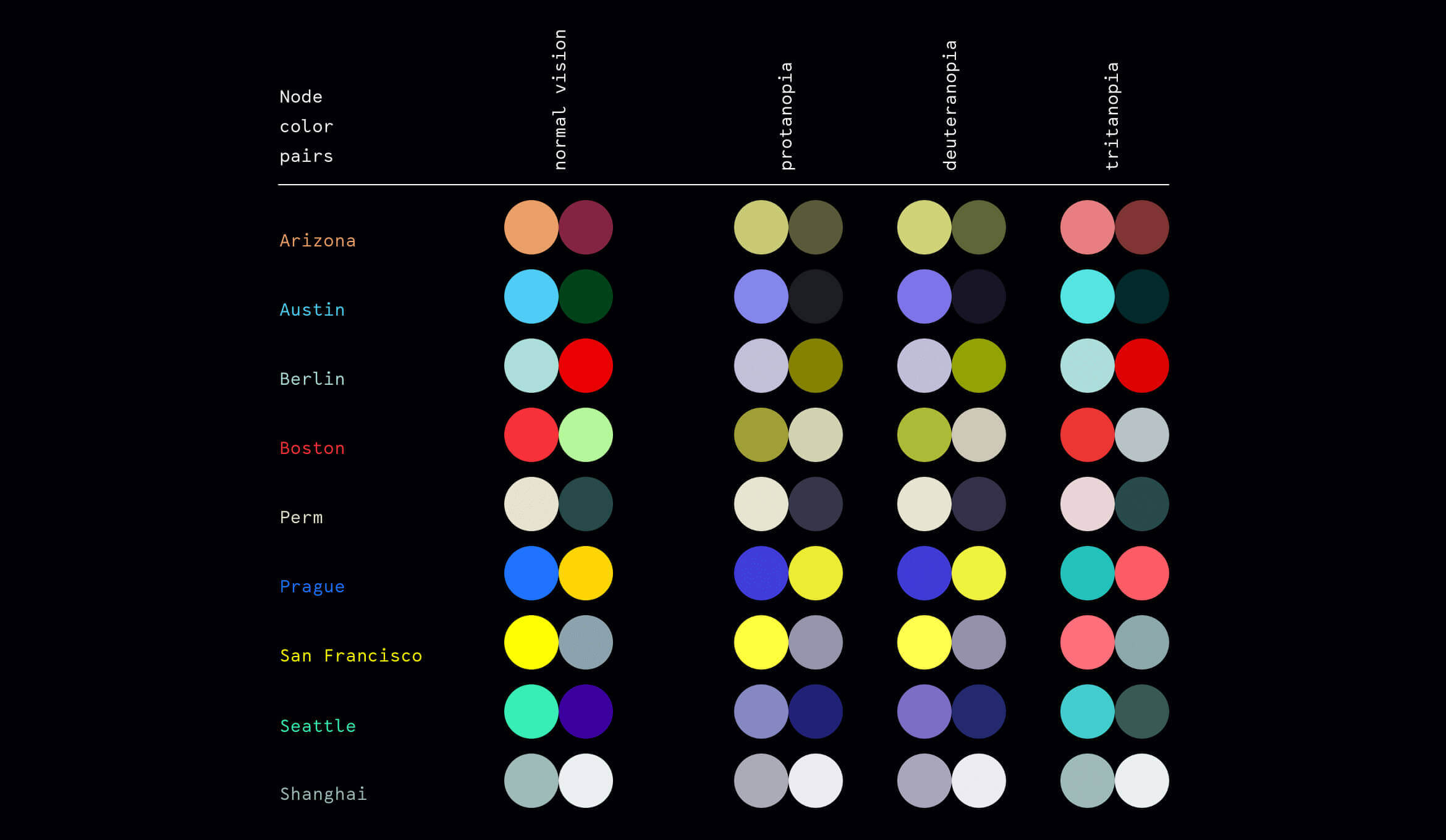
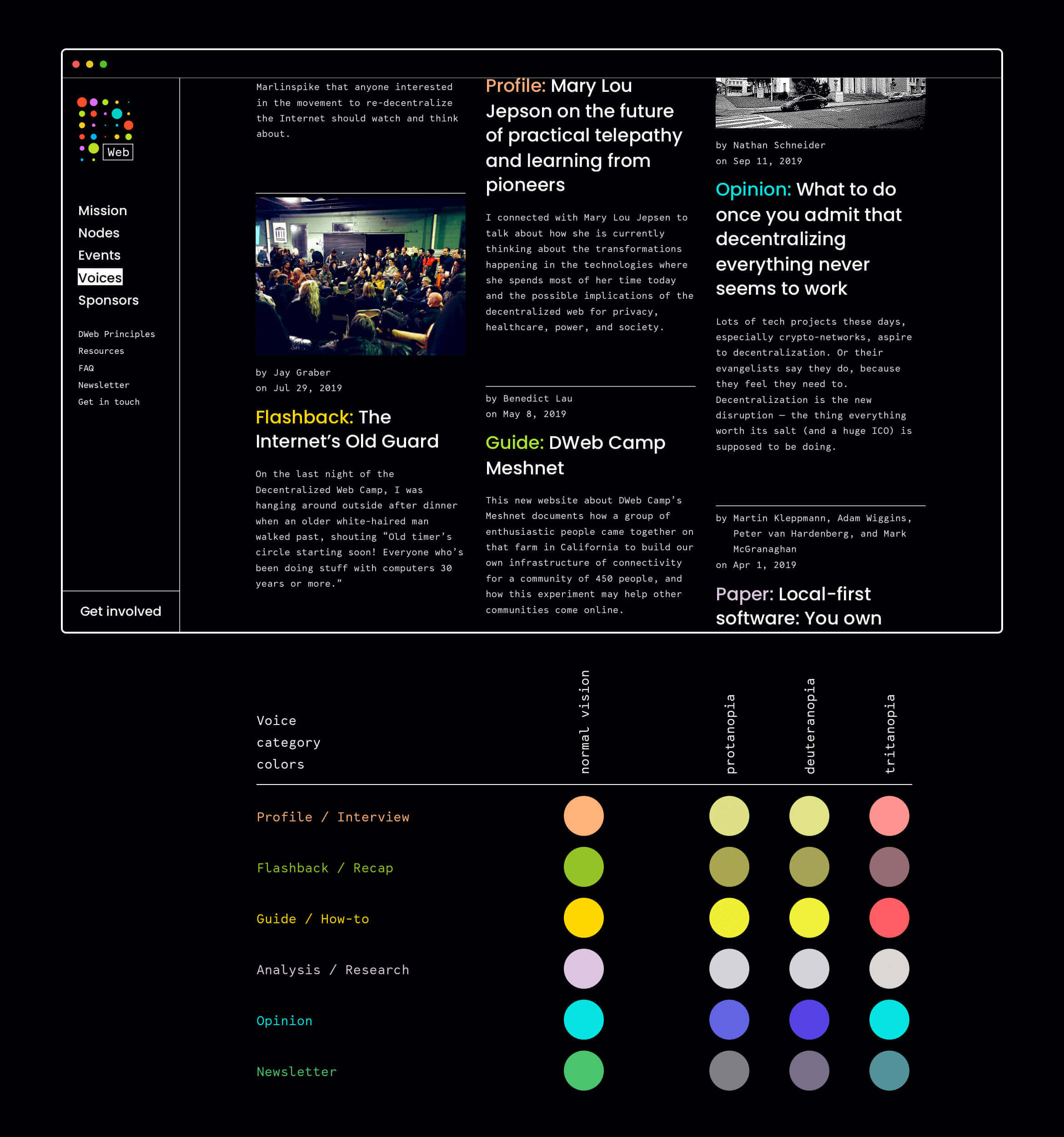
To make information more legible for people with color blindness or lower contrast sensitivity, we put extra effort into finding the right secondary color palettes in addition to the dominating black and white.

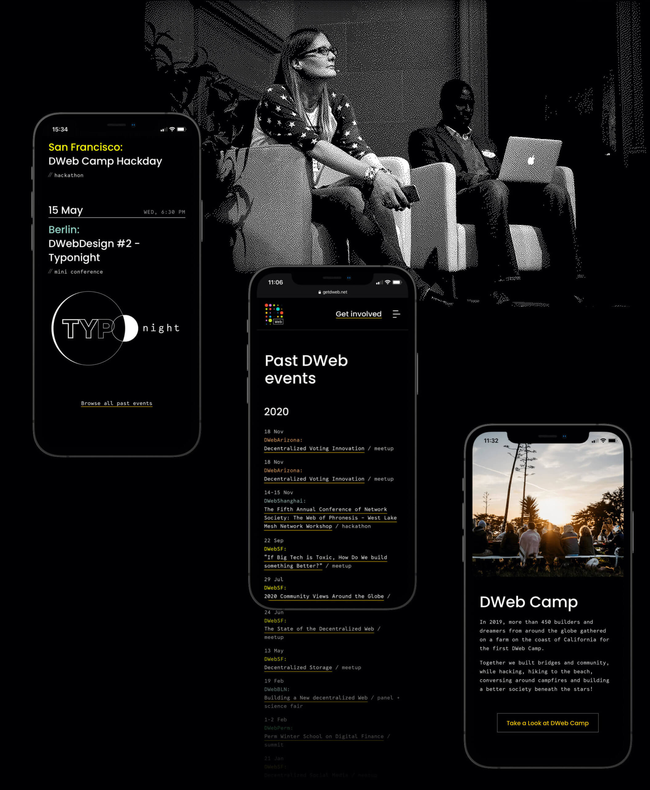

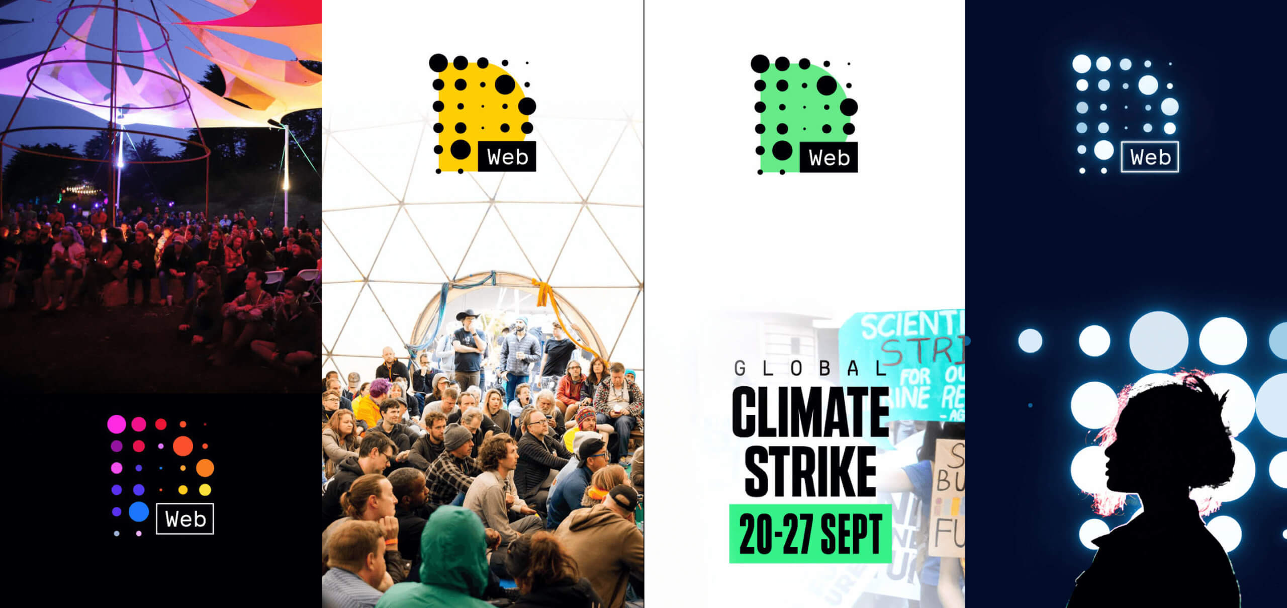
To give the community a wider space for self-expression (which we called “design improv”) we avoided creating templates that were ultra-finished and too directing for the event covers.
Instead, we provided Node leaders with a template with only two presets - a typographic system and elements positioning. Everything else - from logo appearance to the background color and key visual - was left blank.
This approach created more space for mirroring the theme of a given event and turned out to be easy and fun to use for all future events.
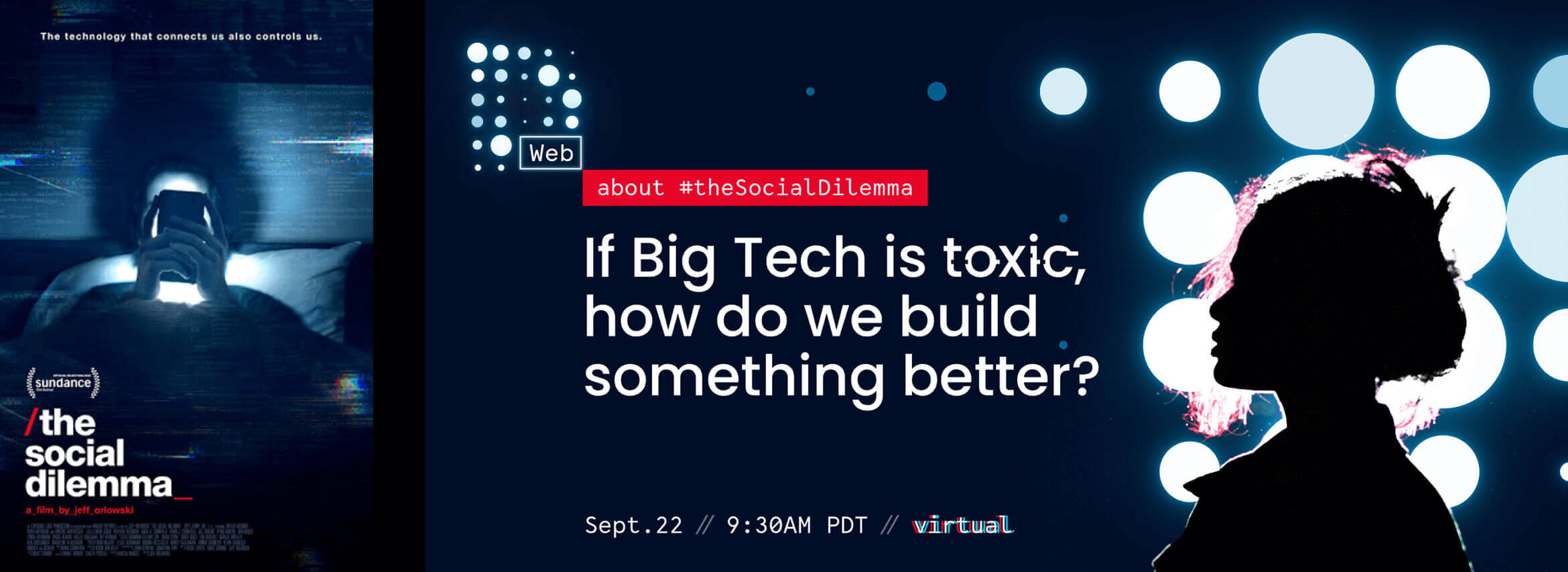
↑ (above) For example, in September 2020 DWebSF hosted an online meetup as a follow-up to The Social Dilemma that had been recently released on Netflix. The main question guests were invited to answer was: “If Big Tech Is Toxic, How Do We Build Something Better?” By having a theme like this that already evokes a particular visual image in the mind of meetup attendees, we wanted the event cover to mirror the movie atmosphere to keep a consistent connection with those visual associations.
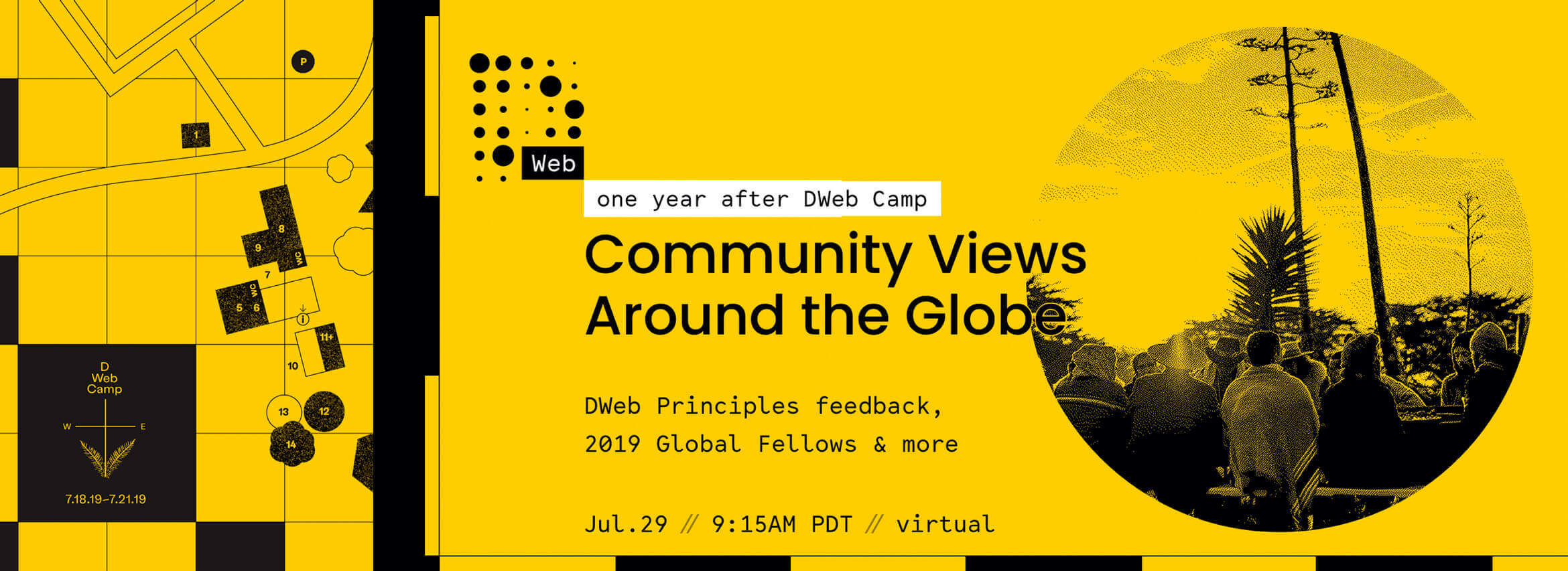
↓ (below) A month earlier DWebSF hosted another online event with the goal of gathering in one virtual space those people who attended the DWeb Camp 2019. The key visual of the DWeb Camp – the Mushroom Farm map - gave the September meetup cover its style and framing.

03
04
..
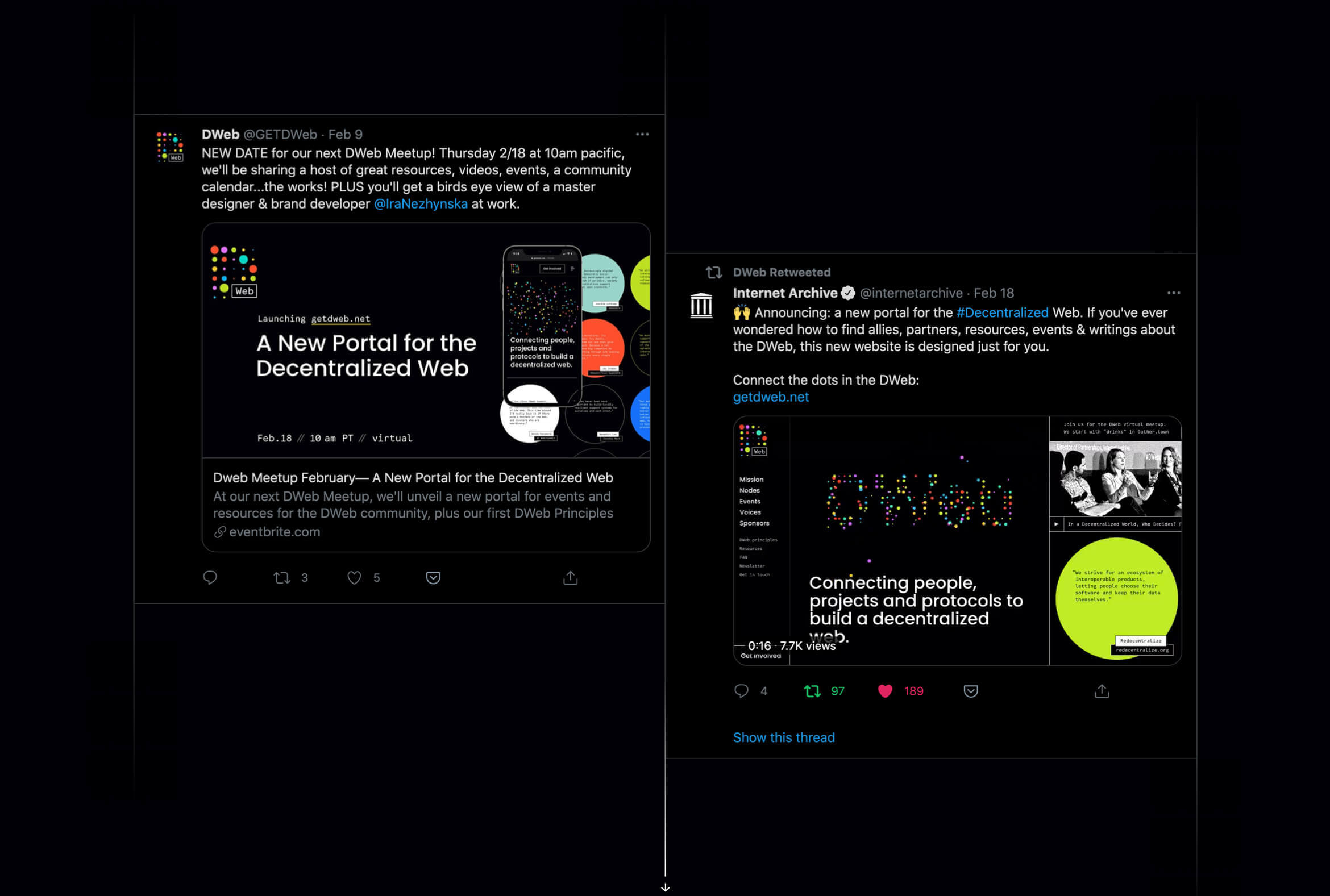
post-launch success
The brand design received a very positive reaction from the community. “Clean and sharp!”, “I like those dots!”, “Very grotesque-y. Love it!”
The website was put on IPFS by the community and was immediately tested in Brave and Beaker by meetup attendees.
In the 5 days after the launch, we received 3 new Node applications and many content submissions.
Within 8 days after the launch, the DWeb twitter account itself gained 174 new followers without any social media campaigns.
05
..
links and credits
Who and how started DWeb?
Read the origins story.
The website is built by a distributed team with a commitment
to the web we want and deserve: Wendy Hanamura, Mai Ishikawa Sutton, John Patrick Ryan, Mina Nagy Zaki, Gerben and me ツ
Use your skills to make a difference:
join the team or get involved in other ways.
next project ↓
Branding, UX design and art direction of a new editorial space at Jolocom.
Learn how to bootstrap your tech brand in less than 12 min per week, for free.
Every week, get one insight on brand strategy, one actionable technique to design-it-yourself and one curated list of aesthetic excellence. Use this 3-in-1 combo to build a product image that accelerates early adoption and funding.
Get them delivered to your inbox:
Created for developers-turned-founders.
See what's inside
▇▇ work with Ira
Other matters: iryna at nezhynska.com
creative
ⓒ Ira Nezhysnka, 2025
▇▇ learn for free
Subscribe to Ira's Embrace Variety
-
ⓒ Ira Nezhysnka, 2025


