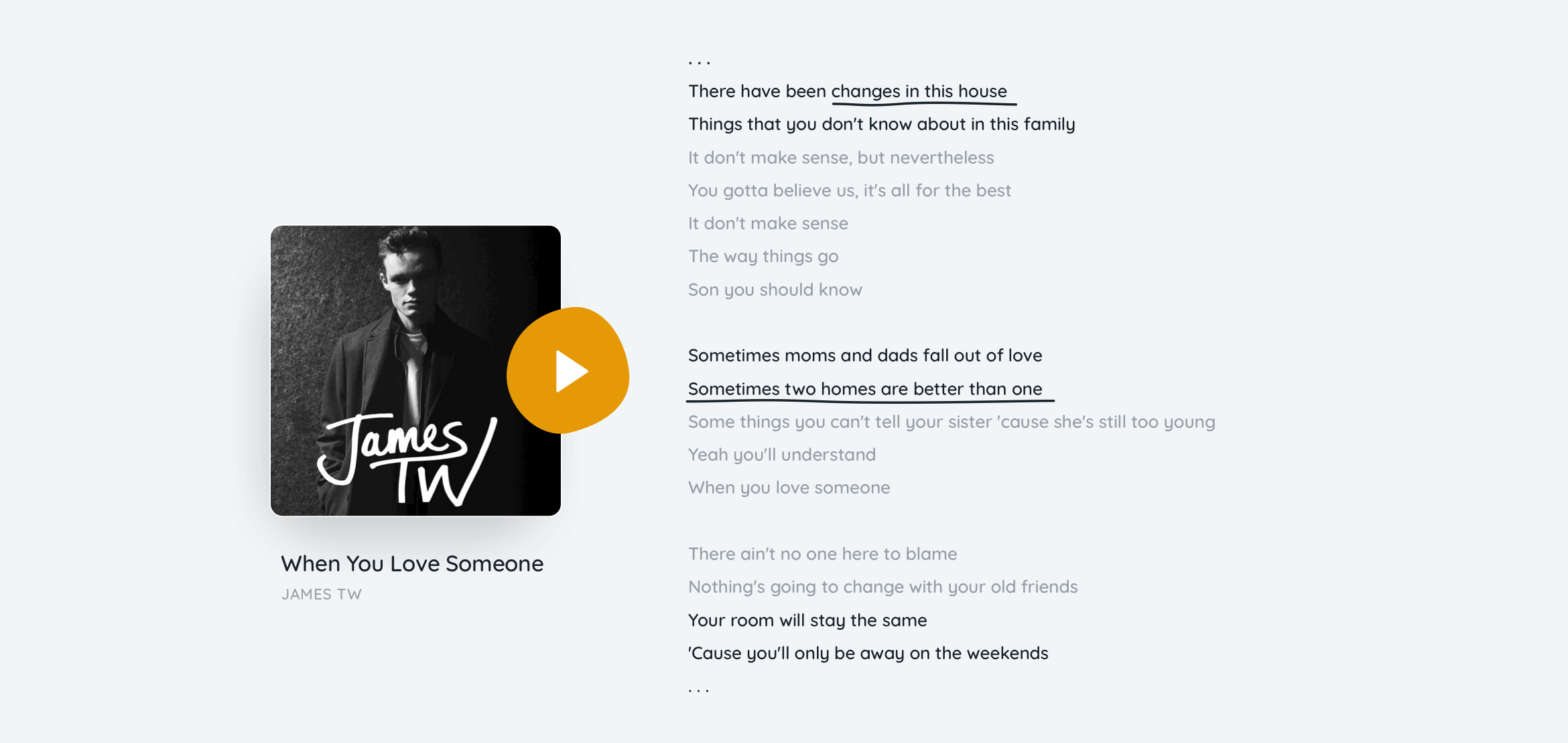
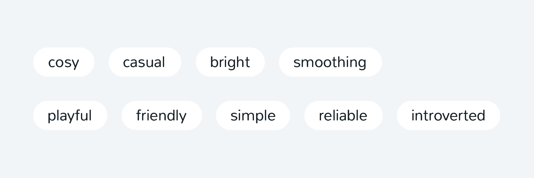
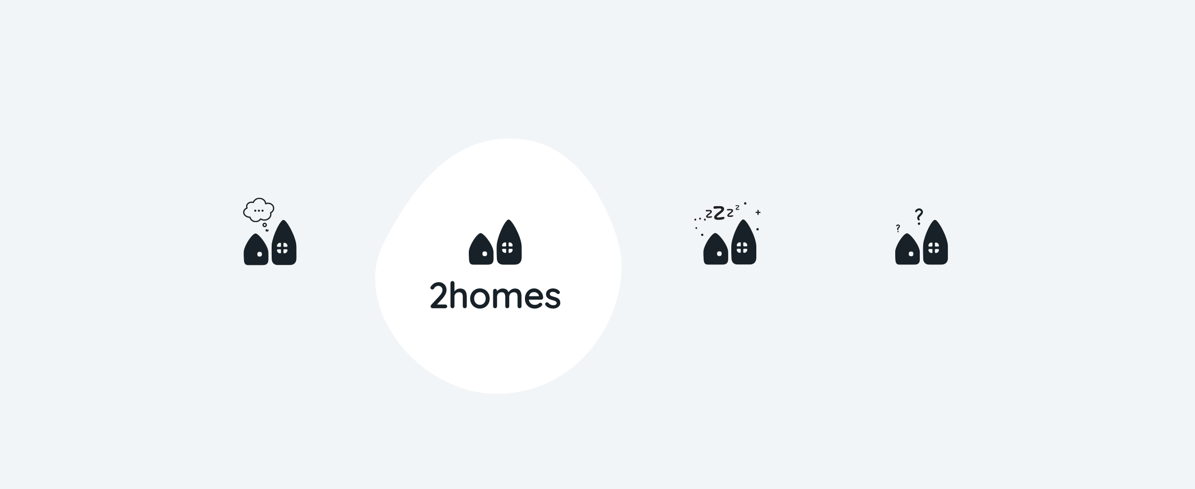
A brand designed to smooth the saparation feelings
Visual identity and UI design for the digital product making co-parenting easier.▉ Client: 2homes, 2018.▉
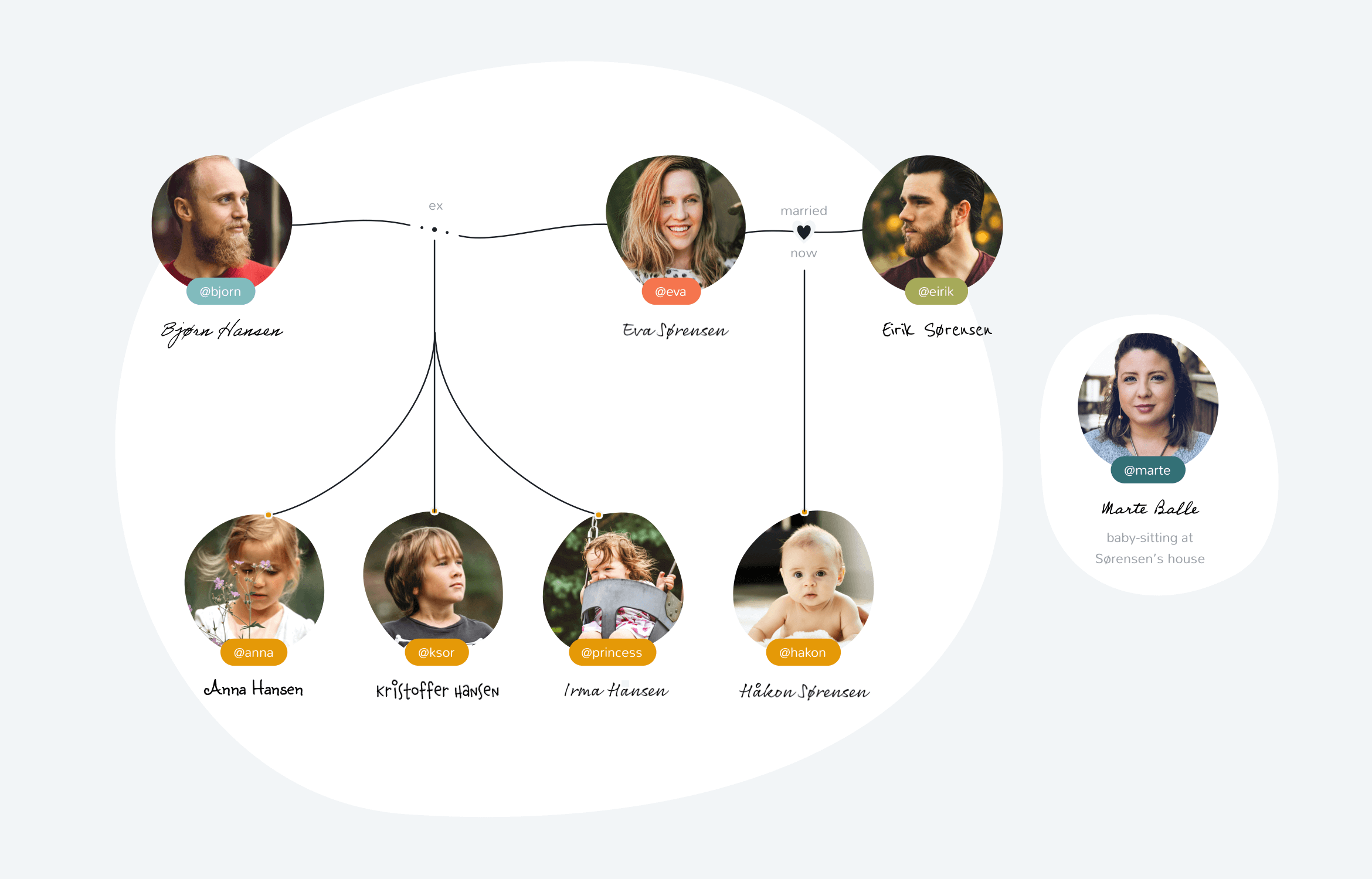
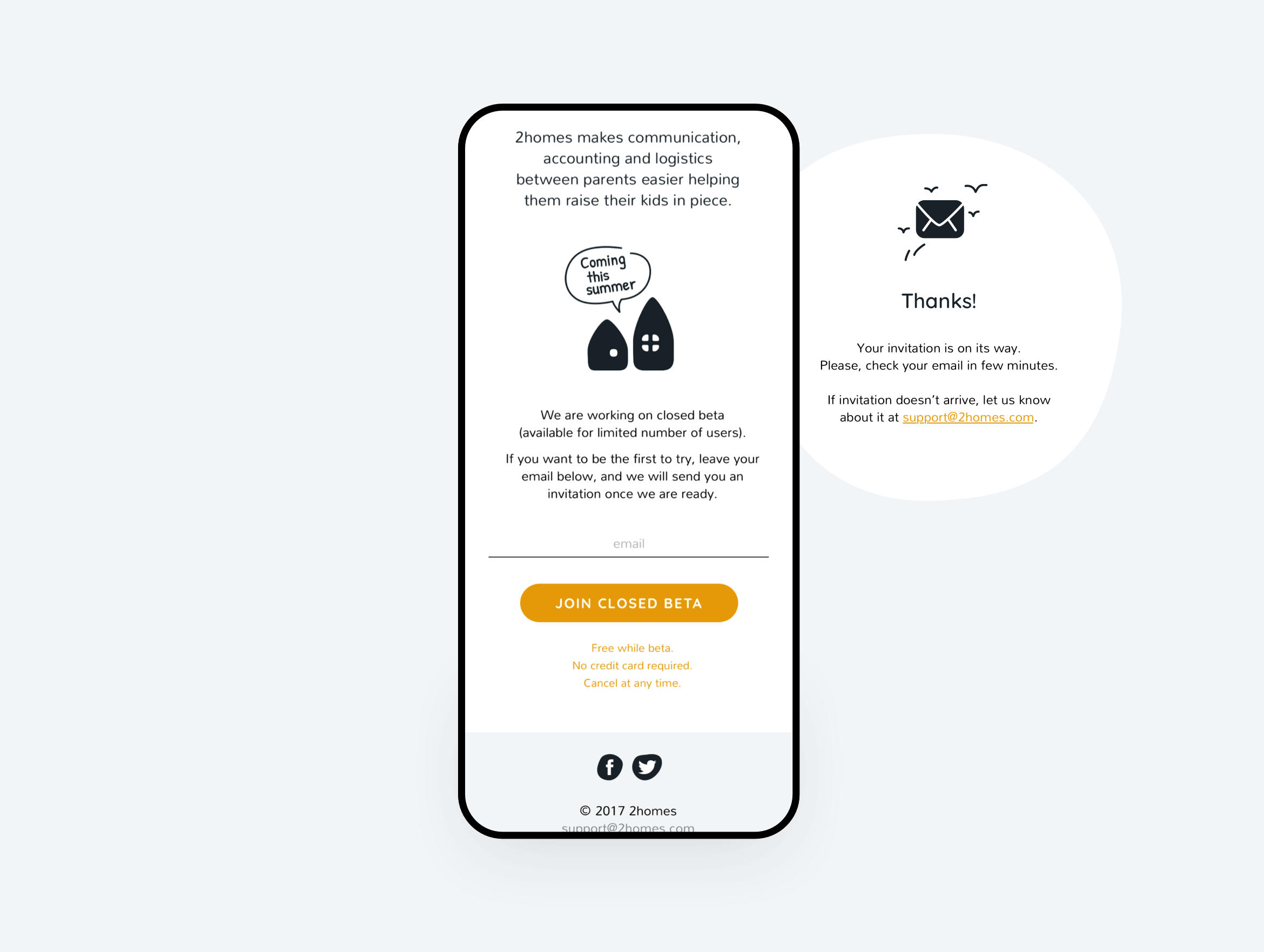
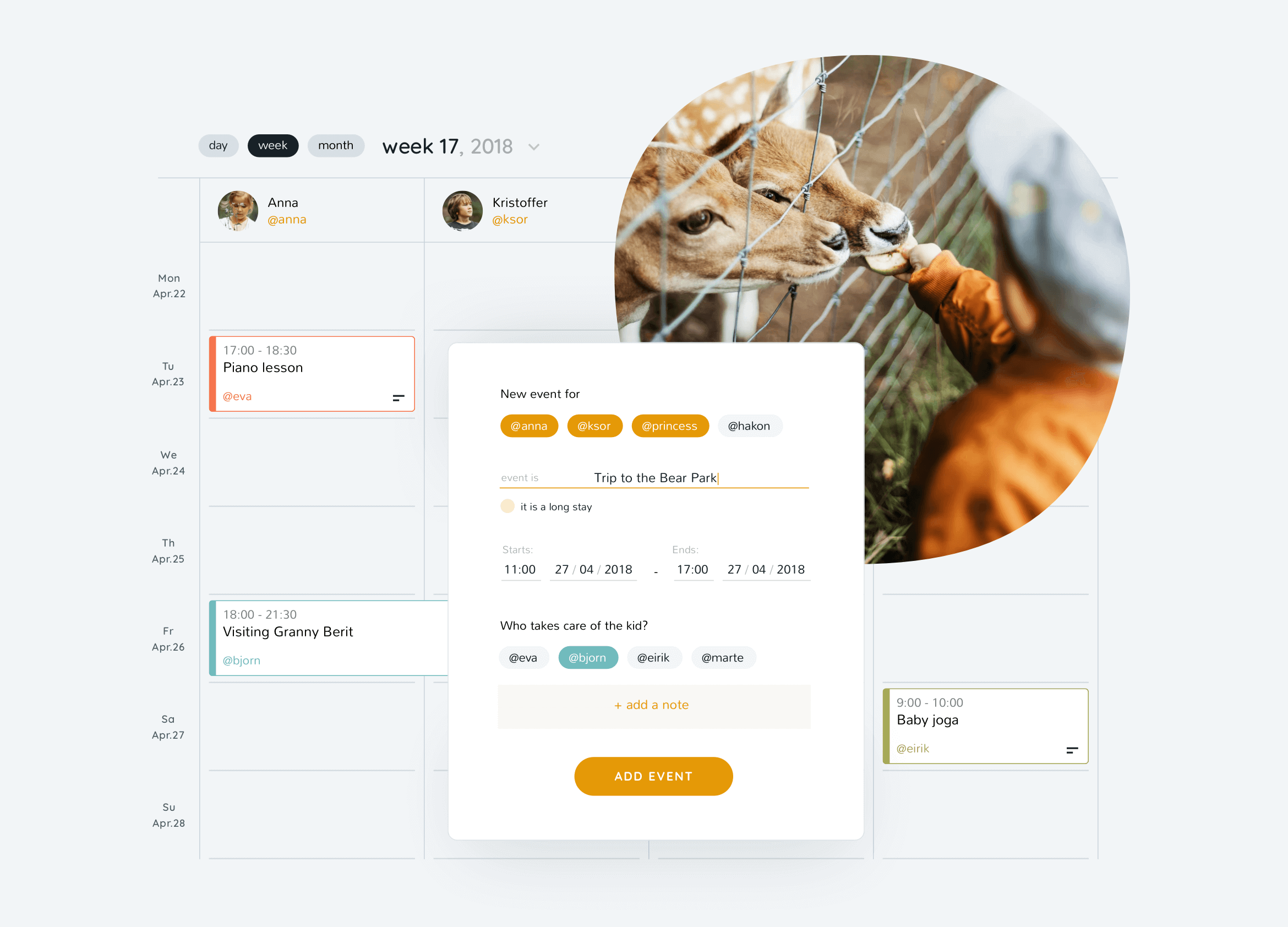
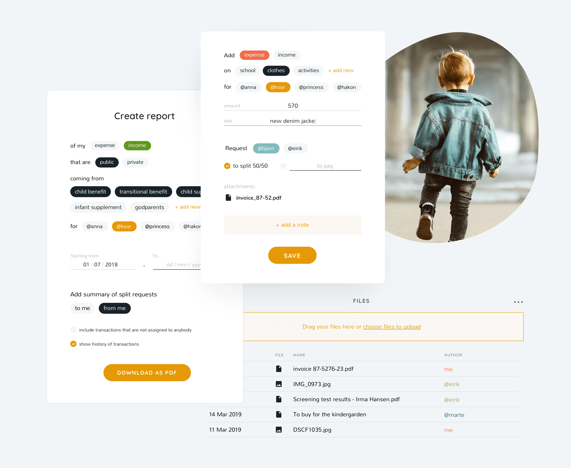
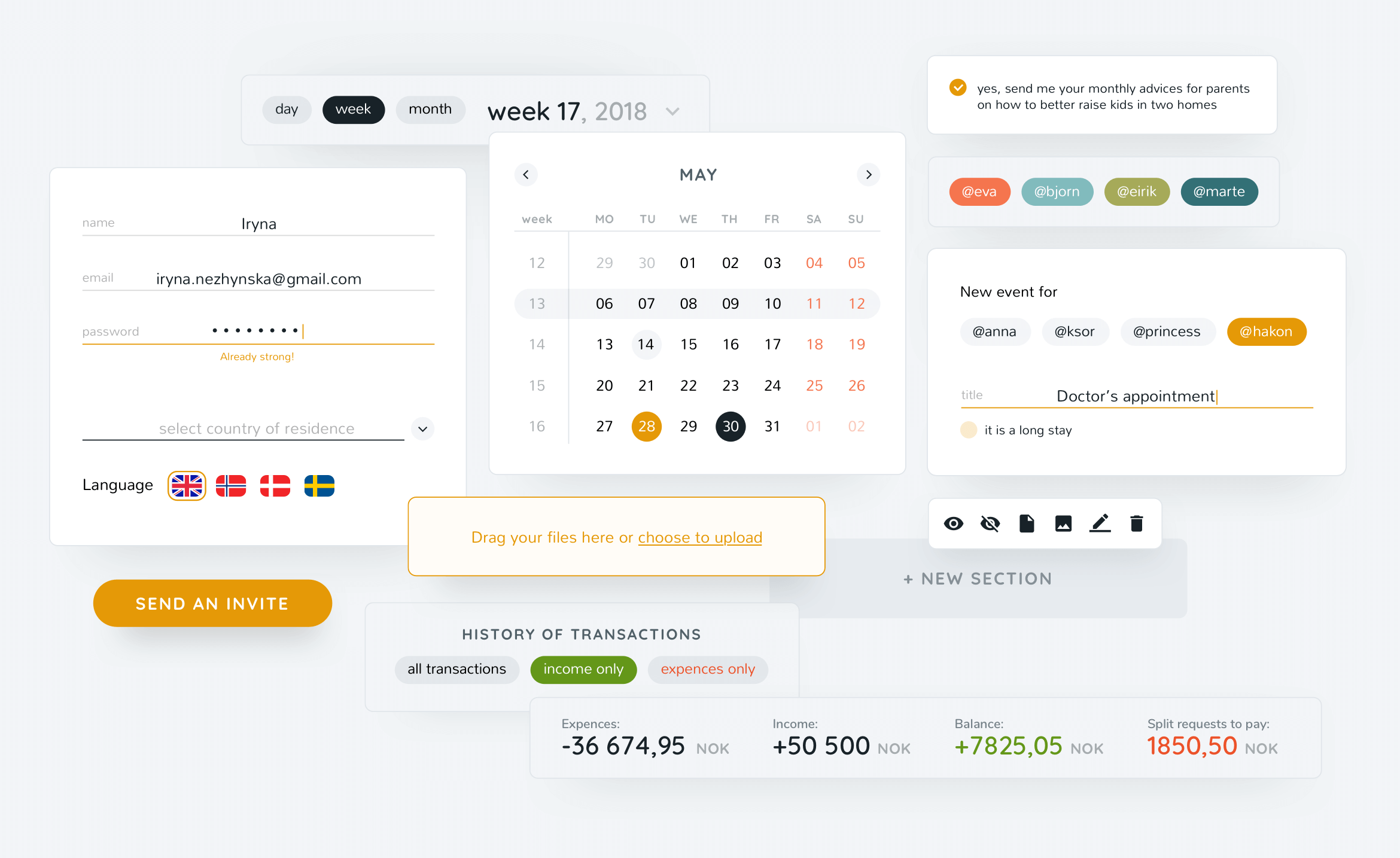
2homes is a Norwegian digital product that makes co-parenting easier after a family split. It is on a mission to give children the stability, security, and close relationships with both parents. To enable this they developed the web admin and mobile app to help divorced parents keep a shared budget, accounting, kid-care event planning and overview of the family responsibilities.
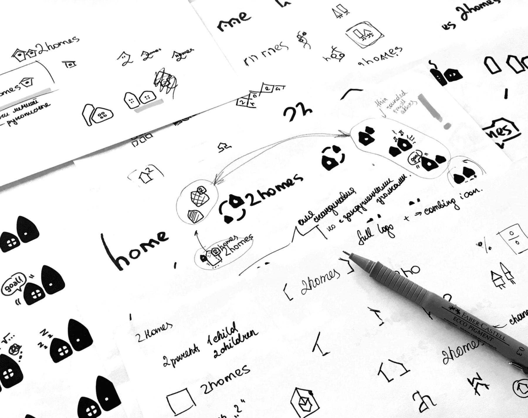
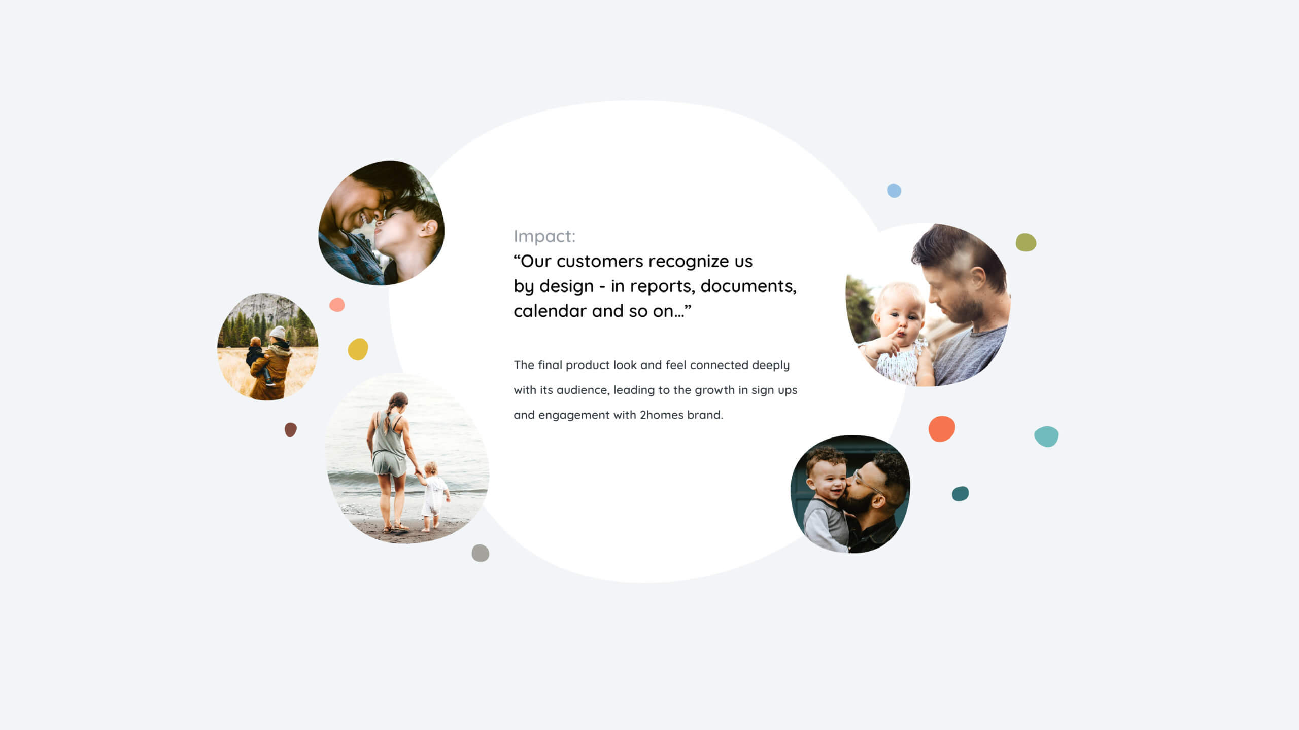
I joined the project to design a product visual language that captures the core values of the brand and reflects the importance of open and stressless co-parenting.
...
Learn more about the project
or continue for a portfolio view ↓


next project ↓
Brand transformation of pioneers in the decentralised digital identity management


▇▇ work with Ira
Other matters: iryna at nezhynska.com
creative
ⓒ Ira Nezhysnka, 2025
▇▇ learn for free
Subscribe to Ira's Embrace Variety
-
ⓒ Ira Nezhysnka, 2025